The author says:
The supreme Celtic goddess of war awakes in modern times and brings magic back with her.
Nathan says:
You get extra points for polydactylism, but…
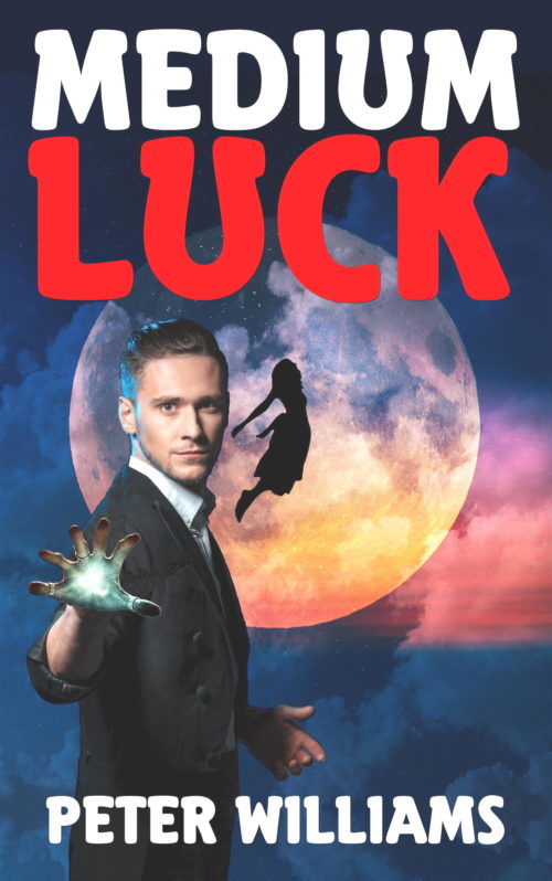
Is this supposed to be comedic? The title, coupled with the font choice, seem to indicate it, but the imagery doesn’t reinforce it.
The compositing of the various images needs work. The light source on the model is very different in both direction and color than the light coming from the moon, and the glow coming from his six-fingered hand is strangely confined to the hand itself, not showing up on his wrist or anything.
It was only after several looks that I realized that the female silhouette is in the center of the moon; before that, it was just oddly close to the male figure, leaving the right side of the cover empty and unbalanced.
I’m not sure if it’s better to tweak it or to come up with a new cover idea entirely.
Comments?


Nicely done as far as it goes…
I can only agree with most of what Nathan has already said.
I find the cover a little bland. There is really no focus…or, rather, what focus there is seems to be misplaced or misused. Everything is left of center, which gives the cover a lopsided appearance. What is dead center is the tiny silhouette of the flying girl…and being dead center the eye tends to go to her rather than the figure of the six-fingered magician. But once the eye gets there…there is nothing to see, nothing that informs the reader who or what she may be. If she is indeed meant to be the “supreme Celtic goddess of war,” you missed a very big opportunity to make your cover visually exciting, interesting and informative.
Aside from its off-balance position, the figure of the magician (or whatever he is supposed to be) is a little weak. The glow coming from his hand is small and unimpressive—and appears to be doing nothing at all. It’s just there.
In fact, all of the elements of the cover—the gesturing figure, the silhouetted girl and the moon—are just there: there is no relationship between any of them, nothing is interacting with anything else.
You get some points for putting a little blue rim-lighting on the left side of the figure…but it is missing from the side of his arm.
All of this being said, the bottom line main problem with the cover is that it doesn’t convey any suggestion at all—not even a hint—that the book is about “the supreme Celtic goddess of war awaking in modern times and bringing magic back with her.” If that is the theme of the book then it needs to be the theme of the cover.
Frankly, I think that you should probably go back to square one and rethink this cover from scratch.
Also, is the main male character meant to be polydactyl only on the one hand? Just gotta ask…
I need to think about this cover some more, before I make any other comments.
Nailing down the genre and main character should be central in rethinking this cover. Is it urban fantasy? Fantasy satire? Comedy? Look at books in your chosen niche to get a feel for what us expected and what is selling.
Also, by all means if she is a Celtic goddess and your title features the word “luck” – play off that! Throw in some green in the color scheme and perhaps a triple goddess symbol or the like. It may be cliche’ but many readers will pick up Celtic looking covers, no matter what genre they turn out to be. The odd cartoony font with the horseshoe U isn’t really translating well.
Looking up Morrigan, the Celtic/Irish goddess of war, I can only stand amazed at the visual opportunities that have been missed.
https://www.pinterest.ca/kennit/the-morrigan/
“Morrigan is known as the goddess of war, with her name loosely interpreted to mean ‘Great Queen,’ ‘Phantom Queen’ or ‘Queen of Demons.’ She was believed to hover over a battlefield in the form of either a crow or a raven, and supposedly influenced or predicted the outcome of the battle.”
The font makes me think of dog food, I’m not sure why. When I look at the cover it looks a bit like comedy, definitely young adult – fine as long as that is what you are going for. Others have already commented on issues with shadows and composition. The shadow on his left hand is really weird because that hand should obviously have a lot of moonlight. The lighting is going to be easier to fix if you use photos of models taken in similar environments – at least outside rather than in the studio. It is at least easy to read the title and author in a thumbnail.
Hi, Joey:
Like this? https://media.tractorsupply.com/is/image/TractorSupplyCompany/5073121?$456$
Any chance that’s what you or your family fed Fido?
Haha, and the cheap dog food, at that, eh? I wasn’t making fun, my covers need a lot of work too. But always good to get honest impressions.
I sort of like your color motif. Is there any way to keep the moon graphic and background type with maybe blues and greens and put a Celtic symbol of the goddess in the front. Even if there is a man there smaller. I like one of the persons idea of symbology. Anyone who is into the goddess knows moon symbology and goddess symbols. Otherwise it just looks like a medium rising the dead. Or spirit communication. Also a bit of green would work mixed in . Good luck with the cover. I think there are things you can work with.