The author says:
In the early 1980s, four people in central Missouri are haunted by the past.
Ngo, a writer of children’s books, is crippled from a wound received in Vietnam. His writing makes him come to terms with the loss of his country, as does letters he writes to Nguyen, an old friend who betrayed him.
Ngo’s best friend is Judith Vogel, a teacher who can’t forget the oppression she saw in Guatemala. This leads her to befriend Concepcion, a girl from that country who is in Missouri to study music. Concepcion rebuffs Judith’s efforts and throws herself into her music…which helps fight off nightmares she has about Guatemala. Judith loses herself visiting an abandoned cemetery, many of whose graves are those of German settlers massacred by Confederate guerrillas in the last months of the Civil War.
Jonathan Amesbury runs a small-town newspaper while he decides whether to return to London or save his family’s ancestral mansion. He wants to find out Concepcion’s secret, and joins forces with a reluctant Judith. Will this be the big story he sought, or will their haunted pasts overwhelm him?
(genre: literary fiction with a mystery, but not a mystery category)
Nathan says:
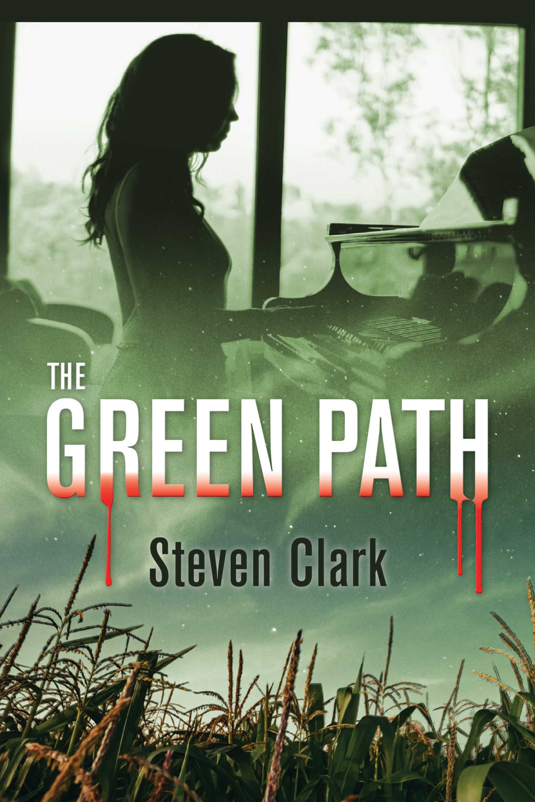
It’s really hard to tell if the cover captures the feel of the book, because the description doesn’t even capture the feel, or *a* feel; it’s all over the place, with no real theme or storyline to latch onto. Welcome to lit-fic!
I think the biggest mistake here is the bloody lettering. That kind of thing promises a story of menace and violence, which definitely isn’t what the description promises.
The second design problem is the way that the window frame in the upper image interacts with the cover’s border — it almost-but-not-quite-but-almost runs parallel, just enough to set my teeth on edge. It’s like a flat note. At the very least, zoom the image in and shift it slightly so the window frame disappears on the right, so the figure doesn’t seem captured by conflicting double-frames.
Beyond that… I dunno. The cover seems to say it’s a violent story about a piano player and corn. Even if that were true (which doesn’t seem to be the case), I have no idea how you’d market that.
Other comments?
Frankly, I would never have gotten an impression of the book as described from the cover.
I think that the fundamental problem comes from all of the imagery being too subjective: every element–the girl, the handling of the type, the field of grain–conveys some special meaning, but only to you because you are intimately familiar with the book.
To the uninitiated potential reader, the cover is not only confusing but even potentially misleading. Completely aside from the irrelevancy of the corn and that I have no idea what the girl is supposed to be doing the blood-dripping letters, as Nathan rightly points out, certainly imply violent crime of some sort.
I think that the only solution is to start entirely from scratch rather than try to save the current cover.
For some reason, when I saw the corn, the blood and the girl, I thought “oh, no, not another Zombie book!” Not sure why, as I said; something I saw in some movie, somewhere in time, no doubt.
That’s all I have for the moment. I need to cogitate a bit on the fonts, too, which are at best uninspired, but I wonder if there’s any point, as I suspect this cover needs a good overhaul or a complete redo.
One of the main characters is a young woman pianist: her secret was hiding a violent crime in war-torn Guatemala corn field. I read the story before I designed the cover. The author and I wanted to show a pianist on the cover. I searched many stock sites, it was not easy to find the right image. To me, the book description needs to be rewritten.
The problem is that one has to have either already read the book or already read the description in order to understand the cover. That is putting the cart before the horse. Before a potential reader gets as far as the book’s description the cover first needs to attract their eye. After doing that, it needs to convey something significant about the book: its theme, idea or nature. And it needs to do this directly, unambiguously and immediately. It should not be a puzzle for the potential reader to solve and it should not require any preknowledge of the book. In short, it is the job of the cover to encourage the potential reader to find out more about the book—to pick it up or read its description.
In this case, you have a pianist, bloody letters and a corn field, all three of which are treated as separate, unrelated images. They are meaningful to you and the author, but you both are already intimately familiar to the story. Aside from the suggestion of death or crime provided by the gory letters, there is really nothing at all that conveys any real sense of what the book is about or what sort of book it is. Neither the pianist nor the corn contributes to this.
I think that one needs to sit down and consider which is the most important idea to get across on the cover: that the main character is a pianist or that the plot concerns a woman whose “secret is hiding a violent crime in a war-torn Guatemalan corn field.” I think it is the latter and that ought to be the focus of the cover art.
Okay, but…while that may be her secret, that’s not what the story is about, right? I mean…maybe it’s a tale of redemption. Maybe it’s the Hero’s Journey, with a twist. Sure, I get it, it’s LitFic, which means it’s not about anything other than (insert some emotion-wrought something here), but…I can’t tell anything about what the author is trying to say here. It’s too literal. Girl playing piano, cornfield, blood.
Which conveys nothing about the heart of the story, the essence or the theme. I tootled over to Amazon and opened up the Lit Fic section and looked at some descriptions:
“American Dirt is a rare exploration into the inner hearts of people willing to sacrifice everything for a glimmer of hope. ”
“Paulo Coelho’s story suggests that living without a connection between action and soul cannot fulfill, that a life constricted by fear of rejection or failure is not a life worth living.”
“Told with insight and wit, Deacon King Kong demonstrates that love and faith live in all of us.”
Emo! Emo stuff! Oprah Book Club stuff here!
So…what the frack is the theme? What message is the author conveying to us? To my way of thinking, the secret that the character is hiding–whether in a cornfield or a coattail–is irrelevant. It’s that it’s hidden and whatever (emotionally exhausting/trying) thing she undergoes to get to (realization here). Or…something along those lines.
To me, being able to pick up a book and say “ah, this looks like hope,” or “this looks like freedom” or whatever–however one conveys those amorphous concepts–is the play. Not cornfields, blood and pianos. Cornfields, blood and pianos could be genre horror. Could be action adventure, could be a mystery, could be…and the list goes on, right?
But…that’s my $.02, or in this case, $0.05, for whatever that’s worth.
I agree with you, Peggy, that the description badly needs rewriting and rethinking, (too diffuse, too confusing, no connections twixt and tween) and unfortunately, I think the cover needs rethinking, too. I know that must be frustrating, with the time you invested for the image, but…I just don’t see it.
I only realized that the girl was playing a piano after looking at the cover a second time. Still no idea what the connection is between that, bloody letters, corn and the description of the story.
I sort of find your images interesting. Still I did not know what the first one was. I thought it was a girl making lithographs. I’m not liking bloody letters because I’m thinking Children of the Corn. I feel the real story is about the relationship between the two characters. I see both faces in corners in black and white with maybe green grass or greenly, maybe a tree or a symbol of the massacre, maybe a sword or gun. Anyway I love the green color and monotone images. Sometimes too much stuff is too much. Sometimes simplicity works too. I learned this in Graphic Design. If there’s too much going on you can’t focus on the main meaning and imagery. Still love the green grass color. Reminds me of a rural country. Any quatamalan natural imagery would work too.