The author says:
Two priests battle a dark presence arising in their parish in a cyberpunk future where demonic possession is common.
Nathan says:
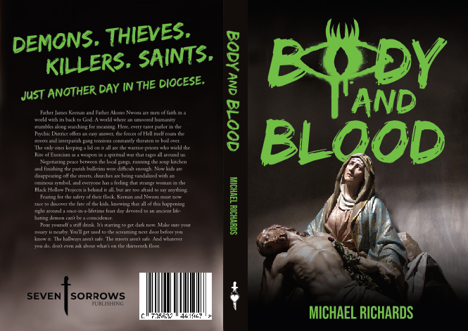
Technically, there’s no problem with front cover. However, all I get from it is “Catholic” and “sorta ominous.” In a synopsis of fewer than twenty words, half of it focuses on the setting, and for good reason — the demon-filled cyberpunk milieu is the hook here. So why is it completely absent from the cover?
Gimme a grungy tech typeface. Gimme a neon, circuit-boarded background. Gimme SOMETHING that presents the most intriguing part of the synopsis. A shadowy pieta simply doesn’t cut it.
Since you gave us the full wraparound cover, I’ll also point out that that looks like a lot of words on the back. Expand it to fill the space so it doesn’t look so dense, or chop it down by a third or a half, or both.
Other comments?
The only thing that conveys a sense of what the book is about is the title and the style in which it is done. Unfortunately, the art not only does not add anything to getting across the nature of the book, it actually works against it. That is, you have a horror vibe coming from the typography that is countered by the conventional religious imagery. The latter needs to be either manipulated in some way so that it adds to the effect of the cover or an additional visual element needs to be included.
At the moment, all you have is a hint of horror but nothing that really conveys the nature of the book you describe: there is no suggestion of a “dark presence” and absolutely nothing that says “cyberpunk future.”
Since a book cover needs to get its message across in just the briefest glance it may be given, every element on it needs to contribute to the overall message.
A quick google search shows plenty of ways to make christian imagery in the style of circuitboards. That might be a good place to start. Here is one:
https://www.dreamstime.com/jesus-christ-cross-circut-blue-diagram-outer-space-poster-background-god-lord-stars-christian-bible-high-tech-banner-image141984648
Demons and cyberpunk? Here is where you want to look for inspiration.
Your cover looks more like a my thriller than a cyberpunk future.
At this moment the cover needs a full revamp; a bold and grungy sans typeface and a more technological image. I think the best thing you can use for the cover is a techno demon or something similar.
The thing which seems to be missing is any actual blood. I guess it might look a bit OTT to have the writing in red, shades of a Dennis Wheatley book, but a bit of a splash somewhere might help. Or a hint how the blood is created, a dagger for example if one is involved.
It’s very slick and professional, but I got “Da Vinci Code-style thriller” from this. I’m really not seeing cyberpunk (or even future).
The other thing I notice is that there’s just a lot of blank space; the image doesn’t really seem to fit the shape of the cover that well. Is there something we can do to spice up all that plain black?
Actually, I’m getting “Damien” from this, more than DaVinci Code thriller.
Honestly, that’s all I got for this one thus far. I’m certainly not seeing even a vestige of cyberpunk. Or Future. Or demon possession, either.
Therefore, slick as it is, it seems that this cover is great–but not for this book, assuming that the very short description we received is accurate.
I feel like the composition’s good enough, but cyberpunk needs the grungy neon colored aesthetic to read. Those DOOM covers are definitely a direction to go in!
Maybe filling that empty background with a shadowy…cathedral? With the colors shifted over to the cyberpunk neons (angry fuchsias against midnight blue)…maybe even hue shift the statue colors in the foreground to punkify it?
Here’s some DDGIS of cyberpunk video games (realistic and 8-bit) for a quick example of color palettes: https://duckduckgo.com/?q=cyberpunk+videogames&t=lm&iax=images&ia=images
https://duckduckgo.com/?q=cyberpunk+videogames+8bit&t=lm&iar=images&iax=images&ia=images
Hey everyone! I’m the designer of this cover (and author), as well as a new but frequent poster in LBC and here as well, so getting a chance to hear from my friends here was both nervewracking and tremendously rewarding! I want to thank everyone for their input, good and bad, it means the world to me that you all took the time to post. I cannot thank you enough.
While I am pretty happy with it, it is by no means the final version, and I agree with the biggest criticism – it not speaking to genre clearly enoug (to the point of even possible confusion). I’ll be taking the inout to heart in my later revisions, but I thought just for closure’s sake I’d mention more about the actual plot, since I made the dire mistake of merely including a much-too brief description in my submisson. So, FWIW, here it goes:
The inciting incident is a late night break-in at a Roman Catholic church in said gritty dark cyberpunk urban setting. The priests in residence, in the course of fighting off the thugs, see that they possess unnatural strength, constitution and have horridly discolored skin and eyes. They discover, from an altar boy of theirs who let the hoods in, that a mysterious figure in control of one of the city’s gangs is offering money for sacred objects from area churches, and that consecrated Eucharist wafers and wine (the Body and Blood of Christ, in catholic theology), are among the most prized. They discover the figure to be a servant of the demon Moloch, who is collecting these items for the purpose of ritual desecration on a once in a lifetime feast day. The sigil in the “O” in the word Body is their calling card, which is spray painted onto the walls and doors of those they want to target or intimidate.
Just a bit of extra fleshing out. In any case, again guys, thank you so much for the feedback! I truly appreciate every word of it!
Thanks for the additional description of the book…which also really underscores the need to have cover art that is much more focused!
MyK:
What are the cyberpunk elements, please?
Hitch, the cyberpunk connection is largely in the setting. Dark, rainy neon lit streets, laser weaponry and wetware technology exist, synthetic foods (like air-activated self-frying meatless bacon) and vehicles that hover (but don’t fly). There is an underlying theme of how man’s reliance on drugs and tech for entertainment and fulfillment draws them away from the things which give their lives ultimate meaning and purpose (like God), and as such makes more vulnerable to demonic possession. However, its meant to be woven into background, not to hit the reader over the head with it, and doesn’t even say the Christians are the ultimate way. I’m taking pains not to cone across as prosthelytizing.
Myk:
I meant, where’s the cyberpunk on the cover? You said, in the description, that it’s a “cyberpunk future.” There’s nothing cyberpunk, at all, on the cover. I think that ignoring it or not including it, is doing your prospective reader base a disservice.
I’m not sure what the proselytizing comment is about, though, honestly…I didn’t mean to go there. ? I really was talking about the cyberpunk stuff. I would strongly consider perhaps..IDK, wasn’t it RK that popped up with a cyberpunky trinity? Or, something?
Sorry, Hitch, I misunderstood your comment- i thought you mean what are the cyberpunk elements in the story. There really isnt any on the cover, I readily concede, and that seems to be the group’s biggest criticism. And I wasnt getting on you about the ‘prosthelytizing’thing, I just worry that it may seem like that when I describe the plot, that wasn’t ained at you.
No, no fear of that here.
I do think it needs something. I’m not gettin’ demons, I’m getting Damien (granted, it may be a distinction without a difference, but…) and I’m not getting cyberpunk, either. It just doesn’t read (the cover) in a way that would make me want to pick it up, in that genre. So…needs a bit of “somethin’ somethin’.”
You’ve got your “Catholic icons” imagery and graffiti-style titling pretty well done, but apart from the neon-green-on-black color scheme vaguely hinting at something computer-related, you’re definitely missing the “cyberpunk” part of it. While I did pick up on the visual allusion to the old days of green-screen computing, it’s worth remembering that those days are getting to be four decades ago now, and that what little the kids born in the late 1980s and thereafter remember of that aesthetic these days comes from their having seen the Matrix movies… which are getting to be two decades old now. In short, the reference is likely to be lost on any of your prospective readers under the age of forty, and even I initially saw more of an “R.L. Stine does Catholicism” theme to your cover than an “exorcists still very much needed in a cyberpunk future” one.
While my colleagues’ suggestions so far aren’t bad, I do think a little flexibility is always in order. While those Doom novel covers certainly combine demons and technology very effectively in their imagery, the demons in those stories were very much physically present flesh-and-blood creatures (the kind space marines could shoot and kill with their shotguns and energy rifles), whereas your story’s description suggests any demons in it are more likely to be wholly immaterial spirits. Besides, we shouldn’t limit ourselves to thinking the cover imagery needs to combine demons with technology to convey the “cyberpunk Catholicism” concept to prospective readers.
Likewise, you shouldn’t limit yourself to pieta imagery when Catholicism has so many other readily recognizable symbols. Cyberpunk imagery, likewise, consists of just about any kind of advanced-looking technology with a layer of grunge on it. Just as your story’s whole plot was easily summarized in one sentence, the effect you need to be pursuing for your cover is easily summarized as “Combine cyberpunk imagery with Catholic imagery.”
For instance, how would you like a wire-frame rendering of a crucifix and a rosary? Maybe a pair of those priestly collars almost everybody recognizes as a common feature of Catholic clergy, except with this particular pair being studded with circuitry? (The latter symbols might be especially appropriate to the context, considering your story’s protagonists are a pair of priests.) Of course, if these priests in this particular cyberpunk future have any highly visible body modifications or wearable technology, that’s as good a reason as any to show them on your cover: priests in full frock with e.g. a cybernetic prosthetic eye or a necklace projecting a holographic crucifix might be enough to convey the story’s basic concept all by themselves.
Bottom line: whatever you do and whatever we do, let’s all try not to get too hung up on any one particular possibility to consider any of the others, all right?
I’m not a designer but I read. The tagline: “Just another day in the diocese” makes me believe this is nothing special, it happens everyday. Basically, nothing to see here, move along.
If the novel is indeed cyberpunk with religious breaking-and-entering – does that happen everyday?
Tedrigawa, the church is located in a pretty bad neighborhood, and the priests frequently find themselves in the company of criminals, gang members and such, both as a matter of location and through the course of their ministerial efforts.
Much as I appreciate hearing about all these fascinating details of the story, I’ll say this again: all you need for your cover is something that unambiguously indicates this is Catholicism + cyberpunk. All other details and plot points can wait for when people actually read the book. Actual scenes from the book are never a requirement on a book cover and might even actually detract from it; just stick to showing your prospective readers Catholicism + cyberpunk, and nothing else.
I absolutely agree! A book cover is not necessarily a literal illustration of a scene in the story. Interior illustrations do that job. The purpose of a book cover is two-fold: first, to attract attention from among hundreds of competing products and second, to convey in a glance something about the book’s nature, theme or idea. As RK suggests, getting across the impression of Catholicism/cyberpunk is more than sufficient.