The author says:
Can the gates of perception be bypassed?
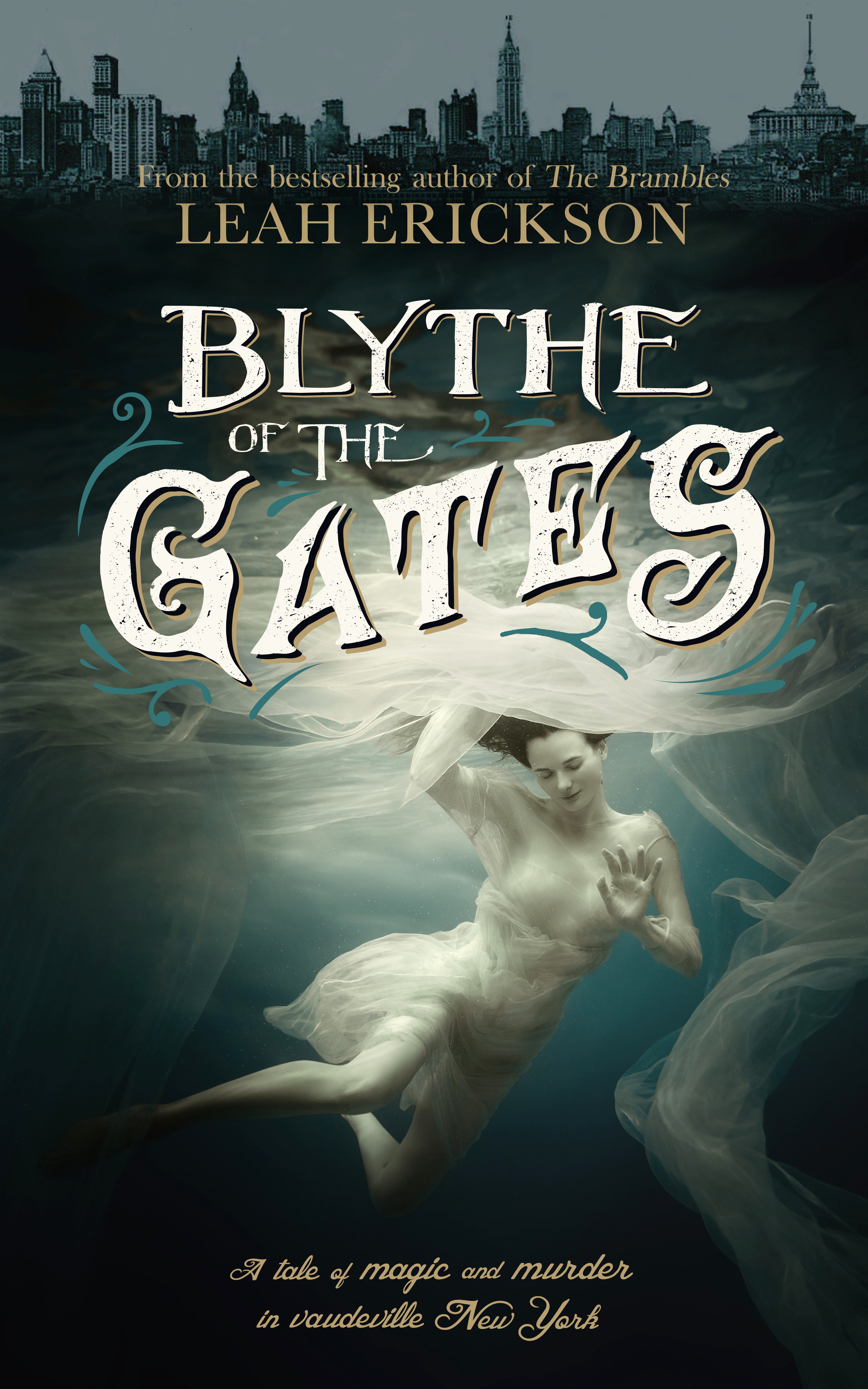
The year is 1911. A rash love affair with a member of the Irish Mafia catapults Luna Mulkerrins into scandal, murder, scorn and decadent friendships in Ragtime Manhattan. Escaping from the blaze of publicity, a new Luna emerges: Blythe of the Seven Gates. Her meteoric rise as a magician leads to fame, vaudeville, silent movies and the notoriety of a damaging court case. Can Luna reclaim her reputation and reinvent herself as an independent woman of the time?
“This book is as enchanting as the magic tricks within. Heartbreaking, thrilling and powerful, it’s a journey you won’t want to miss.” — Jo Niederhoff, Seattle Book review
[original submission and comments here]
Nathan says:
I see you took a lot of the comments to heart. That’s always gratifying.
If it were me, I would:
- Make the sky lighter behind the skyline at the top, possibly with a slight sunrise/sunset glow of color.
- Enlarge the female figure downward; there’s no reason that the tagline at the bottom can’t overlap her knee.
- Audition other fonts for the tagline — something about it doesn’t sit quite right with me. Possibly just make it the same font as the byline and credits, or switch both of them to something new.
Well done!
Other comments?
Gorgeous!
The cover looks really nice! Indeed, it’s exceedingly beautiful and attractive.
But…I am not at all sure that it really conveys any sense at all of what the book is actually about. I don’t see anything that suggests the “meteoric rise” of your heroine “as a magician [that] leads to fame, vaudeville, silent movies and the notoriety of a damaging court case” let alone a “rash love affair with a member of the Irish Mafia catapults Luna Mulkerrins into scandal, murder, scorn and decadent friendships in Ragtime Manhattan.”
Instead, I get a sense of fantasy and otherworldliness that makes me think of “The Shape of Water” rather than “Ragtime” or anything involving scandal, murder and decadence in turn of the century New York.
Quite nice. I think the city’s just a little too crowded toward the top. I’d like to see everything moved down a bit so there’s less empty water above and below the woman and more room for the skyline.
I really like the type treatment.
I agree with Nathan’s comments–lightening the sky behind the skyline will actually help the focal point in the center; I’m very fond of the title font treatment (and not so much the tagline), and I agree that she would be even more of an impact made a bit larger.
I know it’s tempting to keep up the fancy font treatment, but I think you can use the byline font for the tagline–it’ll be fine.
Very, very nice job. Great improvement on an image that was quite fetching in the first place. Well done!
It’s not a bad abstract image, though I would have preferred that the city be at the bottom of the cover rather than the top; having her beneath still makes this look a bit like some kind of ocean-related story, which I didn’t think it to be from the description. (Of course, if any of the “murder” indicated in the tagline has to do with drowning somebody, then never mind my complaint; having the gal seemingly underwater makes perfectly good sense in that context.) Also, the all-shades-of-blue monochrome strikes me as just a little boring. I’d make those fabrics swirling around her all some garish fluorescent shade of green or purple just to hint a little more at the magical part of this story.
The tagline does help to make a little sense of the cover, but…it is A. much too small to be effective in that regard and B. a cover should not depend on a tagline in order to be understood. Imagine the cover without it (and the title, too, for that matter). Would it really convey anything of the book you describe in the blurb?
I agree that the cover is beautiful but doesn’t sell the described book. But maybe a few small tweaks would fix that. What if instead of a city on the top there was retro stage lights? You could put a tank edge along the top and maybe the side and put some flooring barely visible in the black part. So she looks like she’s in a tank on a stage, not the sea. You could even add a reflection in the black part of the water of a man dressed appropriately for the era or a crowd reflection or even the inside of a club, but really I think the stage lights would be enough of a clue this was a performance and not a mermaid sort of tale.
https://imgur.com/a/2IH5p1r
my super quick remake to set it on a stage and address Ron’s issues. Pretend author name is still above title and the light from the lights is lighting the title correctly…lol. Making her be in a tank on a stage, whether or not her trick happens on stage, will have better recognition at first glance as to what sort of book this is.
Hey, Savoy:
I like the idea of the kliegs, but I think the general problem is, the woman-in-water dominant image leaves very little room for elements that will sell the actual story elements of the book. After all, you have period elements (Ragtime NYC), Magic (lady magician), a love affair that crashes and burns, and a murder. If you think about it, other than a custom image, showing an early 20th-century lady magician on a stage, WHAT can you put on this cover that would really say all that?
I think that it’s fairly lovely, someone evocative, and works pretty well with the typeface, which says “early 20th century.”
Possibly the kliegs and a stage setting might work, but even those are NOT gonna yell all the other things that this cover is trying to say (Ragtime NYC, lady magician–she could easily be a magician’s assistant; murder, failed affair, etc.).
Y’know? I think it’s pretty suitable. I presume it’s being marketed as literary fiction?
This is certainly in the right direction!
If the stage or lights looked period (first decade of the 1900s) that would help set the tone really well.
It’s period, it’s tonally appropriate, and no image is ever going to convey EVERY element in the story. (I don’t even think the skyline was strictly necessary.) Girls underwater are a common theme on literary/women’s fiction covers; there’s no reason to think anyone will be catastrophically misled into thinking the book takes place under the sea any more than, say, the Twilight cover misled people into thinking it was about apples.
TL;DR It’s fine.
I agree that “no image is ever going to convey EVERY element in the story” but the cover art should convey something significant. The problem here is that the present cover doesn’t seem to connect with anything the author has described. It may not make people think that the story takes place under water, but by the same token I don’t see anyone seeing “rash love affair with a member of the Irish Mafia catapults Luna Mulkerrins into scandal, murder, scorn and decadent friendships in Ragtime Manhattan” in the cover, either. One of the problems we have in this group is knowing a little too much about the books we are asked to comment on. Seeing this cover cold, with absolutely no prior knowledge of its subject or themes, would you have any clue that it was about a “rash love affair with a member of the Irish Mafia” that “catapults” its main character “into scandal, murder, scorn and decadent friendships in Ragtime Manhattan”?
As beautiful and evocative as it is, I think the present image of the woman needs to be replaced with something a little more specifically relevant.
And to that end, here is a thought: adapt a period-appropriate magician’s poster. The Library of Congress has dozens of these available at high resolution http://www.loc.gov/pictures/search/?q=magic+posters&st=gallery
Actually, that “Alexander Crystal Seer” poster might be asskicking for this book. Sure, no floaty lady on the cover, but the imagery certainly conveys magic, the Ragtime era, and murder. Couple it with the typography on this proposed cover, and it could be amazing.
Although…from looking at this and the previous effort, to me, anyway, it seems clear that the author’s view of this book is more “Women’s Literature” or “literary fiction” than genre murder/mayhem or supernatural mystery. So…that might be a losing argument.