The author says:
Searching for the wreck of an eighteenth-century Spanish treasure ship, underwater salvage expert Jax Malone discovers an uncharted island, and the Holy Grail of historical mysteries. When he and his crew are attacked by natives on the island, the Americans are rescued by an unlikely troop of soldiers from the past, descendants of the English colonists who were sent to settle the New World over four centuries ago – then vanished without a trace. While stranded on this island, Jax and his crew are relieved to be among civilized people, and exploring the old world commonwealth that they’ve built. But they gradually find that things are not as they seem. When their group becomes separated between the English and the natives, the Americans discover that their survival is further threatened by another force, one which they have even less control over.
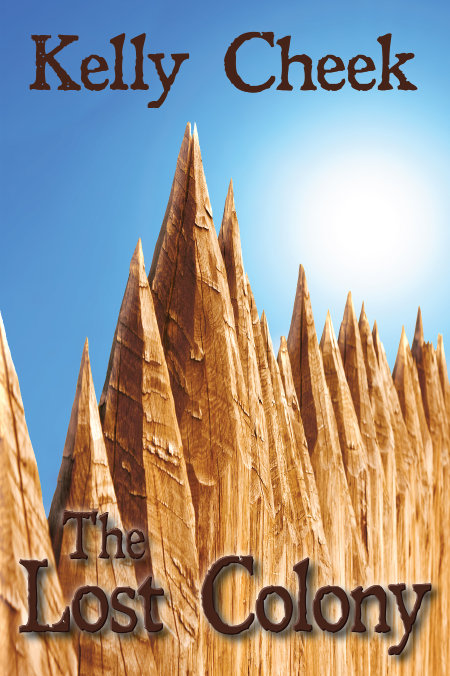
Nathan says:
It took me a second — which is too long for a book cover — to identify the image as the top of a palisade (at first I took it to be some kind of cathedral). My impression from that, combined with the antique type, is of a purely historical novel, probably one detailing how the lost colony was lost. Given that your setting is the present day and your protagonist is a modern American who discovers the lost colony, I would suggest a mix of elements with both a historical and modern flavor — either both present in the image itself (a modern semi-automatic juxtaposed with a flintlock, for example), or a historical image combined with a modern typeface (a flintlock with a modern military stencil font, for example).
It’s also waaay too bright and cheery for a novel with so many suspenseful/dangerous elements.
Other comments?
I agree. The basic idea is all right so far as it goes, it’s just a little too abstracted. The image needs to be more immediately recognizable as part of a fortification in order to be effective. But even at that, it may be too ambiguous and uninformative to really convey any sense of what your book is about. You should probably consider adding one or more additional elements to this image, though the best thing might wind up being to go with another image entirely.
In this case, we have a picture that is literally too close to the subject matter; my initial guess was that the spikes were some kind of weird mountain formations on some alien planet with a lower gravity than ours. If nothing else, we definitely need to be “zoomed out” to recognize that the picture is that of an old-fashioned colonial palisade. I’d recommend “zooming out” even further, however, to show that this palisade is in fact an old-fashioned colonial fortress on an island.
Beyond that, not much else should be necessary, since those old colonial fortresses are a pretty well-known visual feature from colonial times. Fortresses by their very existence also testify to the violent nature of their locale, so you’d be hinting at the conflict taking place on this island in the story without giving away too many details all at once. Of course, you might still want to add some optional features to underscore the oddity of the setting: an unfamiliar flag flying over the fortress, for instance, and maybe some seemingly anachronistic object from our time lurking in some corner of the picture such as (for instance) a motorboat on the shore nearby.
Basically, juxtaposing things from two different time periods is intriguing, and prospective readers would be pleasantly surprised to learn that the story is actually set in our time and the fort and its defenders are therefore the actual anachronisms. That way, you get the attention of both readers who like historical fiction set in colonial times and readers who like speculative fiction about contemporary crypto-civilizations. Slap your current title and byline (which look all right to me, though you might have to adjust their color to contrast with the new picture enough to be legible) on that cover, and you’re set.
I’ll try to comment more later, but one odd point I wanted to make is that an optimal design could vary quite a lot depending on where this uncharted island is. Old colonies off South America code differently in images from those in the Caribbean, and a lot differently from New England colonies like Roanoke. The palisade wall immediately says Roanoke to me, so any natives would be expected to have buckskin clothing, for example.
At first glance I thought the cover photo was of un-leaded pencils. I needed to read the synopsis to find out what the book was about. Not an indication of a good book cover.
The synposis offers so much more: adventure, action, history. Although I wonder about the phrase “relieved to be among civilized people.”
This would be a fun cover to make because you have so many choices. merging the old and new has limitless possibility. I immediately envisioned a distant contrail in the sky over a much easier to recognize palisade but I’d also add some graphic element to show the palisade is in use, an eye peeking through, a spear leaning on it, a cookfire and smoke, something that says it isn’t just an old fort, its an old one being used in the modern day.
I totally got that it was a palisade. Right away. I like it’s simplicity. My issue with it is that it’s too bright and cheerful considering the subject. Seems like the wood should be more weathered/aged/grungified? (unless I missed something in my quick scan of blurb and responses)
Perhaps a stormy sky might suggest more conflict, or impending doom. (she says as a thunderboomer cracks over her head, as if to confirm her opinion.)
Also, because the author is not, to my knowledge, a famous writer, it would seem that the title would be more appropriate in the easier-to-read sky area, and the author name below in a san serif, easier-to-read-on-a-busy-background font.