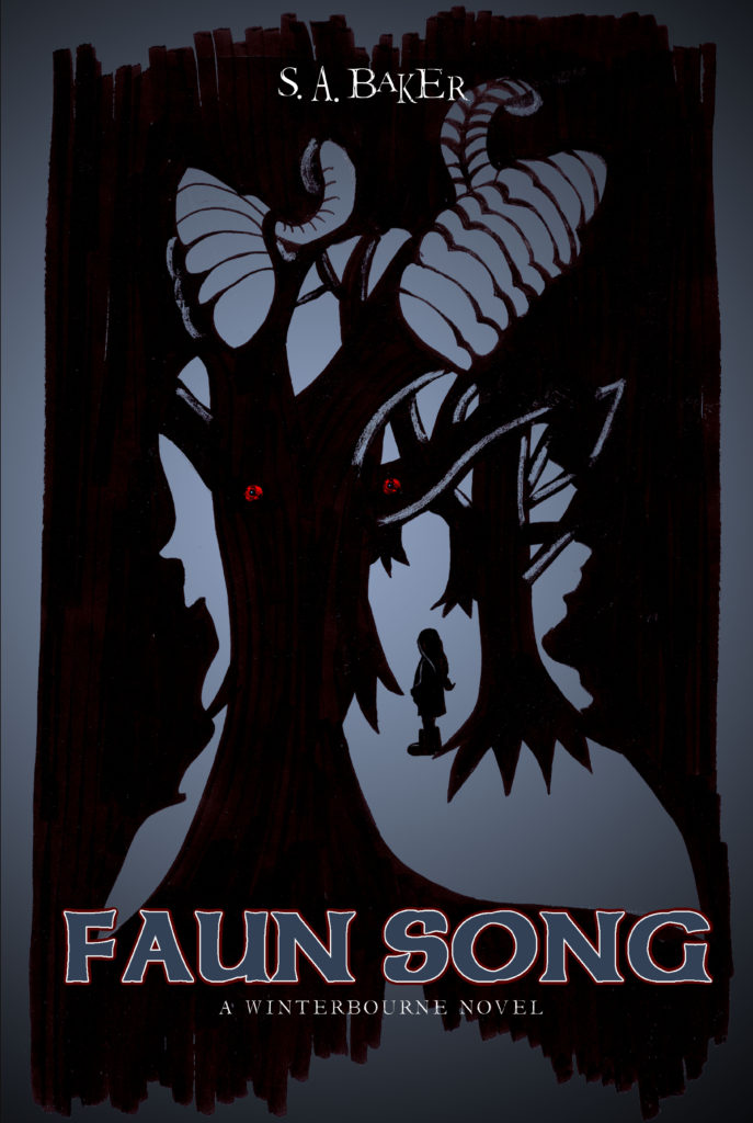
The publisher says:
Faun Song is a book in the Winterbourne collection by our author, S.A. Baker. It is an urban fantasy centering around an adult through the looking glass type of adventure. It involves the twisted writing style of the author and his take on the way fantasy characters, like fauns, actually would be like. From start to finish, it twists the reader through discovery and conclusion.
We are looking at feedback on the cover for sales have been somewhat flat since it was released several months ago.
Nathan says:
I can see why this would work at conventions and other live sales, but not online; the image is just too intricate at thumbnail size — it’s a puzzle, with nothing to keep the browser’s attention until the “aha” moment when the image makes sense.
Exploring other cover concepts might make sense. However, if you are devoted to using this cover idea (whether you keep this actual artwork or not), here is a five-minute redo showing four refinements:
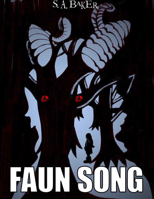
- Crop the extraneous visual data from the border — it makes it harder to comprehend.
- A larger title font, more easily read in thumbnail, with more contrast. (I’m NOT suggesting you use Impact or lose the Celtic character completely; this was just the closest font at hand that was as tall as I wanted, because hey, five minutes.)
- Make the eyes bigger. Eyes make the face.
- Up the contrast enough that it doesn’t seem murky.
Any other comments?
Yes, live sales are up, but online and such suck.
Interesting – waiting for more to weigh in.
Nathan’s 5-minute redo is right on. I’m wondering if also finding a way to highlight the girl silhouette would be advised. And the red in tree’s eyes less mottled.
See my 10-minute redo here: https://www.dropbox.com/s/knbtjlr7g3ipyu1/Faun_Song.png?dl=0
Nathan’s remake is great. I would up the contrast in the art even a little further.
I can see what you’re going for with the illustration and it’s a potentially successful direction, but this version of the idea is just too confused and unrefined a version of the idea.
There’s an absolute tonne of gorgeous artwork going on in your specific genre, so your cover needs to be on its top form. And it’s currently echoing an idea which is used a lot (which is fine) but not measuring up to other covers in the same vein (which is the problem).
Here’s a handful of covers doing something similar to excellent effect:
https://i.pinimg.com/564x/7a/d2/c3/7ad2c3be35fc75f6e284ec6e44a3edf7.jpg
https://i.pinimg.com/564x/7b/ac/e6/7bace6df5193ffdfcea5c5eb1c7caab1.jpg
https://i.pinimg.com/736x/19/1e/94/191e9439d6fb1766a7a39c094e07597a–thriller-childrens-books.jpg
https://i1.wp.com/blog.kristenburns.com/wp-content/uploads/51Got9Jw2BLL.jpg?resize=326%2C500
https://i.pinimg.com/564x/38/dc/4b/38dc4b972f2bc7c70895875195f20003.jpg
Here’s one that appeared on Cover Critics a while back: https://images.gr-assets.com/books/1498841120l/35557942.jpg
Now OK, these are all covers by great professional designers, but you can stand on the shoulders of giants here and learn from the commonalities.
Notice that the face-shape/silhouette element i always super clear – it’s always in profile. That ways it’s a nice, clean, immediately-readable shape for the more detailed illustrated elements to play off.
Also that there is always a contrast in these covers between a very simple shape (often silhouette) and more detailed illustred elements. In your cover everything has the same treatment and weight which makes the image less interesting an dmore confusing.
The interaction of shape and illustration within is clever, using parts of the illsutration to suggest features of the face and so on. They work like a yin yang, the negative space of one element suggesting the positive of the other. Your two elements (faun face and forest) clash rather than complement one another.
The type is always large and usually central. It’s a focal point rather than politely and unobtrusively sitting underneath the illustration.
Notice the palettes too: some books are more vibrant, others more restrained but all of them use at least two contasting colours to make different elements pop.
Although I like Nathan’s 5 minute redo, I still think it has issues with the eyes. The red eyes are the problem. Red blends too easily with the black, especially when the image is brought down in size to a thumbnail. You lose the suggestion that the image is a face. Love the concept, though. I think you should take Kata’s examples and comments to heart and have another go at it.
I think it is that fore-most tree that causes the problem. It breaks the silhouette in half. If you get rid of that somehow, so that most of the silhouette is filled with blue instead of black, I think it would help the art a lot for this purpose.
All have lots of good suggestions and I really like the positive feedback. I’m going to talk to our author and see what he thinks about reworking the cover.
Thanks everyone!
A very rough idea
https://i.imgur.com/SLdztIK.jpg
I like it! Maybe ditch the glow around the girl, though. Looks a little bit, hm, unnatural.
I expected someone to rip my terrible attempt to make evil eyes!
…And the fonts. The fonts don’t work, at all, and they need to not blend into the background. It’s the absolute opposite of what needs to happen.
I would also not hide the byline, which is effectively happening, as well.
Whatever the original thought process was, for “hiding” the title and byline, it’s the wrong thought. If nothing else, you want them to remember–what? If someone on a bus sees another reading the book, and is intrigued, do you want him to remember the puzzle–or the title?
The title, obviously, as that will enable him to buy the book. So, use a better font–that one doesn’t look Celtic, or supernatural, or anything along those lines–and make it stand out, as it should. I understand why you picked Sherwood–but as you see, when used too large, (and with a faux-bold) it starts to look crummy. You probably went to the various font places, typed in Celtic, and Sherwood was one of the heaviest, in terms of readability. Completely understandable. But consider some outliers, like, perhaps, Orial. Consider Flamingo–with some tighter manual kerning. Might fit in very nicely, with this specific book. Depending upon what you do with the cover, maybe even “You Rook Marbelous.” It’s hard to say “use this font” while the artwork is in flux. But please, don’t let it fade into the background. That’s not its job.
Thanks everyone! Talked with the author and we updated the ebook cover. The print is selling so that is not an issue.
Really appreciate the assist on this one.
Regards,
Doug