The author says:
A short story about the end of the world, told through the eyes of an eleven year old little girl, hiding inside her parents pet shop.
Nathan says:
It never pays to spend an inordinate amount of time or money on a short-story cover, so if any suggestions here seem extravagant to a modest budget, cut back where necessary.
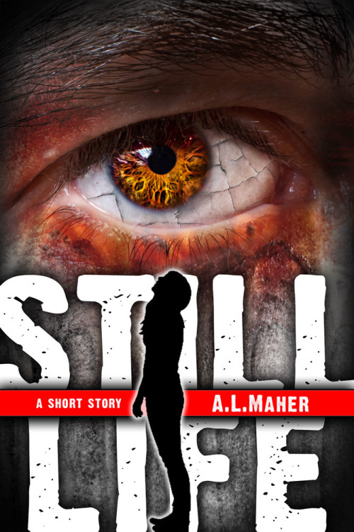
That said, it’s a great cover, but I’m not so sure it works for the story you describe, for one reason: the eye. I think that if the viewpoint character is a little girl, then the eye central on the cover should be that of a little girl.
Other than that, I’ve got the minor tweaks that are one designer’s preference over another, but they don’t impact the design in any major way. Anyone else got a major issue?


Is the silhouette supposed to be that of the 11-year-old girl? It appears to be more of a teenager. I’ve taught 11-year-olds for years and this body type seems more of a 13-year-old at least.Also, just a thought, if you are going to have the silhouette over the letters, why not have it replaced the i in still and the i in life?And I agree that the eye should belong to the child.
My first thought was that the cover and description don’t match. I would either save this cover and write another short story that fits the cover, or search for two other images that seem to be a better fit. That is, if I were willing to make more than minor changes.
Hmmm. Ok. Fair point on the cover not matching the description. In the story the kid watches her parents (and everyone around her) become frozen living statues,
Maybe I’ll have a look at reworking the cover to a different concept – either that or change the description 🙂 (which would be a lot less effort)
Have to say. I really like this site. Thanks guys.
This is great as is. But part of me wonders if it might be better to take out the eye altogether and make it more minimalist, emphasizing empty space.
Nah, katz–on that one, I disagree with you. Sure, we could nitpick this cover here/there, but honestly, it’s pretty damn great. No pun intended, it’s simply eye-catching, and that’s all it’s supposed to do. Not tell the story; just get the buyer to the page. I think it’s pretty damn god.
I think that this is a good concept. However, it seems to me like the two elements of your cover don’t fit together. Either keep the eye, and go with a rough serif font and no silhouette, or keep the current font and silhouette and find a different image for the top.
If you do keep the eye, I might suggest making the transition from skin tone to gray more subtle, or simply having the skin under the eye still be skin tone, just with more gray in it. As it is, there is a definite “line” under the eye where the skin turns from flesh tone to gray.
These are just some things I might experiment with. Overall, this cover does seem to have a good concept and some great design elements.
I think the silhouette is really distracting, so I’ll suggest deleting it. I have to make an effort to read the title and author name behind the silhouette, and the shape pulls my eye straight off the cover. Also, the positioning of the red band is unnecessarily suggestive with the silhouette there.
My only other thought is about continuing the cracked glaze effect onto the gray skin.
I think it looks pretty impressive, especially for a short story, and it reads well at the thumbnail size. I might bump the eye up slightly higher, and maybe fuss with the font a bit so the “L”s, for example, have a different pattern of flecks in them, but really it’s good to go.
I have no major issues, either (except perhaps with the silhouette—I am never crazy about their use)….other than there appears to be absolutely no connection with the story.
The eye or the silhouette might make for a visually arresting image, but not both at the same time. For a better cover, you might dispose of one or the other image or both; eyes on the cover are rather overused (Lousy Book Covers tags these as nagilum), and any silhouette is unlikely to convey the theme of your story effectively. If this is indeed a horror story about seemingly the last survivor in the world being a little girl in a pet shop, why not show instead a picture of your traumatized protagonist curled up into a ball beneath a table with some animal cages on it, staring out at the reader? Tugging at the heart strings this way is an old trick, but cover artists keep using it because it still works.