Month: January 2018

Emotions Over Time

The author says:

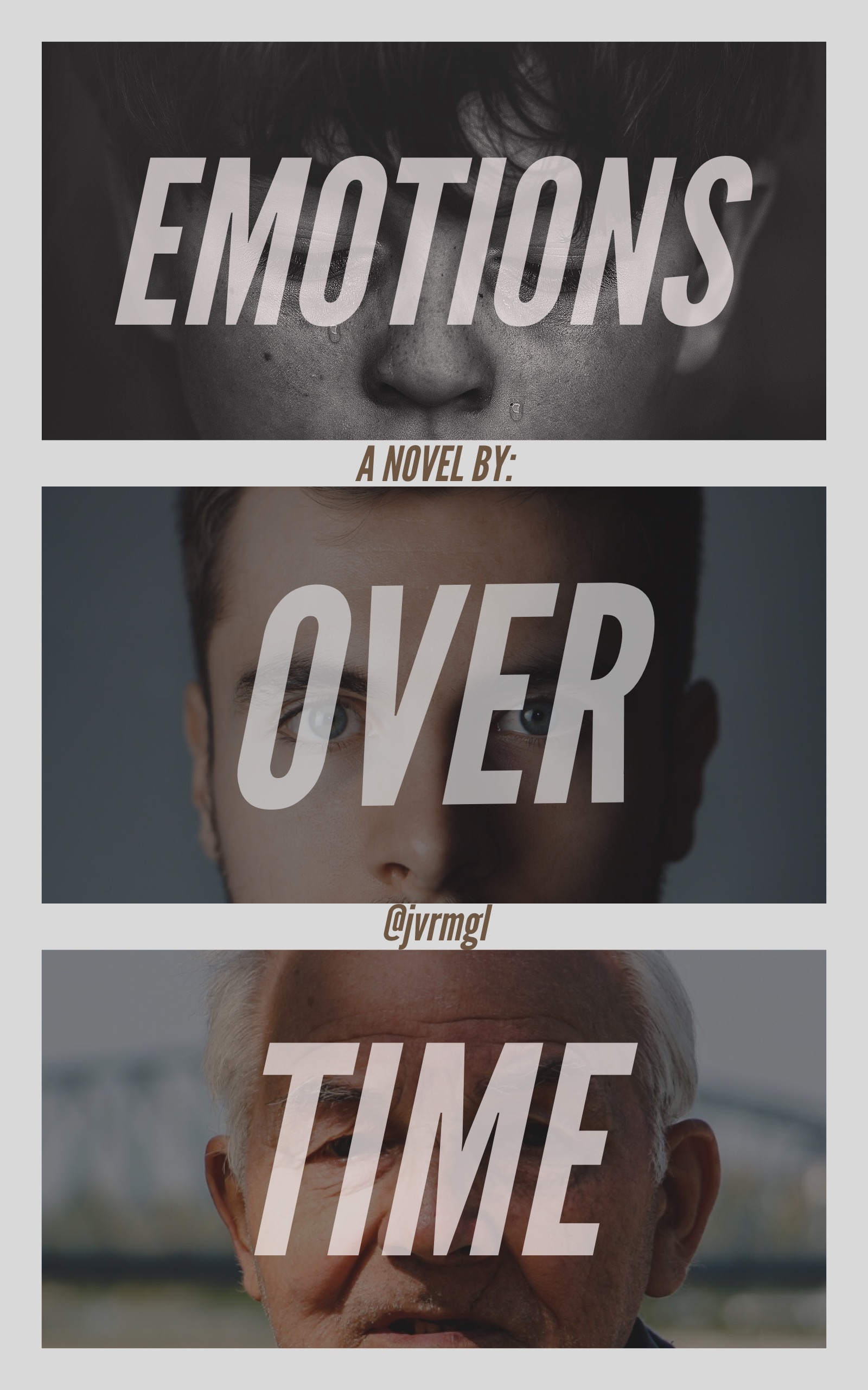
Not too sure yet but it’s something like a coming-of-age adult drama thriller thingy, mostly the first part of what I said. I thought the people in the picture represents someone growing older in just a short while. Idk, thoughts?

Nathan says:

It sounds like it’s still a novel in process, and you’re not too sure what it’ll end up being. Aside from any problems that may present in novel-writing itself, it makes it almost impossible to put on your marketer-hat and figure out the audience you’re trying to attract — you don’t know what your product is yet.

As far as the cover image simply as a concept, I like it, although I would recommend a number of changes (change the top photo to something in color, make the three words in the title all the same size, move the interstitial byline to a single line at the bottom, and give the author a REAL name), but it’s hard to focus on the number one purpose of a cover — attracting the attention of the readers who would like the novel — before we know who those readers are, and we can only know that once we know what the novel is.

Conflicted Heart

The author says:

The story is a Urban Romance Fiction which targets Females 25-35. The story is about a female and her longtime boyfriend. Secrets are revealed that rips their relationship apart. As a possible knee jerk reaction she winds up falling in love with a new man. She has to try and resolve her conflicted feelings and decide who she is love with and wants to be with.

Nathan says:

From my perusal of the genre online (since I’m doubly not the target audience), I’ve seen that the covers of urban or African-American romance are generally more color-crowded than for Caucasian audiences.  That’s fine, but even within that framework, I think there are things that you could do to make the image “pop” more.

  1. The figures don’t have enough contrast with the background — the poor fellow on the right gets lost in the wallpaper. Dimming the background, even just immediately behind the heads, would help the people stand out.
  2. In the same vein, the title lacks contrast from the background, especially the word “Conflicted.”  Yes, they are different colors, but the values (light and dark) aren’t contrasting enough; in fact, the variations in color tend to camouflage the word instead of helping it stand out. You can see that more clearly if you see it in monochrome:

    I would lose the gradients in the title, and darken the image ever-so-slightly from the woman’s shoulder on down to let the title stand out.

  3. The other problem you can see in the title, especially in the word “Conflicted,” is that the letters aren’t quite linked. This is a cursive font; the tails of each letter should run into the next letter completely, instead of having those itty-bitty breaks.

Other comments?