Month: January 2018

Stasis [resubmit]

The author says:

This is an updated cover concept I’m re-submitting for comment, based on several much-appreciated comments from the group. Because the new concept is such a diversion from the previous, I hope you’ll consider it in that light. As for the book, it’s a sci-fi novel targeted at adults. The story begins 50 years in the future as the protagonist and her husband travel to an exclusive resort on the Moon. A bioterrorist attack leaves most of the guests and staff infected with only days to live. The heroine goes into stasis to try and survive long enough until a cure can be found. She’s in and out of stasis for the next 200 years until the day arrives when she can take matters into her own hands.

[original submission and comments here]

Nathan says:

It’s a much more solid design than your first attempt. My two biggest comments are:

  1. Up the sci-fi factor — whether with the font, or adding an instrument panel, or something.
  2. There’s no need for the byline to be crowded into where it is, at the size that it is, when you’ve got all that empty real estate at the bottom.

Other comments?

Alone

The author says:

This book is about a girl who wakes up with amnesia. She has to figure out who she is and why she feels like someone is after her. It is YA and will have paranormal and suspense elements. Cover is not finalised.

Nathan says:

Give that you can’t tell us anything about the protagonist — what can you tell (and show) about the setting?  Is it a high school in suburbia?  The Old West? Thailand? The moon?  You really ought to give us some indication of the one thing you can tell us about.

Despite the fact that albinos are unsettling to some, I don’t see a lot of suspense or mystery here.  What if her eyes were closed? Or blank? Or black?  Or just plain not there?  I’m spitballing here, but there’s got to be a way to show an absence here, which is one way to describe the story.

(Also, the title font isn’t very suspenseful; it seems more appropriate to a coming-of-age drama.)

Other comments?

The Legend of El Toro

The author says:

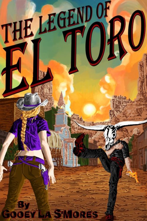
My book’s a comedic western. A con-man, who can’t shoot the ground with gravity’s assistance, stumbles into the life of a gunfighter. Figuring to make a living faking the deaths of semi-famous and infamous gunmen, his new ‘career’ puts him in the crosshairs of his sweetheart. (pen-name not settled)

I attempted to blend the classic earthy colored oil painting style most ‘gritty’ western covers use with a more colorful high-contrast cartoony thing, throwing my own style in the mix. I figured I’d post this here before it ended up on your Lousy Book Covers website with the ‘refrigerator art’ tag. (note: The art is digital art saved with multiple layers, so it’s easy for me to change big and small things. This is the first artwork I’ve done in over a decade, so I’m not sure if it’s rank horrible or actually pretty good.)

Nathan says:

Before we even get to the art, the first thing that’s gonna draw some ire ’round these parts is the title font — not only is Algerian overused beyond all reason, the drop shadow in the font conflicts with the angle at which you’ve set the type. Ditch it!

The art isn’t horrible, but the excessive detailing in the ground, the trousers, etc. is distracting, and the bright purple matching-shirt-and-holsters set, while amusing, doesn’t just stand out, it clashes.

I’d say simplify the details, tone down the purple, change the title treatment, and enlarge and center the byline (and drop the “by”), and you’ve got something that works.

Other comments?

The Souls of Wuhan

The author says:

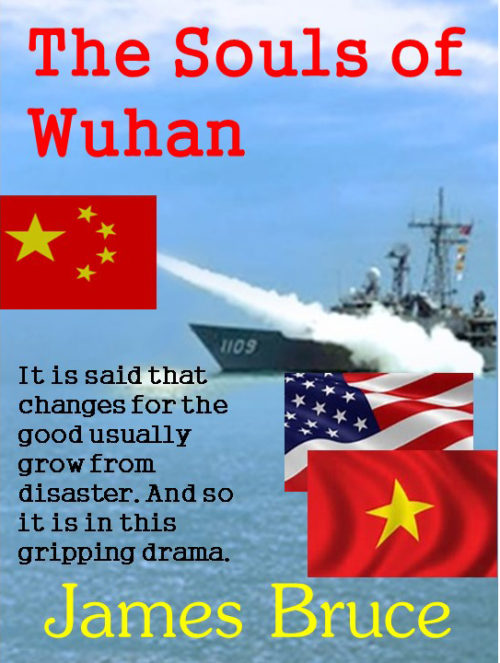
War drama between China and Vietnam. Much suffering on each side. Eventually, America and other nations unite to beat China at sea, forcing their retreat. This united action brings the world together and ushers in a new world order of peace.

Prologue: It was the enmity between China and Vietnam that was the prompt for changing the world. Their shared animosity through war and bitterness created the circumstance for a new philosophy that set the world on a course to the closest thing it has seen to a Utopian state of being. But the course getting there was filled with tragedy that God could never imagine. It is said that changes for the good usually grow from disaster. The disasters were of a scale that humankind had rarely seen. The good that resulted had never been seen before. Over nineteen centuries the pain has continued for Vietnam until these modern days.

Into this arena stepped Matt Anderson, Deng Tao, Zhuang Chen, Trung Kiên and Chuck Wallace. An American teacher, a Chinese naval commander, a Chinese politician, a Vietnamese soldier and the American Secretary of Defence. These men shake the world to its core as it teeters on the brink of disaster. It simply never stops between China and Vietnam but there is always hope that some people will step forward and change history. It had taken a desperately poor country with little ability to threaten anybody to teach the world a lesson. They stood up and said, “We are going to fight for what is right and just. If you do not help us, then here we may die”. They did die, and they created more heroes! They are not just Vietnamese heroes, they are world heroes and thank God for them! For the Americans who participated in the drama and others who watched the events unfold it was almost beyond belief. In Asia, hate based in history seems never to be forgotten. In Europe the animosity related to the two World Wars has subsided and life between friends is much better. But in Asia, history seems never to be forgotten. It is always the worst of that history that still lives in the hearts of people who should be friends. This book lives out those animosities and it also shows to the world that there is always hope for a new beginning and a new world order of friendship. America took a long time to act, as did the rest of the world. But eventually they did act and it became an example for all people who joined the effort for peace and a future for their children. The world had grown up! As Asia limped from one disaster to another and millions died, Matt did not know it but his die had been cast. He had a decision to make that would change the world. As Julius Caesar sat beside the Rubicon River he weighed his risks and formulated a course of action that would change the world. He “crossed the Rubicon” with his legions and went on the rule the Roman Empire. Matt had no idea about where his future was headed. Unlike Julius Caesar he knew nothing about the future that awaited nor the risks he would take. Whist history would never remember Matt, his moment lay ahead. His decision more momentous than Caesar’s.

Nathan says:

I think I’ll just cut to the chase on this — the cold, cruel chase: This may be a barely adequate cover for a dry historical treatise about the military in southeast Asia.  For a “gripping drama,” it falls flat.

I could delineate the ways in which it misses the mark, but they are so many — literally the whole cover — that my advice is simply to find someone who has the skill set to create an appropriate cover and give them some money.  The alternative is to spend multiple years learning design skills and wisdom that you do not have.

Tokyo Black

The author says:

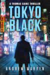
I am the author of this book. It was published in 2016, but I am considering a cover redesign for the series.

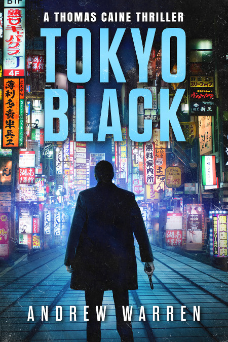
Tokyo Black introduces readers to Thomas Caine, a former CIA assassin. Betrayed and left for dead, he has put his past behind him. Now he lives off the grid, in the seedy underworld of Pattaya, Thailand. But when local gangsters set him up for a crime he didn’t commit, his old CIA masters make him an offer he can’t refuse: rot in a hellish Thai prison, or accept a dangerous mission in Tokyo, Japan.

The book is a spy action thriller. There are three other books in the series, which all follow a similar design treatment. Readers compare the style of the books to Vince Flynn, Ian Fleming, Barry Eisler, etc. It has a cinematic, high action feel, with a mysterious streak, and a heavy emphasis on Tokyo and the Yakuza.

Nathan says:

It’s very well put together, but I can also understand the impulse to redesign, especially if it’s been a few years and your sales are leveling off — it’s time to attract some new eyeballs!

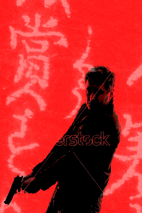
I don’t think this cover is too busy (the elements of the background blend into a good backdrop for the main character silhouette), but when doing a periodic redesign, I always think, “What can I flip to catch the attention of those it didn’t hook the first time around?” So instead of blue, I’m thinking red. Instead of a full background, I’m thinking a few strings of half-toned brush-written kanji, at an angle to the edges of the cover.  Instead of a silhouette from the back, I’m thinking a posterized view of a man with a gun from the front.  Sort of like this:

Note: Do NOT use that stock model photo. It was on the first page of search results of “man with a gun” on Shutterstock, which means that it’ll be overused and overexposed.  But this at least illustrates my idea.

Other comments?