The author says:
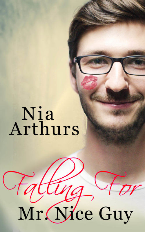
A contemporary romance for Young Adults set in the Caribbean nation of Belize. Adam Lockwood is bamboozled into a date with an escort– who doesn’t seem to approve of her own job. Through a series of adventures, they draw closer and fall in love.
Nathan says:
First up: If it’s set in the Caribbean, why am I not seeing any indication of that? Romantic novels are a form of escapist entertainment, and that means that the exotic setting is a big part of its draw. I should see sunny beaches or colorful Mayan ruins or something in that big blank area.
Second: Because the cursive font for “Falling For” is less easily readable than the font in which the byline and rest of the title is rendered, the eye (and the attention behind it) has to linger longer on it to decipher it, with the unintentional result that it gains more emphasis. In the reader’s mind, the title becomes “FALLING FOR Mr. Nice Guy.”
My suggestions:
- Move the byline up to the upper left, put “Falling For” in the same readable font, and render “Mr. Nice Guy” in the cursive font — or better yet, a similar cursive font which is both heavier (thus making it more readable in thumbnail) and less ornate (ditto).
- Add something colorful and tropical in that unused area thus created by moving the byline up.
Other suggestions?

