The author says:
A young gypsy’s prophetic visions reveal there is more to her dancing than simple music and motion. When she draws the unwelcome attention of her caravan’s scheming master, she must confront the truth of her mother’s desperation that has trapped her. Only if she can come to terms with elusive nature of her own worth will she find real freedom. Beyond Price is a short story set in the same story world as two other fantasy series, and will be part of a set of short releases that further develop the history and characters of that setting. It will appeal to primarily older teen and adult female readers of authors such as Terry Brooks and Anne Elisabeth Stengl.
Nathan says:
Fantasy is one of the publishing genres in which ornate cover art is still the common presentation for books. You referenced Terry Brooks and Anne Elisabeth Stengl as having your desired readership; a quick Google image search gave me this:
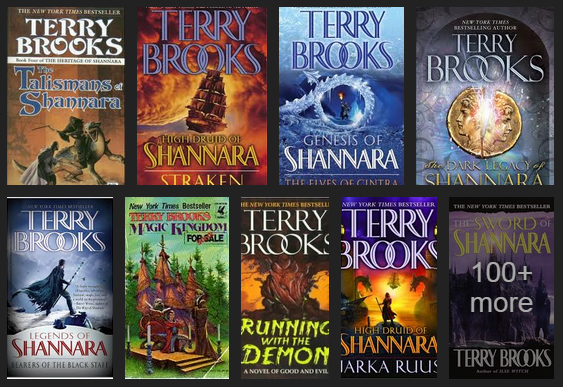
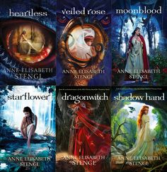
Ask yourself: Is a reader who is used to finding the kind of books she likes behind covers like these going to assume that a book she likes is behind your cover? You have some definite ideas of what you want as part of your cover image, but let’s be frank: Your skills are not such that they can render the kind of cover from which your readers would find you, and getting from here to there would involve years of study and practice. (That’s no slight. I can’t do that kind of art either.)
I think the best options open to you are these:
1) Save up money, work with an artist, and come up with a cover of which you can both be proud.
2) Browse through DeviantArt.com, CGSociety.org or another artist portfolio website, find some pre-existing artwork which fits the feel/mood/theme of your book, and offer the artist $50-100 for its use.
Best of luck.