The author says:
Set on a fantasy medieval island. The genre is Monster Romance (Monster Smut) The target audience is women 25-55. This book will be published exclusively on KindleUnlimited.
Leeja the half-orc has bedded dozens of males, but not one has initiated the mating response in her. Without compatible mates, She will never foarm a horde. She’ll never be truly happy. When her friends bet her to try dating “like a human”, Leeja meets a smooth talking, fun loving human who seems like the answer to her problems. He even has her “dantû” stirrung. But when she learns about his playboy past, Leeja must decide if she’ll protect her heart, or bet on love.
Nathan says:
Observing from outside the target audience, I’d have to say that the “monster smut” audience isn’t too discriminating. But even if these comments make no difference, they have to be said.
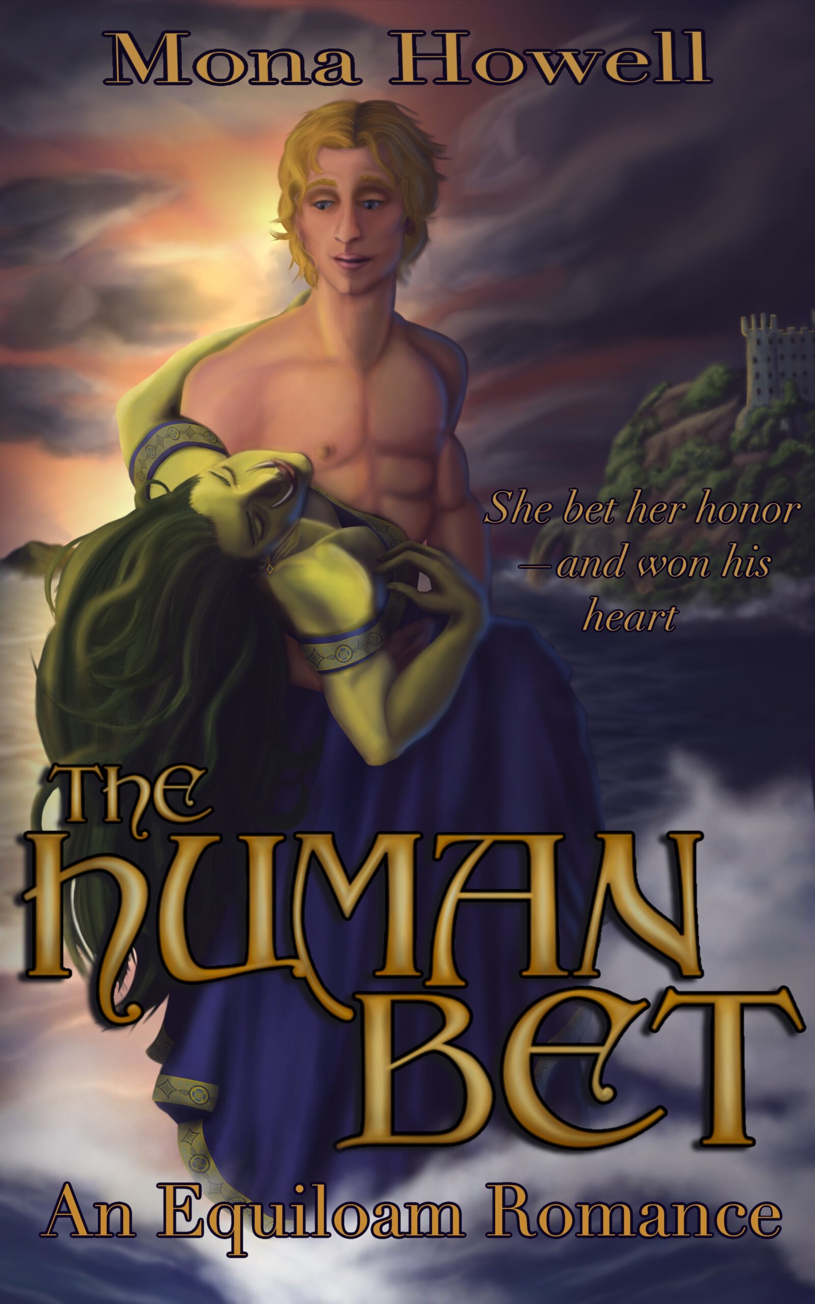
The artwork isn’t at a professional level. You can see that best in the hapless human, who’s got disturbingly warped anatomy. Also, shadows don’t work like that.
All of the print is hard to read, between heavy outlining and a lack of value contrast with the background.
But the biggest problem (and may God have mercy on my soul for saying this): IT’S NOT SMUTTY ENOUGH. A reader who peers through the general murkiness of the cover may come away with an impression of romance, but if this is supposed to appeal to the readers of Taken by the Troglodyte and Bred to the Parasaurolophus*, it apparently needs in-your-face eroticism more than it needs technical skill.
Other comments?
*Please tell those titles don’t exist.
The illustration is not very professional-looking.
Your blurb is not very readable and your name and tagline not much better.
Indeed, from what I’ve seen of the niche erotica on Amazon and Smashwords, the “Monster Smut” target audience is rather lacking in discernment (among other traits it lacks), as are many of its authors; to say nothing of its cover designers. What this means in practical terms is that being even marginally better than the other authors (and cover designers) gives you an advantage; but you do in fact need to be that extra bit better in every way, and you need to press that advantage as hard as you can. The typos in your pitch tell me you definitely need a good proofreader and editor (among other things), but since the very first part of your book any prospective readers are going to see before they even get to any of the words you’ve typed (if they ever get there) is a tiny thumbnail of your cover, I’ll stick to critiquing that cover here.
While your current cover draft isn’t outright terrible in my (decidedly subjective) opinion, neither is it a particularly terrific cover; on the whole, it’s just very mediocre, which is unfortunately a death sentence for your book’s sales from any perspective. Basically, this is a cover that could be posted over on this site’s companion site Lousy Book Covers, but wouldn’t even be distinctively bad enough to draw much interest from anybody there. It’s just about completely lacking in any strongly positive or negative qualities to distinguish it from any of a thousand other books in the same genre.
For starters, the best improvement you could make to this cover would be to get a more distinctive image. Though the current drawing is better than most of the ones I’ve seen on covers with the art for a refrigerator tag on Lousy Book Covers, it would still earn that tag for looking like it was drawn by a potentially gifted amateur in a community college art class. While such pleasant amateur art is fine for fan fiction and any other kind of amateur writing one is allowing people online to read for free, you need professional-looking art on the cover for any writings you’re looking to sell, even if it’s a relatively short read.
Of course, actual professional artists (e.g. the famous comic book/graphic novel artist Alex Ross) typically cost a lot of money, and chances are if you’re coming to us for advice, you don’t have anything like the hundreds or thousands of dollars their services typically cost. My proposed solution: try one of those new AI image generator sites that have lately been springing up all over the place online. While they’re still very buggy and definitely haven’t mastered the nuances of human body language, those generators can draw some stunning and exceedingly professional-looking imagery if you can get them to follow your instructions.
(Some words of warning if you decide to go that route: when I say those AI image generators are buggy, I mean some of these “artificial intelligence” programs should more properly be known as “artificial stupidity” programs. When I was trying to make up some sample pictures from some of these sites to show to you, you’d have been absolutely appalled to see how many times they disregarded my clearly-worded instructions and gave me a picture of a green-skinned pointy-eared half-orc man and/or blonde-haired shirtless Caucasian fully human woman… or two women… or the gal by herself with a green-skinned body and blonde Caucasian human head… or etc. before one of them finally gave me these examples; and even then, you’ll notice only the long-haired blond dude in the third picture is actually shirtless as instructed. Moreover, many of these sites demand at the very least that you sign up for a “free” account before they’ll let you generate any pictures, and the few that don’t typically have some kind of limit on the number and quality of images you can generate.)
As our esteemed host notes, your cover’s current image is also not “smutty” (I personally prefer the word “steamy”) enough, although that’s clearly not for lack of trying; mostly, it’s the image’s general blurriness and the low contrast between the various colors and shapes that keep the shirtless blond guy’s (kinda flat) six-pack and the green-skinned half-orc gal’s much-exposed cleavage from being more noticeable in the thumbnail. That said, for your particular kind of fantastic interracial erotica (that’s how I’d classify it), no R-or-even-PG-13-rated nudity on the cover is necessary; neither is it permitted at Amazon nor any other online retailer that sells this kind of story. The “trashy romance novel cover with a twist” is what you should be pursuing here: anything the traditional romance publishers (e.g. Avon and Harlequin) could get away with showing e.g. a pirate and a noble lady doing on their covers (which would probably rate no more than a hard PG for skimpy clothing and suggestive posing), you can likewise get away with showing your white-and-green interracial couple doing on yours.
Once you’ve got a nice clear—and immediately recognizable—image of your scantily clad couple getting a bit handsy with each other on your cover, a bright shiny high-contrast silvery or golden font for your title and byline (and possibly tagline) carefully placed to keep from covering up anything your prospective readers would like to see should make your cover complete. Since you say your book will be sold exclusively on Kindle Unlimited (i.e. as an e-book), the cover ratio should also probably be about 5:8 or 9:16 so that it will properly fill the screens of the smartphones and tablets on which the majority of your prospective readers would most likely prefer to read it.
As I say, this cover’s no worse than many others I’ve seen in the genre (usually while looking for something to suggest to our esteemed host for his Lousy Book Covers page), but just being “no worse” is not good enough. You want your book’s thumbnail to stand out above and beyond all the others in the genre, and to do that, it needs to look like it was drawn by a professional artist from one of those traditional publishers. Don’t settle for a boring mediocre image that’s just kinda okay, I guess when you can get a gripping image every bit as good as those expensive professionally drawn ones for your cover at little to no cost these days.
P.S. No, esteemed host, those specific titles don’t exist; but I did find one dangerously close to being a match for one of those titles. So let’s try not to give those “Bred By The X” and “Taken By The X” authors any more ideas, mmmkay?
I’m divorcing my species.
Now here’s a particularly good example of what I had in mind for your cover: the guy and gal look to be getting rather frisky, a lot of skin is showing (enough, in fact, that the auto-moderator at the site flagged this image as potentially NSFW) but no visible mammaries or genitals are flapping in the breeze, and everything’s looking nearly photo-realistic though not quite. The gal’s skin is a bit pale, but you can clearly see the green tinting, and maybe that’s the shade of skin an orc/human hybrid gal would have.
Feel free to try this out for yourself; I made this image over at the Night Cafe.
https://imgur.com/a/J6Ls6X8
I didn’t even see the green lady in the original post. I thought she was a cloak until I examined it closely to see if he was wearing ‘modern’ clothing when looking for a new image.
you need an image like the attached, where an attractive man is focused on the woman and all text is readable
You can have this if you want
Wow: that 2:3 cover draft looks like you paid actual money for it, and it would make an excellent book cover indeed… for a physical copy. While this author has stated she intends to release the book exclusively in electronic form on Kindle Unlimited, I think she definitely should consider making a physical version available with your cover as well. For the electronic version, as I say, the cover should be somewhat taller and thinner so it’ll fill the screen real estate on a phone or tablet more effectively.