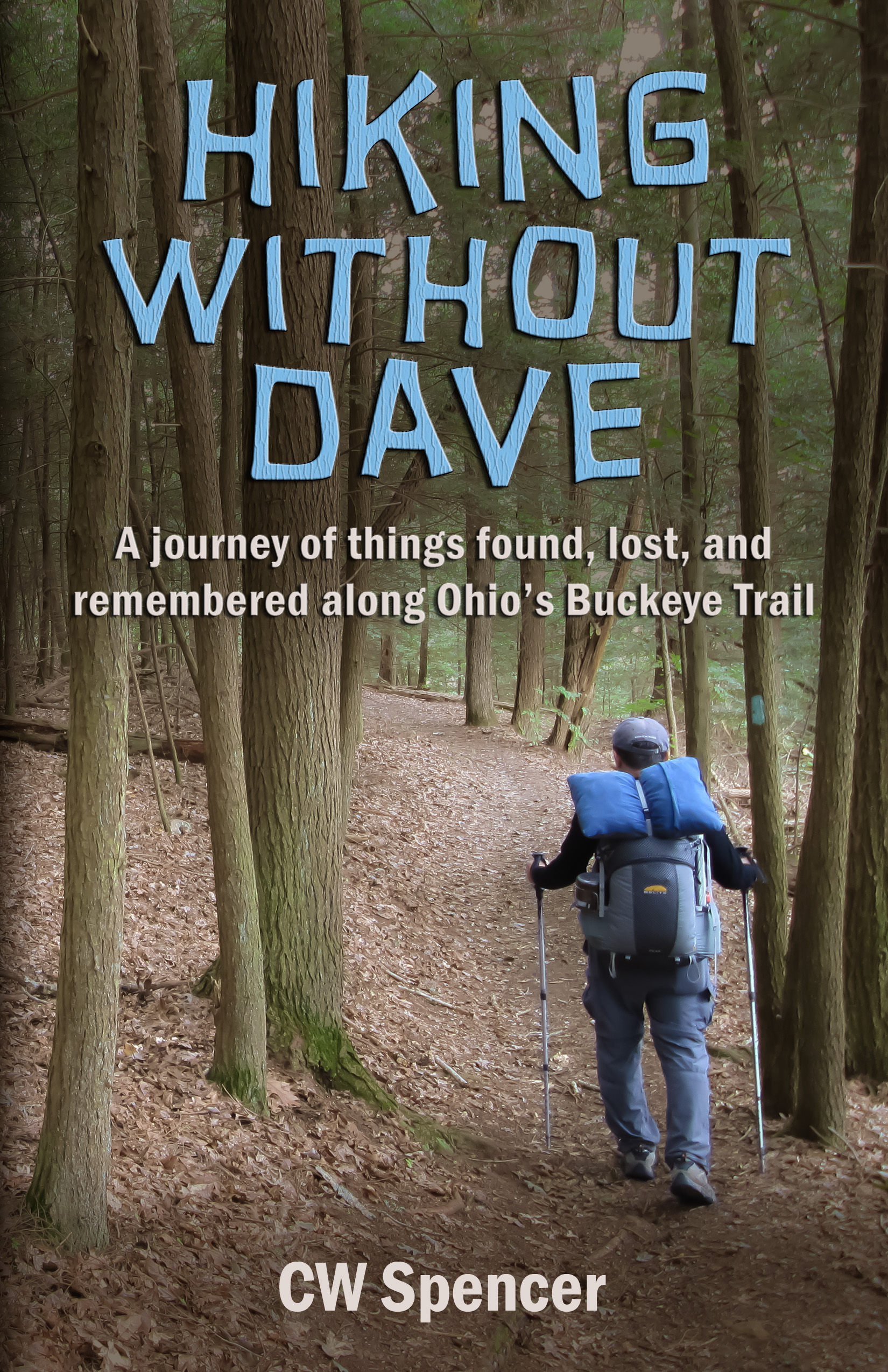
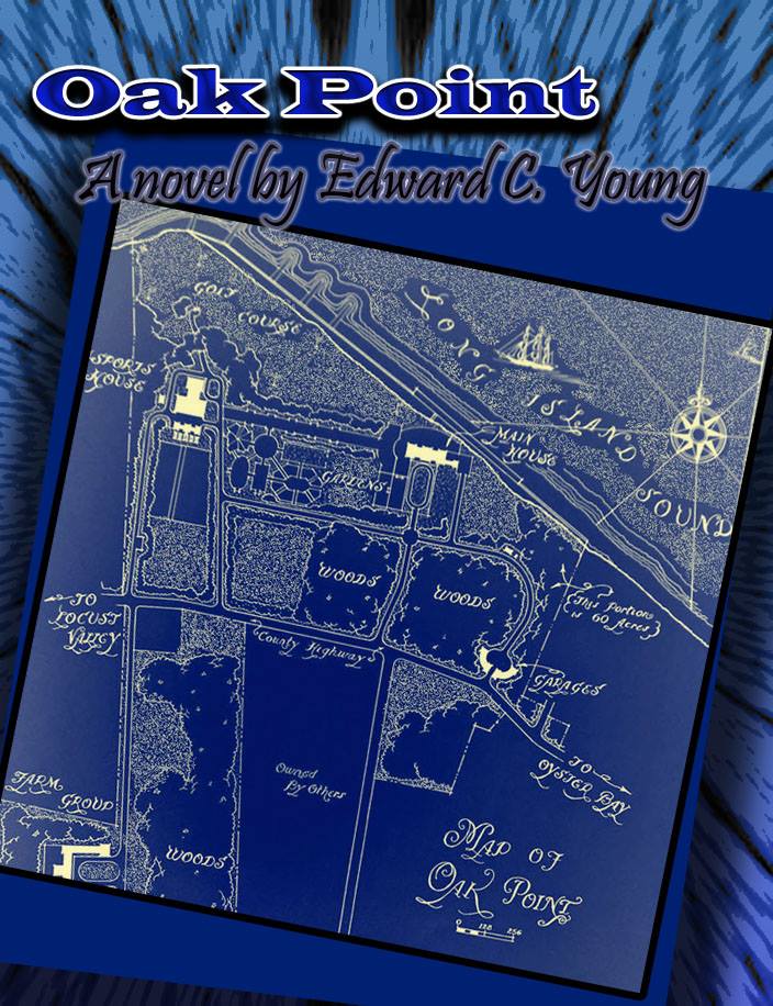
Month: October 2014

Oak Point

The author says:

OAK POINT is commercial fiction for readers who experienced the sixties, or would have liked to. It is the story of two girls coming of age in 1969, one of whom has an affair with the neighbor of Countess Mona von Bismarck. It also explores the world of French haute couture, especially Balenciaga, and Long Island society as it stood in those free-wheeling days. A “Roman à clef” based on real people and events, the cover is a map of Oak Point, which I grew up next door to in the 50s-60s. Other parts are set in Paris, NYC, & KY.

OP cover 4.4

OP cover 4.4

Nathan says:

I think the main problems are immediately apparent if you look at the thumbnail: The title isn’t very readable, the byline is completely obscured, and the map — which is always an arresting image — barely looks like a map, thanks to the color treatment.

Here’s what I would try:

  • Put the map in “map colors” — either its original color scheme, or a beige-and-coffee color scheme that looks like well-used paper. Overly a texture of crumpled paper (not too strong, and stronger at the edges) to map it look like an honest-to-goodness used map.
  • There’s no design reason to have the title shifted to the left; centering and enlarging it makes it look less like an afterthought.  If the background map is in for-real map colors, the color you have for the title should stand out better, but I’d still look at other fonts — something that does better at evoking either the time or place.  Find some old paperbacks or fashion magazines from 1969 for ideas.
  • Separate “A Novel” from the rest of the byline.  Put “A Novel” under the title, and your name someplace separate like at the bottom.  You can then increase the size of your name, making it more readable. I’d play with the font here, too, to give it some of the flavor of your setting. (Those fonts are especially important on your cover because, without cues given by the fonts, the old map might make it look like a pirate adventure.)

I get the suspicion that, even once those changes are made, the cover will still want something else, but I’m not foresightful enough to know what that would be.

Other ideas?

From Leya’s Eyes

The author says:

It’s a young adult fantasy. Leya has two different coloured eyes and is chosen to attend the Sphere of Vision, even though one eye may be too weak to fulfill her potential. She develops power over both water (blue) and plant (green). THIS IS NOT MY BLURB. It needs work.

final

final

Nathan says:

The face is a good, striking image. Is there any reason that the top and sides of her head aren’t there?

Neither the title font or the byline font really strike me as being right. I want to see the title be bigger and less “hesitant”; you can reduce the size of the series title to make room if you want.  And adding a lighter highlight to the title will make it pop with more contrast.

The thin letters of the byline get lost against the energetic shape of the flower.  I’d find a way to separate those two elements so they’re not competing directly against each other.

More ideas?


When the Stars Fall

The author says:

Halyn Mugarson has been invisible all her life, but all that changes when a star literally falls on her and her neighbor Esteban Sanchez, whisking them off to the magical land of Keidreiy. They are told that they have been chosen to be the next king and queen, but before Halyn can be crowned, she is taken back to Earth. She then discovers that for the time they spent in Keidreiy, they had been missing on Earth. She must fight her battles on Earth while Esteban fights his battles to save Keidreiy.

WhentheStarsFallMichailaCurtis-front

WhentheStarsFallMichailaCurtis

WhentheStarsFallMichailaCurtis-front

Nathan says:

If I’m reading the description right, you’re aiming for a YA audience, probably female. Am I right? If so, then this cover seems suited to the audience.  The closer one looks, though, the more the shakiness of the rendering of the house and roof is apparent. I’d recommend it be redrawn, with a ruler to keep the shingle lines straight.

I think what’s missing is any feel for what the magical land is like — important, since the synopsis implies that a large part of the novel takes place there.  Pseudo-medieval European high-fantasy world? Idyllic nature kingdom? Whatever it is, it could be indicated by, say, something in the lower left corner — a distant castle or minarets or whatever.

I’m also not crazy about the byline font, but it’s not a dealbreaker for me.

Other opinions?

Hiking Without Dave

The author says:

Hiking Without Dave is a true account of the author’s hike of the entire 1,440-mile Buckeye Trail in Ohio. CW and his younger brother Dave had talked of hiking the Appalachian Trail, but before they could he lost Dave to suicide. CW’s hike and his writing about it was part of his healing process. The book intertwines the hiking account with stories about Dave. It will appeal to hikers, but also to anyone whose life has been touched by the tragedy of suicide. The Buckeye Trail is marked by blue blazes, thus the importance of the blaze on the tree to the right of the hiker and the choice of blue lettering.

Hiking Without Dave cover  - 6.3-3

Hiking Without Dave cover  - 6.3-3

Nathan says:

My condolences on your loss.

I think you’ve got a lot of good elements.  Here’s what I’d try to make it stronger:

I definitely think “Dave” in the title should be no smaller than any other word, and possibly biggest — it is, after all, the interesting/quirky part of your title, and yet it’s easy not to notice at thumbnail size.  One thing to try would be placing each word of the title on its own line, with “Dave” at the same font size as “Hiking.”  Ideally, the original photo is large enough that you could fit more of it on the cover, making the hiking figure smaller so the increased type size wouldn’t overlap.

A good rule of thumb is “the smaller and denser the type, the more readable the font needs to be.”  Experiment with a clearer, more “bookish” font for the subtitle — you could instead render the byline in the title font.

You might also want to tweak — very, very subtly — the color tones of the photograph, to counter that “straight out of the digital camera” vibe. Here are some ideas (of course, because I was working from your complete cover, my variations affect the type as well):

Hiking Without Dave cover  - var 3 Hiking Without Dave cover  - var 4 Hiking Without Dave cover  var 1 Hiking-Without-Dave-cover----var-2


Other ideas?

10/20/14 Edit: The author says:

Thank you for all the comments on the cover for Hiking Without Dave. They are very much appreciated. I am resubmitting the cover with some changes. Some comments were about the title font being perhaps too whimsical for the subject of this book. Even though it deals with suicide, there is much humor in both the recounting of memories of the author and his brother and in his hike without his brother. It is a balance of humor and seriousness. The texture of the title font has been changed to be more bark-like.

Hiking Without Dave cover  - 6.3-17

Stumbling Aboard

The author says:

This is the true story of a first mate who agrees to a two-year voyage aboard a 44-foot, schooner to impress her new boy friend. She lacks basic sailing, seamanship, and swimming skills while he is competent but sometimes difficult. Their trip begins in California, continues down the west coast of Mexico and Central America, through the Panama Canal, to Colombia, Venezuela and through the Caribbean to Florida. Experienced blue water sailors will love the adventures. Travel readers will enjoy a book that uses sailing terminology sparingly.

upload

upload

Nathan says:

You’ve got a good cover photo — it’s obviously a sailboat, but not just a sailboat, and focuses as much on interesting landscape at the horizon as on the boat itself. So let’s change the type around so that it supports the photo instead of fights against it.

First: Take a look at the nonfiction books you know. 99 times out of 100*, the title and subtitle are separated not with a colon, but with a different line, a different type size, and often a different typeface. The title is more important that the subtitle, so make it look more important.

Second: The Verdana-esque font is too common and unremarkable to add anything to the cover. If the two-word title were large enough to extend from side to side, it would be large enough that a more ornate or complex font wouldn’t limit the readability (don’t go overboard, though). How about something strongly classical or historic-looking? Maybe something hand written? You can then render the subtitle in a font that’s clearly readable, but more interesting than Verdana.

Third: The way the subtitle slops down into the bottom half of the photo makes it look like the type was placed without knowing what image would go behind it. Don’t let the type fight against the photo; place it all in the top half of the cover so it doesn’t get lost against the mountains.

Fourth: “By” is unnecessary for identifying the author, and the added room gained by deleting it would allow the author’s name to be larger and more easily readable. (Placing a slight halo around the name will keep it from getting lost against the photo.)

Here’s a five-minute mockup of the kind of fonts and type placement you could use (I didn’t have access to the original image, so just imagine this on top of the sailboat photo).  These are probably not the fonts I would decide one, but they were the closest ones to hand that approximated what I’m talking about.

stumbling

Other ideas?

*And the other one is an accounting report to the board of directors that’s supposed to look boring.