Month: October 2014

Art For the Unwashed Masses

The author says:

A picture book with short humor featuring the artist’s art, writer’s short stories of 50-80 pages.(same guy: me) Cover objective: Make viewers want to own the book. Book objective: Create exposure to, and desire to own, the artist’s work.
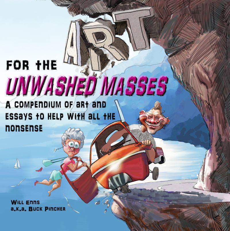
Art for the Unwashed Cover


Art for the Unwashed Cover

Nathan says:

You’ve certainly got the illustration part down!

I only have three suggestions for the present cover:

1) The way the title is placed, it looks like it reads “For the Art Unwashed Masses.” If you could put “for the” to the lower right of the huge “Art,” it would read more intuitively.

2) My rule of thumb is, “The smaller the type is, the more readable the font should be.”  That subtitle/description is an awful lot of text to wade through in that irregular font.

3) Inflate your name, dude! The byline shouldn’t be the smallest thing on the cover!

Other thoughts?

Two Moon Rebellion [resubmit]

Two Moon

Two Moon

[The original submission and comments are here]

Nathan says:

Much better, but there’s still so much more you can do.

The typeface is still too “gentle” for an interstellar adventure involving space police.  Center it! Make it bold and in-your-face!

The addition of the nebula is a good start, but as it is the two moon and the nebula seem like separate elements thrown onto your cover.  Make the nebula bigger, and put it in the black space behind the two moon, visually connecting everything into a composition.

The texture on the smaller moon looks fine, but it’s a lot more artificial-looking on the big one, and the curve of the moon, doesn’t seem spherical.

Remember: The point of a cover in this genre is to get the reader EXCITED to read your book.  Promise excitement on your cover!

Other comments?

Oak Point [resubmit]

The author says:

Long Island, 1969. Hendrix, incense, light machines, free love. Sophia “Taffy” Kuhn, a foxy ninth-grader, needs a boyfriend. So does her cousin and best friend, Laura “Candy” Essex. Enter Evan Charles, an eighth-grader, the last year for boys at posh Mill Hill School. He thinks Taffy and Candy are out-of-sight, and anticipates carefree years filled with girls, cars, and parties. Then his father drowns in an inch of liquid. Now he has to wing it.
 Next door, Countess Mona von Bismarck, a horse trainer’s daughter from Kentucky, is in a high-stakes legal battle with Evan’s refined mother, president of the planning board, over the development of Mona’s 60-acre estate, Oak Point. The village’s future is at stake. Exploring the semi-abandoned property is Evan’s dangerous pastime. When a night of romance there ends in gunfire, his luck takes an unexpected turn. 

 Paris, 1983. Mona, dying, wants to tell all, to Evan, a fledgling writer. From stable to salon, her many loves of both sexes, and decades-long friendship with Balenciaga. The Countess gives Evan a 75-carat black opal, which allegedly has psychic powers. She used it to become the most beautiful, best-dressed and richest woman in the world. Evan has a loftier goal. Later that year, when Taffy and Candy re-enter Evan’s life, Mona’s black opal proves its worth. OAK POINT is commercial fiction. (Re-submission with tweaked cover!)

OP 5.3

OP 5.3

[Original submission and comments can be seen here]

Nathan says:

You took the advice on separating the byline from the title, and upping the contrast between the type and image; that’s good.  But I still think that your color scheme and your chosen fonts work against you — they give no indication of the setting in time and place (which, from your description, seems like a big part of the novel) or the genre.  I think this cover is going to need more than minor tweaks to serve its purpose.

What says everyone else?

The Mystic Princesses and the Magic Show

The author says:

The Mystic Princesses hear about an oil spill in the Gulf of Alaska. They raise money to help clean the water and wildlife and are treated to a trip to Alaska to help with the clean up efforts. While there, they get to see the Aurora Borealis. The book is written for children aged 5 to 10 years old.

Draft Cover 2014.09.22

Draft Cover 2014.09.22

Nathan says:

I love all the elements. My only advice: Make the title bigger!  Right now it looks hesitant. In fact, the only reason the snowy landscape exists is to have a place to put the title; instead, crop it so the cabin is right in the lower right corner, and boldly splash the title right across the heart aurora!

Anyone else think different?

Two Moon Rebellion

The author says:

A man leaves his planetary defense system in hopes of joining the planet’s police force. What he finds out changes the course of his life and the planet. This is a SciFi novel set on a planet in another galaxy. The target audience would include Star Wars fans.

Two Moon

Two Moon

Nathan says:

I’ll be painfully honest: If I had seen this for sale on Amazon, I’ve have posted it on LousyBookCovers.com. It’s completely underwhelming, especially for a genre as slam-bang as space opera. The font, Times New Roman, is the most common one in the world. The moons are dull and featureless — and the upper one is visibly “stretched,” instead of being spherical.  Even the starscape is boring.

What would I do? I would awesome it up!  Use a mechanical or futuristic font, and then add flares and rivets! Texturize the moons! Add a rainbow nebula to the starscape! (Did you know that every photo on the NASA website is free for public use? They’ve already been paid for with your tax dollars.)

If you don’t feel at all confident in your abilities to use PhotoShop or a similar program to get the results you want, the other option is simple: A quick search for “space opera” on DeviantArt.com gives me over 6,000 results. Find some pre-existing artwork you like (it shouldn’t be hard, as the cover you already tried had very little content that related specifically to you book), message that artist and offer him/her fifty bucks for the use of their art on your book. They might even put in the title and byline for you.

Good luck!