The author says:
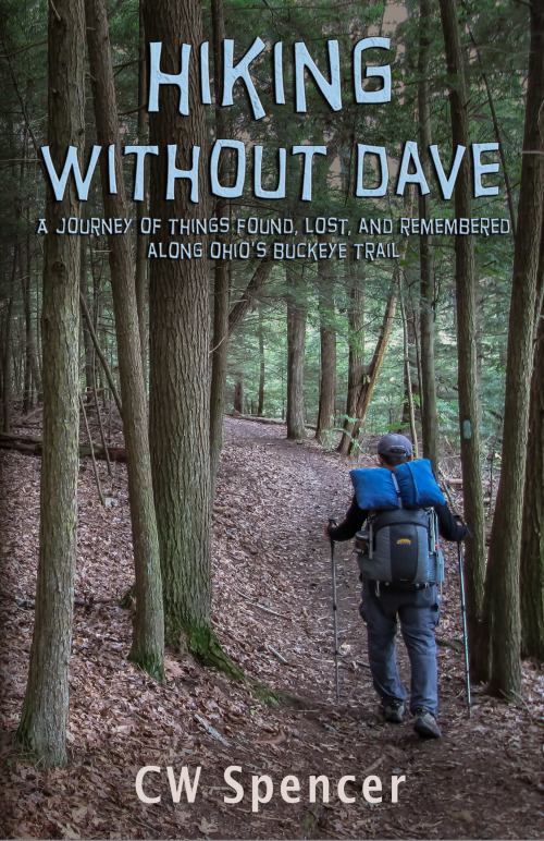
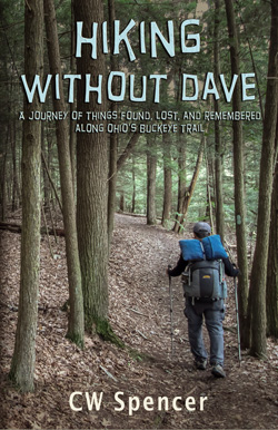
Hiking Without Dave is a true account of the author’s hike of the entire 1,440-mile Buckeye Trail in Ohio. CW and his younger brother Dave had talked of hiking the Appalachian Trail, but before they could he lost Dave to suicide. CW’s hike and his writing about it was part of his healing process. The book intertwines the hiking account with stories about Dave. It will appeal to hikers, but also to anyone whose life has been touched by the tragedy of suicide. The Buckeye Trail is marked by blue blazes, thus the importance of the blaze on the tree to the right of the hiker and the choice of blue lettering.
Nathan says:
My condolences on your loss.
I think you’ve got a lot of good elements. Here’s what I’d try to make it stronger:
I definitely think “Dave” in the title should be no smaller than any other word, and possibly biggest — it is, after all, the interesting/quirky part of your title, and yet it’s easy not to notice at thumbnail size. One thing to try would be placing each word of the title on its own line, with “Dave” at the same font size as “Hiking.” Ideally, the original photo is large enough that you could fit more of it on the cover, making the hiking figure smaller so the increased type size wouldn’t overlap.
A good rule of thumb is “the smaller and denser the type, the more readable the font needs to be.” Experiment with a clearer, more “bookish” font for the subtitle — you could instead render the byline in the title font.
You might also want to tweak — very, very subtly — the color tones of the photograph, to counter that “straight out of the digital camera” vibe. Here are some ideas (of course, because I was working from your complete cover, my variations affect the type as well):
Other ideas?
10/20/14 Edit: The author says:
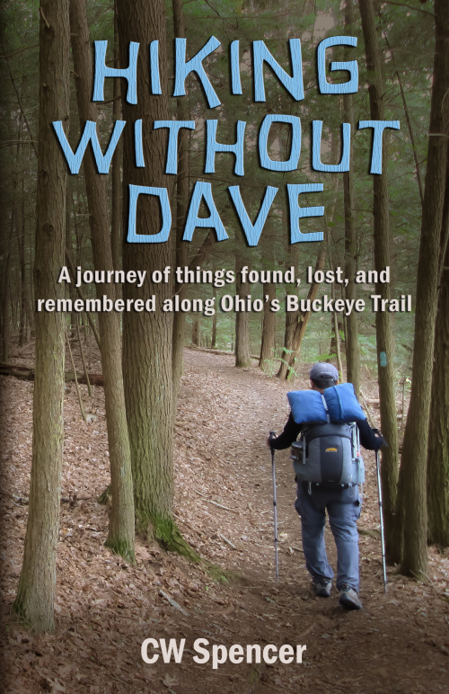
Thank you for all the comments on the cover for Hiking Without Dave. They are very much appreciated. I am resubmitting the cover with some changes. Some comments were about the title font being perhaps too whimsical for the subject of this book. Even though it deals with suicide, there is much humor in both the recounting of memories of the author and his brother and in his hike without his brother. It is a balance of humor and seriousness. The texture of the title font has been changed to be more bark-like.

I like the colouring on the bottom right that Nathan has suggested best. What I wonder would also look interesting, and would impart more of the book’s message, is to reduce the saturation of the image apart from on the blue areas on the tree and the backpack (perhaps use a mask) so it has a slightly sepia look, since this is a book about grieving with a hiker walking alone on the cover. I would also make the text and the author name fill the available space above and below the figure, so it obscures the peripheral parts of the image and draws the eye in to the hiker, which should be the focal point of the cover, and perhaps increase the gradient darkening the image at the top, and add another at the bottom.
I was thinking something similar. Knock the background saturation back 50%, or even make it B&W, and maybe feather the edges. Then leave the hiker in color and really make him (and the text) pop.
Something like this, but I’d do something different with the subtitle and author name. The subtitle should be a clearer, san serif font, maybe stack it above the hiker. The author name can be the same font as the what the subtitle would be changed to.
http://rebelpress.org/Hiking-Without-Dave.jpg
Nathan has this covered (pardon the pun). I would just like to say that the color Nathan used on the author’s name in his last example in extremely appealing against the colors in the background photo. I would consider using that at least for the name, perhaps even for the subtitle.
I also add my condolences for your loss.
I just had one afterthought upon a last look. Does the original photo allow for centering the hiker? If so, I think it would be more visually catching.
The font isn’t working for me. It looks fun and whimsical, and I’d never guess that this book was for “anyone whose life has been touched by the tragedy of suicide.”
All of Nathan’s alternates work fine.
For myself, I’m not too crazy about the choice of typeface…but if you wish to keep it for the title I certainly wouldn’t use it for the subtitle. It is much too difficult to read. Decorative and display fonts are not designed to be used for any sort of continuous text. Here, the small size, odd shapes, color and dark glow all contribute to making the two lines blend into the background.
I would also close up the spacing between “Hiking” and “Without Dave” a little if you keep the title as it is. However, I agree with Nathan that the words should be given equal prominence, rather than emphasizing “Hiking.”
By the bye, I kind of like the off-center placement of the hiker: it looks as though there is someone missing. If anything, I wish the effect could be enhanced by making the empty space to the hiker’s left even wider.
I’m so sorry for your loss.
I too like the off center of the hiker. It focuses the eye on the path. I don’t think I’d want the hiker to be more vibrant considering the topic.
Whether you brighten the photo or not depends on what feeling you want readers to get when they look at the cover. I like the shadowy look of the original picture.
I agree with changing the typeface as it seems almost cartoonish.
We found the comments on the original cover to be very helpful. Thank you. We would appreciate any feedback you have on the resubmitted cover.
Nice cover CW. Using Buckeye trail blaze blue for the lettering is a nice touch. Excellent photo of a well manicured section of the trail too! Hocking Hills I presume.
Offset hiker highlights what could be down the trail around the bend. Also shows an unknown journey ahead.
The average buyer will most likely not pay real close attention to the fine details of the cover.