The author says:
A nonfiction collection of forty previously published magazine articles about family outdoor adventures:
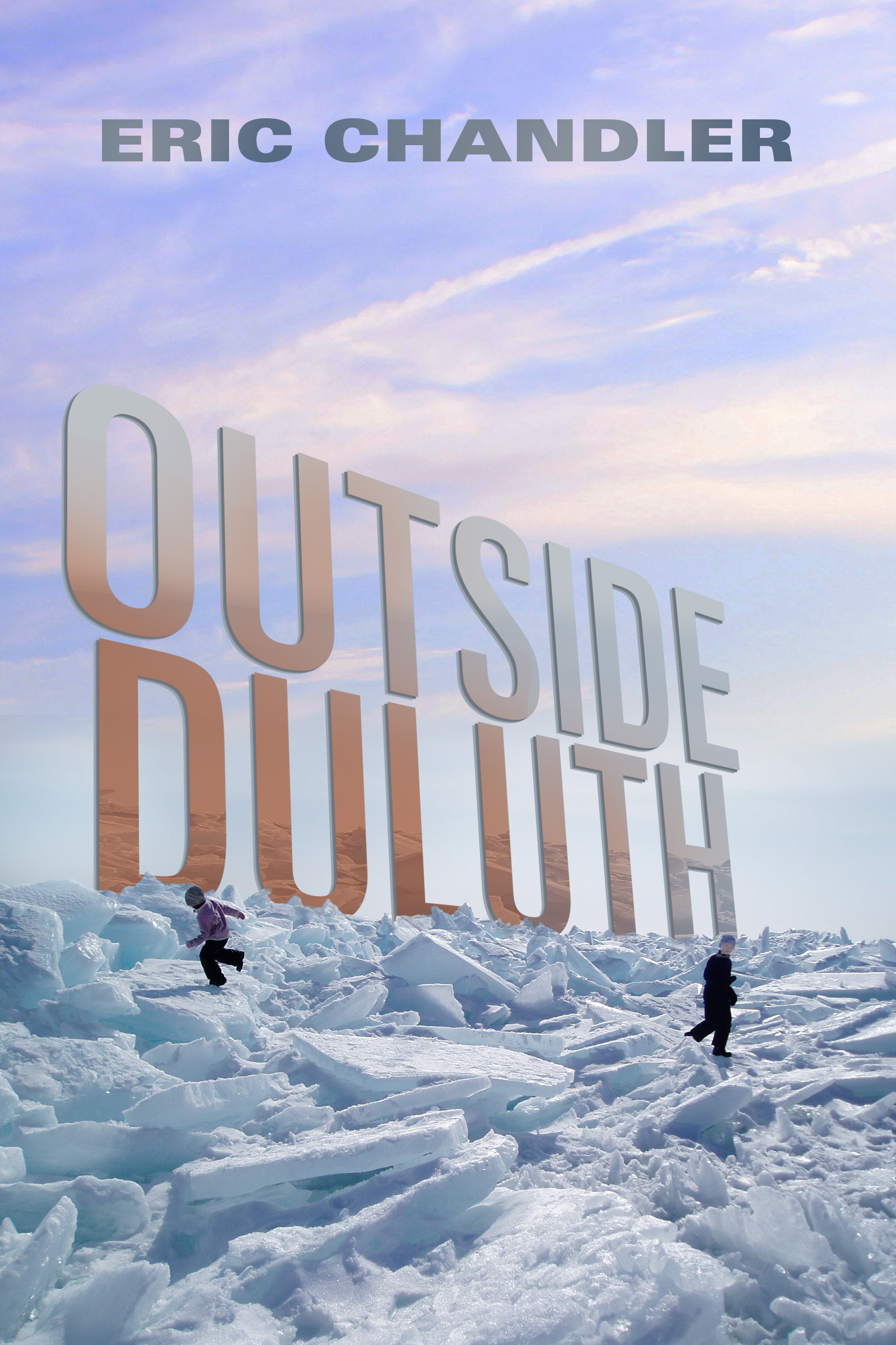
Outside Duluth will take you on an armchair tour of one of the best regions for outdoor fun in the US. Join Eric Chandler as he takes you cross country skiing, biking, paddling, and running with his family near the head of Lake Superior. Chandler’s stories are part essay, part guidebook and all fun. Find out why Outside Magazine named Duluth runner-up for the best adventure hub in the whole world!
Nathan says:
I really like all the elements; it’s a good cover. I especially like how the sky has gone from being simple negative space to an active design element.
If it were me, I’d play with rejiggering some of the spacing. There doesn’t seem to be any reason for the title text to be slid to the left; it creates an odd margin over to the right that’s especially noticeable given the centering of the byline and the mirror positions of the children.
While I’m at it, I’d try moving the byline even further to the top, emphasizing the colorful sky as a deliberate design choice.
I’d also toy with moving the children further down into the snowfield rather than up touching the title.
Other thoughts?