A special twofer!
The author says:
This literary novella is the first of a 3-part novella series.
Jacob Alderdice is the son and heir of the prominent San Francisco family. Although dearly loved by his sister Vivian, his philosophical and artistic lifestyle has made him a pariah to his tyrannical mother, Larissa.When the Alderdices take their yearly summer vacation to the prominent resort town of Waxwood, Jake meets Stevens, an older man with an obsession for leadership. He befriends Jake and introduces him to The Order Of Agrios, a group of misanthropes who have rejected the commercial and conventional luxuries of their former lives to live in the wild. Seduced at first by Stevens’ powerful and charismatic demeanor, Jake comes to realize that behind the man lies something more brutal and sinister.
Any feedback would be much appreciated!
The author says:
This literary novella is the second of a 3-part novella series.
Gena Flax, abandoned by her mother at a young age, has built her life around caring for her guardian Helen, whose physical illness and mental peculiarities have reduced her to a childish, neurotic, and clinging woman.One summer, she gives her aunt a gift of the sea. She takes a room at the exclusive Waxwood Inn in Waxwood, California with money she has scrimped and saved from two jobs and her aunt’s disability checks. But the gift reveals the depths of mental deterioration, betrayal, and family secrets.
Any feedback would be much appreciated!

Nathan says:
I put both of these books in one critique, because series branding is a big deal, and they should thus be considered as one unit.
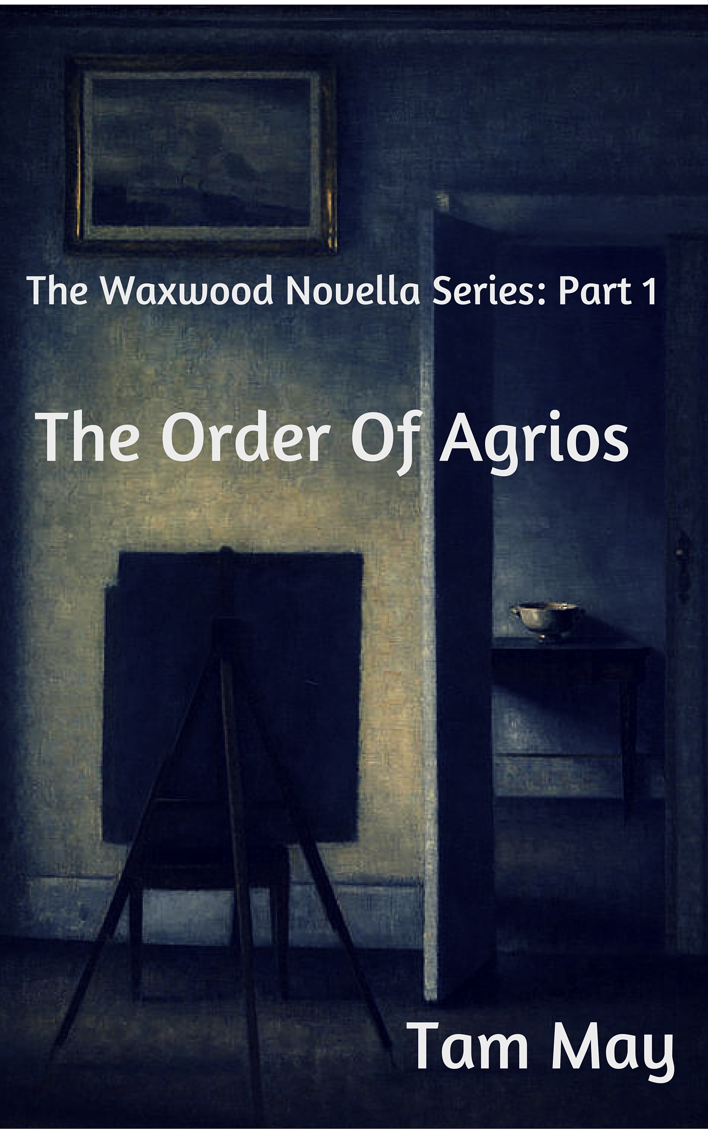
I’ve joked before that “literary” fiction covers go out of their way to look like they’re about nothing in particular. That’s obviously hyperbole, but the fact remains that lit-fic covers eschew anything which looks like an obvious pointer to a specific genre: No planets, no silhouette figures running down dark alleys, no half-naked headless couples embracing, no wolves. By that metric, the first cover especially succeeds: The art (public domain — Google Image Search tells me that it’s by Vilhelm Hammershoi, d. 1916) is both exquisitely accomplished and understated, and is quietly intriguing for readers who avoid the “crowd-pleaser” elements of popular fiction.
Using the first cover as the lynchpin of the series, then, we move to the second cover, and we run into some problems:
- Part of series branding isn’t just typeface, it’s type placement. Even though the position type on the first cover is largely dictated by the layout of the artwork, it’s also a good arrangement on its own. But to continue the brand, the same type placement should be used on the other covers in the series, which obviously limits the images you can use — you have to have something that will fit behind the predetermined type layout. In eyeballing the second cover, I can see that mimicking the type layout of the first cover would put white letters across the lightest parts of the image — a liability for readability. But that’s okay, because…
- The image used for the second cover both isn’t good when considered by itself (it’s obviously a low-resolution image blown up to cover size with attendant problems, and the hues suggest that it was either poorly photographed to begin with, or it’s a print that hasn’t aged well), and doesn’t relate well to the image used on the first cover (a photograph instead of an antique painting). Wouldn’t it be better to use another obscure antique painting — either another Hammershoi, or something that shows similar age and quiet reserve?
In short: The first cover looks deliberate, while the second cover looks desperate. Make the second cover appeal to the same readers who are drawn to the first cover.
Other comments?