Category: Covers

Son of Ruin

The author says:

There are beings who walk unseen through the world, demons with evil in their dark, twisted souls. The young demon Succubus, summoned to the prison world of rock and fire, is learning to curse, using the dark lore of his kind. Talented and reckless, he desires to enter the world of humans. Meanwhile two brothers, Jonathan and Solomon, live in suburban Chicago with their parents. Solomon’s clear blue eyes see things others don’t and he helps his older brother navigate childhood. The talented demon and the two brothers are on a collision course, one that could alter the order of things.

Nathan says:

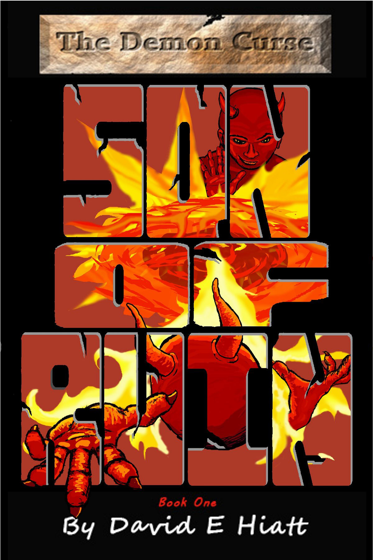
This cover has several problems; some are apparent at thumbnail size, and some at full size.

From the thumbnail:  We have a perfect storm here — the artwork makes the text unreadable, and the text makes the art incomprehensible.  There is literally nothing here that a casual browser, encountering the thumbnail on Amazon, can identify or find attractive in the three seconds or less that they’ll give this thumbnail before glancing to the one on the left or right.

From the full size: The title font is still almost unreadable.  At least I can make out the artwork now, but that’s a mixed blessing, because the artwork is simply not of professional grade.  One glance at the top demon’s misaligned face screams “amateur.”  To add to that, the stone background behind the (I assume) series title only serves to make that text harder to read (and to remind viewers of the design aesthetic on display at Geocities).  Top that off with a total of four fonts, and damn.

And on top of that (yes, I’m piling on, I know), the cover makes it look like the book’s about two demons fighting.  That doesn’t match well with the description you gave.

The advice I’ll give your is common advice around here:  Look up those books that you would expect to be popular among readers who would enjoy your book, and see how those readers expect to be marketed to.

Other comments?

Gladness Goes to the City

The author says:

Marguerite Martyn was a noted journalist and artist in 1910s U.S.A. Besides her serious reporting (always accompanied by her drawings), she occasionally wrote lighter fiction, which appeared on the newspaper’s feature page. The book is based on one of those fictional pieces. It’s about a girl named Gladness. This will be one of a series based on Martyn’s reporting and including her sketches.

Nathan says:

Hm. Hm, hm, hm.  Your description gives us very little to go on, really, unless your target audience really, really likes early 20th-century female journalists. With that said, I think we can offer some constructive advice from a pure design standpoint.

  1. You’ve divided the cover in an odd spot — almost-but-not-quite center.  And as you can see especially in the thumbnail, the real estate in the lower half seems terribly under-utilized compared to the top half, which is nearly unintelligible due to the detail and lack of color.  I think you should let the illustration take up about 3/5ths of the cover.
  2. Extend an unobtrusive border around the top half — the off-white background of the illustration conveys the idea of “old paper,” but it clashes with the white-white that will be surrounding it on most ebook vendor sites.
  3. Lose the third font for your byline. Just reuse the title font again.

Other comments?

Fight: Become The Best Of You One Step At A Time

The author says:

This book is about challenging people to be their best, to beat the odds against them. It is about the need to better and how to become a better version of yourself. Its about not accepting the status quo. Its about fighting back and taking life by force.Its about reaching for the stars.

Nathan says:

If what you’ve given us is the mock-up you plan to give to your designer, that’s all well and good. If this is actually what you plan to present as your book cover, I think you had better step back and work with an actual designer.

Even when taking into account the foreshortened perspective of the book that isn’t reflected in the graphics (again: this is a mock-up, right?), the mismatched type aligned at random, the BRIGHT PINK cross the cover model (who seems to be wearing a shrug made entirely of Photoshopped dots), the completely unnecessary “VS” before the byline… all of it seems to be either a joke, or a dashed-off brainstorming idea which has not benefited from reconsideration.

Sorry if that seems cruel, but it’s the truth.

(Also: *It’s)

RJ: The Age of Innocence

The author says:

RJ: The Age of Innocence is a young adult romance set in present day America with a part in Italy. I am attempting to appeal to a similar audience as John Green. An agnostic teenager’s world views forever change after his new stepsister comes into his life and breaks down after an unexpected and disastrous trip to Verona.

Nathan says:

I’m not the target demographic, but you certainly seem to have nailed one of my most common pieces of advice: Figure out how the audience for your book is used to being marketed to.  This has certainly got the same vibe as the cover for The Fault in Out Stars.

The only head-scratcher for me is “RJ” — it’s not a part of the title you gave in your description, so what is it?  Why is it bigger than the title?

Other comments?

[01/18/17 Edit: Due to the way my submission form frontloads the message I get with extra data, I missed that “RJ” is indeed the first part of the title, so all comments expressing confusion at that are my fault.]

Glory on Mars

The author says:

A one-way journey to Mars may be a mistake. Colonization of Mars is in trouble when the colony psychologist, one of the first eight settlers, commits suicide. Four more settlers are now on their way, bringing renewed hope – and a cat. Emma volunteered so she could explore Mars in her robotic walkabout suit. Even if she gets the chance, that may not make up for everything she left behind. Mars is a hostile planet, danger follows from Earth, and an inexplicable sense of desolation cripples the settlers’ efforts. Would you go?

Science fiction set in the near-future, at the first colony on Mars. Hopefully will appeal to readers of scifi with an emphasis on the science. Some violence and a little romance, but mostly the struggle to survive, explore, and figure out what’s going wrong with the settlement.

Nathan says:

There is no single major problem here, but there are a lot of little issues that, added together, may tip the scales away from you in the eyes of potential buyers.

  • The inconsistency of the black border around the title is confusing.
  • There’s an overabundance of mid-range orange tones, mushing everything together.
  • Mars taking up the perfectly round porthole gives us a crescent of black which ends up being the most eye-catching part of the cover.  You could easily solve this by having the porthole be a different shape.
  • Shadows are inconsistent; the rock face is lit from the left, but the cat is lit from the right.
  • Problems with your cut-and-pasting: the front of the cylinder pedestal is obviously flat instead of rounded, the edges of the cylinder don’t line up with the top, the borders of the porthole are completely texture-less in contrast to the stone wall, the black space in the porthole overlaps onto foreground elements.
  • The cover may make perfect sense once you’ve read the novel, but it doesn’t make sense when seen fresh: If we’re seeing Mars through that porthole, what red rocky place could we be in?  Why aren’t we in a spaceship with riveted, steel-blue bulkheads instead?

Like I say: No single big problem. But it definitely needs a thorough tweaking before it’s ready to compete for eyeballs on Amazon.

Other observations?