Category: Covers

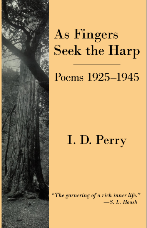
As Fingers Seek the Harp [resubmit]

The publisher says:

This version has a very different photo and a vertical orientation; font is slightly darker.

[original submission and comments here]

Nathan says:

It’s not as generic a layout, but I still see two big problems:

  1. The tree is hard to make out at thumbnail size — the point of having an image with a single focus is for it to be instantly recognizable for what it is at first glance.
  2. The large salmon-colored area is just plain boring. Even a slight texture (maybe stronger at the edges, fading away under the print) would be an improvement.

Other comments?

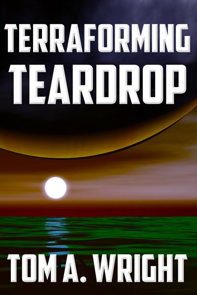
Terraforming Teardrop [resubmit]

The author says:

Safety and Liability Analyst Craig Shannon finds himself investigating the deaths of two people on the water-filled world called Teardrop. But the deaths were no accident, and all evidence points to a conspiracy against the peaceful alien natives known as the kell. Craig must search for the truth behind the plan to terraform Teardrop to not only save his own life, but the life of an entire planet.

This is my newest version of the cover for Terraforming Teardrop that I previously submitted here. After all the good feedback on the last, decided the best approach for me was to keep it simple, but moody.

[original submission and comments here]

Nathan says:

This is definitely orders of magnitude better than the original cover; it’s not great, but it’s something that can be improved upon rather than jettisoned.

Suggestion #1: MORE CONTRAST. Especially at thumbnail size, the whole thing becomes a muddle of mud.

Suggestion #2: A more readable font that uses the space better.

Here’s a five-minute redo:

I’m not at all in love with the color scheme, but hey, five minutes. (I moved the edge of the moon/upper planet down so it wouldn’t get lost behind the title.)

Other suggestions?

The Tainted Shrine

The author says:

Medieval Fantasy/Sword & Sorcery, new adult/adult novel.

“Ilas is not the gentle goddess the invaders believe her to be, you know. There will come a time when her sword is all that stands between humanity and ruin.” Kanika, the scorned Seer, must reclaim her identity from the invaders’ Crown Prince Atham. Though her people may never forgive her, she must redeem herself through fire and blood if necessary and take back the land the Seers have called home for centuries. However, Prince Atham’s position is not as secure as Kanika would like. Prince Meto and Princess Elsephere both have designs on the throne, which would spell the end of any hope of justice for the subjugated Seers of Argorien. THE TAINTED SHRINE follows the fight for control of the conquered city of Argorien, the revolution that creates more problems than it solves, and the unnatural creatures threatening to consume the Fierce Lands in chaos.

I am both the artist and the author.

Nathan says:

Nicely done artwork, although the biceps could use some refinement.

However, the whole definitely doesn’t say “Medieval Fantasy/Sword & Sorcery” to me.  The only element that even indicates at historical Europe are the girl’s blonde braids, which aren’t visible until one spends time examining the image.  My guess at first glance would have been either non-European mythology, or science fiction incorporating non-European mythology.

However, a lot of that “Medieval Fantasy/Sword & Sorcery” vibe can be added by switching out the typefaces and perhaps adding some ornamentation or scrollwork around the borders. Even just replacing the garden-variety Roman-ish font with a simple uncial would do wonders. (Our resident font expert will be along presently with suggestions, no doubt.)

Also, the glow around the white letters makes the print harder to read. I would suggest a dark glow or simple drop shadow to separate the type from the image.

And finally, the “by” in the byline is unnecessary.  When people see a title and a name on a book cover, they know that the name is that of the author. The only time you need “by” is when you need to describe the book: “A Historical Drama by,” “A New SERIES TITLE Novel by,” etc.

Other comments?

The Fiasco in News

The author says:

This is the currently published cover to my dark humor/superhero novel. I want to ‘re-brand’ the cover because I feel like it missed the mark on depicting genre/tone. While it does have superheroes throughout the book, the main focus is on Adam, the guy who got stuck with the worst superpower ever-an immortal disaster magnet for superpowered events. There’s a lot of insanity (mole people and portals to twisted versions of Wonderland anyone?), and a darkness that follows a jaded and sarcastic Adam. While I initially thought the illustration definitely hit those targets, I had a few people mention they didn’t even notice the superhero in the background. But I’ll be honest, I’m at a complete loss in what direction to go with this, as there are two more books in the series I don’t want to mess up the next two covers. (Authors’ readers it would appeal to: Caimh McDonnell, David Neth, Samuel Shem) Thanks for your time!

Nathan says:

The art is well executed, but I can see the problem that others mentioned to you: the superhero in the background both blends into the general busyness of the cover and is partially covered by the title, which means that the superheroicness (I’ll let someone else figure out the appropriate noun) is lost.

I think that you could work with the same artist — I REALLY like the style for this novel — and modify some elements:

  • Make the background much less busy; let the smoke isolate Adam and the girl visually.
  • While you’re at it, move Adam and the girl further to the bottom.
  • Place superheroes in shadow of silhouette nearer the top, letting them be both distinct from the background and separated from Adam.

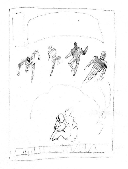
Here’s my thumbnail sketch of the layout:

This both simplifies the cover, and makes a point of Adam’s visual separation from the superheroic types.  I blocked in the title in an arc because it would take up less of the real estate, allowing your artist to put in the hero silhouettes clearly while allowing space between them and Adam.

And if you still need it to me more comic-booky… the rectangle to the left of the title is where most comic companies put their indicia, as more of a visual cue to the genre.

Other comments?

Brutal Adaptation

The author says:

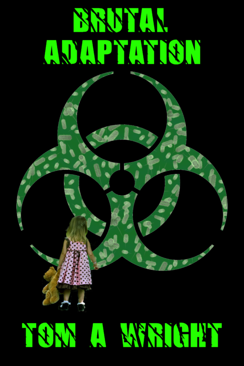
Local TV news reporter deals with a worldwide plague of antibiotic resistant bacteria, a conspiracy to cover up a new skin disorder in children, and his old high school nemesis forcing himself back into his life.

Although Brutal Adaptation could be considered a modern medical mystery, the science fiction elements of the story are too strong not to consider it sci-fi. It utilizes an around the corner type of science that was used often by Michael Crichton, without the embedded action sequences.

This is a test of concept for a replacement cover for my existing novel. One thing I am concerned about is that the font on this image may make it appear to be a horror story, which it is not.
Nathan says:

Whenever anyone introduces a cover as a replacement for their current cover, I like to seek out the current cover for comparison:
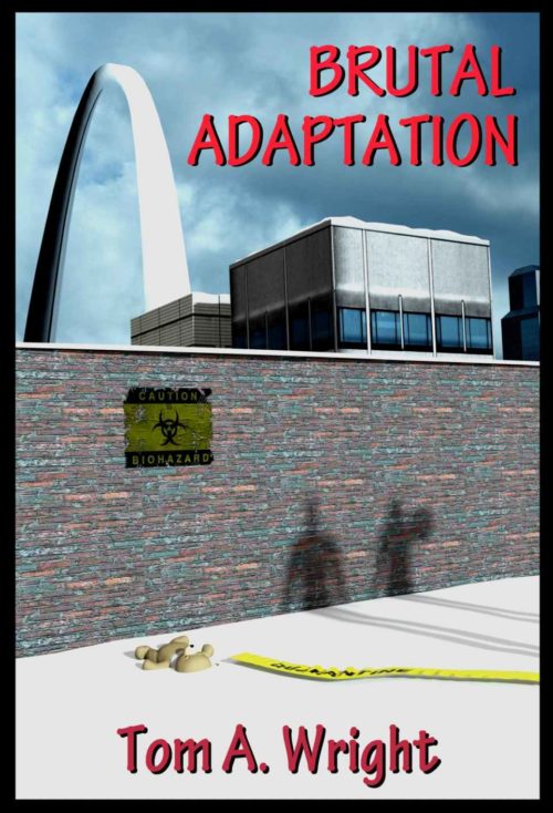
So yes, the new cover concept is an improvement.

I think the new font has other demerits before you get to the question of it looking too much like a horror novel; it’s also nigh unreadable, and even worse at thumbnail size.

And if looking too much like a horror novel is your concern, then definitely DON’T include a little girl and her teddy bear — anywhere other than a children’s picture book, that just screams “horror novel” to me.

I’m also not a fan of the biohazard symbol, if only because it’s so overused these days (and half the time, you see it on the cover of a zombie apocalypse novel — yet another false flag for horror novels).

You mentioned Michael Crichton as an author with comparable appeal. Obviously, it’s a problem taking cues from the covers of Michael Crichton novels, because the most important element on those covers is the big name “MICHAEL CRICHTON,” but let’s take a look at the “medical thriller” category, where you’d find such novels as The Andromeda Strain:

Here’s what I’m seeing: strong and clear type that dominate the “real estate” of the cover, and a single central image.  A lot of reds, which seems to correlate with how “medical” the book is.

So: Find a simple image that says “contagion” or “infection” — a broken test tube seems to fit the bill.  Either a dark red background if it’s a very “medical” story or, if your story concentrates more on the conspiracy as it sound like it might from the description, some other dark color. Clear, untextured type above and below the test tube, and Bob’s yer uncle.

Other comments?