The designer says:
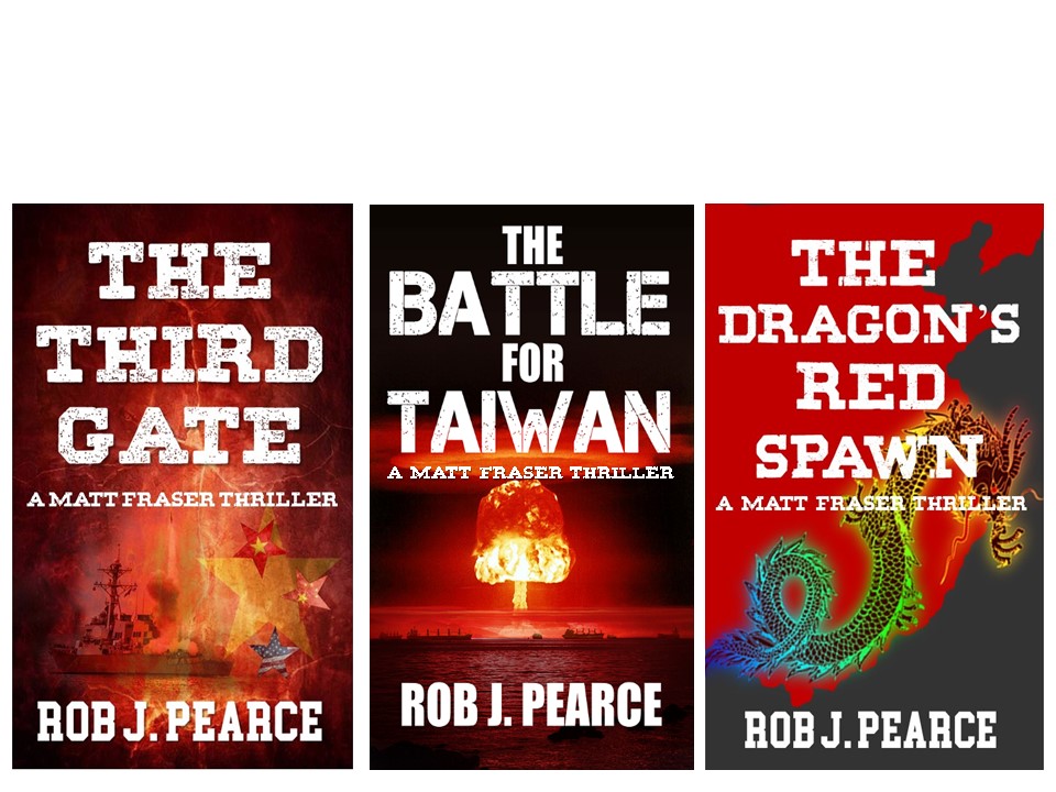
This book is a dystopian action, soft sci-fi. The target audience is adults age 19-30 or so. The book has LGBT+ themes, and later books in the series will contain somewhat less action and more political maneuvering as the story progresses, though action will still be present. The story primarily focuses on a violent rebel group that seeks to overthrow the repressive government. I am not the author, just a friend who is also not a professional designer. I did make this cover, however, and the author also agreed to changes based on your feedback.
Nathan says:
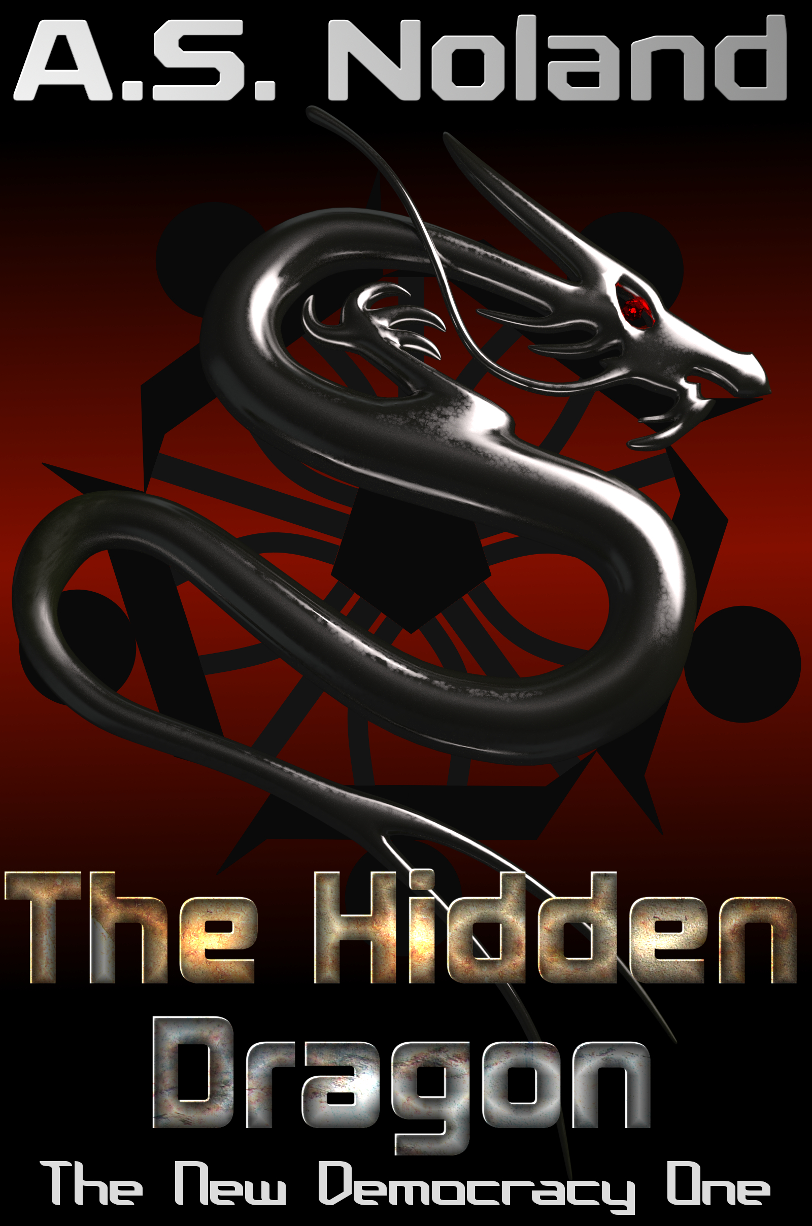
It’s a very eye-pleasing cover, although I’m not crazy about the typeface used for the series title, especially as it clashes with the other typeface used.
My bigger question is whether it communicates what you want it to about the story and setting. It’s got a bit of that Hunger Games vibe, but that series isn’t the be-all end-all of dystopias; what can you do to communicate “dystopia” or “repressive government”? Uneven paint in place of the smooth red background? Rust and bolts on the dragon? A militaristic stencil in place of one of the fonts?
I’ll let the others give more ideas.