Category: Covers

Freeforce: The Gryphon Saga [resubmit]


The author says:

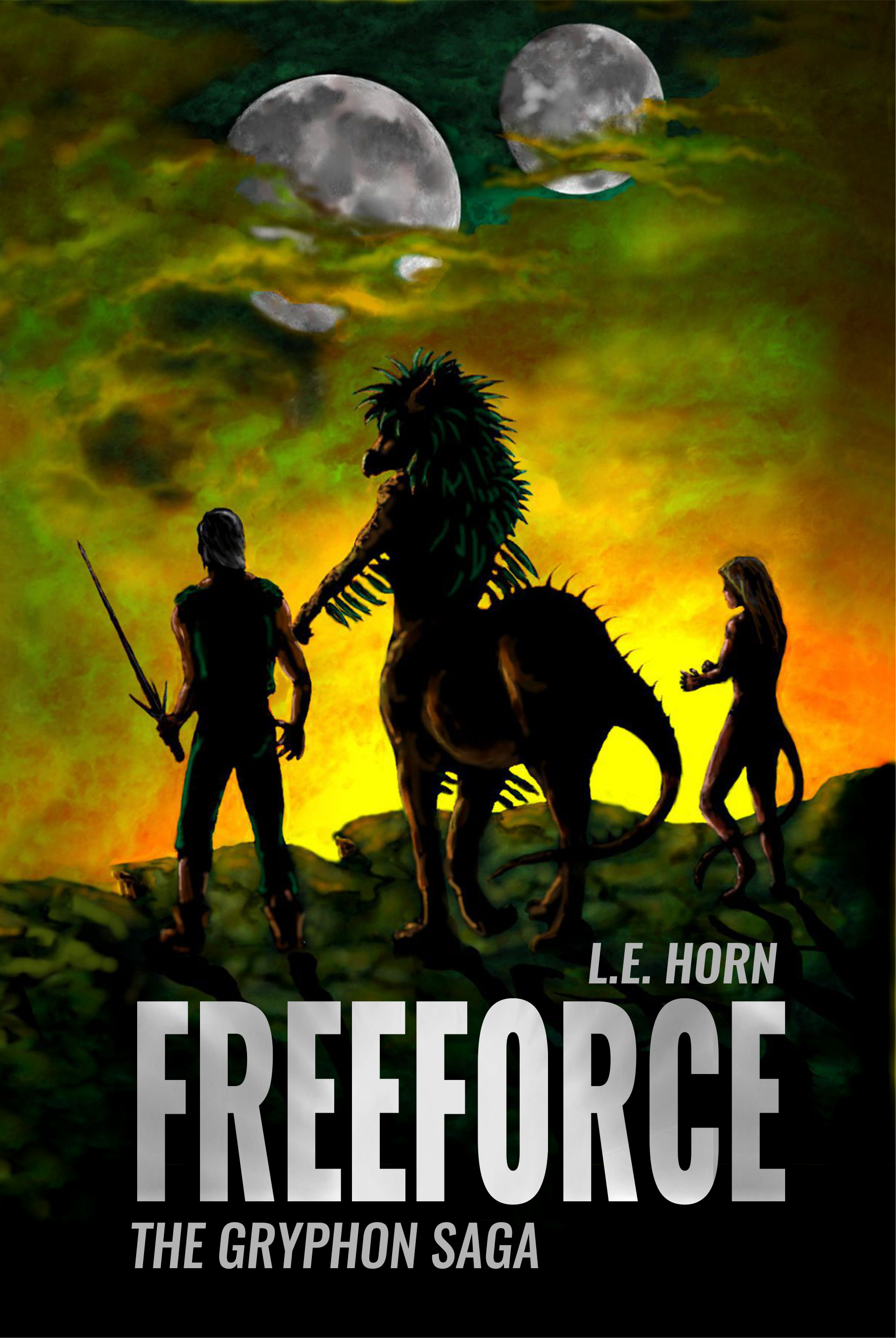
Hi again, New name, blurb, and cover. The author did the cover art, this was finally acceptable after many collage-type attempts. Freeforce is set in current time, on earth, a spaceship, then mostly on the planet Tarin. The genre is soft, biological,science-Fiction with a tinge of fantasy. The target audience is adult females who enjoy reading epic (this has 180000 words), character-driven, space adventures

The blurb draft: All Humans live on Earth Aliens don’t exist. It’s easy to believe in lies. Ruthless aliens enslave veterinary student, Lianndra Ross, and force her to take part in an archaic planetary war. Amid chaos and death, she discovers the only chance of freedom lies with the very beings she is fighting against. After all hope seems lost, an unexpected meeting offers her an opportunity to rebel. With the help of her fellow captives, Lianndra pursues the one thing most people on Earth take for granted. There is a catch—if the rebellion doesn’t succeed, life on the planet Tarin and possibly the entire universe will be decimated.

[original submission and comments here]

Nathan says:

You know what? My only problem is that the moons don’t look like they’re lit from the same light source. Other than that, well done.

If anyone else has other comments, have at it.

Rebirth: Birds of Change

The author says:

It’s set in a Hellenistic world where people who have exhibited supernatural abilities are known as Tallents. Its an Urban fantasy/Dystopian novel. The target audience is young adults both men and women between ages 12 and up, mainly those who are into fantasy elements like vampires, demons, werewolves, etc.

Nathan says:

It’s a good start — the artwork is obviously snazzy, although I’d take the color saturation down a titch.

The biggest problem is with the text.  As you can see especially in the thumbnail, the title and subtitle merge with the background, and the beveling on the letters hinders rather than helps.  And there’s no reason for the byline to be the only part of the cover not aligned to the center (and in italics to boot).

I would actually make the title and subtitle larger (recrop the art so that the figure is lower if you have to) with a clear drop shadow or outside border to set the letters off from the art, and then have the byline in the same font, centered and extending almost fully side to side at the bottom.

Other comments?

Colette: Becoming a Guernsey Girl

The author says:

The story is set in 1967/8 on the island of Guernsey in the British Channel islands. Mild-mannered Colin becomes outgoing Colette. I want a cover that will ‘pop’ but you may have other ideas. It’s a 65k novel. The byline is a pen name. Genre will be LGBT but I want it to appeal to non LGBT readers, too.

Here’s the blurb I’ve written for Amazon.

When nineteen-year-old boatbuilder, Colin, is offered a new job in Guernsey, he doesn’t expect to become a girl. But he hasn’t counted on unconventional boatyard boss’ wife, Leanne. Theirs is no ordinary attraction. In encouraging Colin to become Colette and explore a new sexuality, Leanne is confronted with her own conflicted physical needs. Even in the sexually liberated sixties, falling for a woman while she’s still a man might be seen as taboo. Together the pair embark on a reckless adventure of sex, love, and rock ‘n’ roll. Then Colette falls for kindly, down-to-earth George, and both women’s lives are thrown into turmoil. Torn between George and Leanne, it takes an unexpected turn of events to force Colette’s hand.

Nathan says:

Um… raise your hands, everyone who sees “a reckless adventure of sex, love, and rock ‘n’ roll” in this cover?

Yeah, that’s what I thought.

The problem here is that the cover doesn’t convey anything about what your message and blurb emphasize as the main selling points: a transgender love/sex relationship.

I think my advice to you would be a standard recommendation to many authors whose covers don’t really reflect the selling points:  Find other successful books that you would expect to appeal to your target audience, and see how those covers convey to their target audience that this book is for them.

Adventures in the Luminiferous Aether

The author says:

Travel to exotic places, shag the natives, see death and destruction. Experience life as an international project engineer through these pages! New version of cover; which is best? The ORIGINAL is currently on Amazon.

Nathan says:

For comparison, here’s the current cover from Amazon:

I think I can say, without fear of contradiction, that the tweaks you’ve made between these covers are merely rearranging deck chairs on The Titanic.  Neither cover gives any indication of what the book is about, or what kind of reader would enjoy it — and the minimal blurb you have for it, for those few readers intrigued enough to over come their confusion and click through, doesn’t enlighten any further.

I think you need to scrap both of these and go back to the initial questions:

  • Who is the ideal target reader for this book?
  • How do I indicate to that reader that this book is for him?

Relative Age [resubmit]

The author says:

I’m considering updating the cover for Relative Age with this version. The “Quantum Fetus” wasn’t a favorite among critics so I eliminated it along with the simplistic clock, replacing it with clock-based art found on Pixabay.

Relative Age follows a group of physicists and engineers who have accidentally discovered time travel while attempting teleportation. During the first full-scale test an unexpected arrival forces them to shut down the program until the problem can be identified and corrected. A professional troubleshooter is brought in to either find the problem with The Machine or rule it out as a cause, but during his investigation he becomes far more involved in the Project than he ever imagined.

[original submission and comments here]

Nathan says:

You’ve replaced a slew of the specific problems, but I think the overarching problems are still present: It isn’t very dynamic, and doesn’t read well as a thumbnail.

I mean, mid-range purple isn’t a dynamic color, and then with the rest of the image you have… people sitting in folding chairs.  The one part of the image which might be intriguing — the guy fading away in the chamber — is so small that it’s easy to miss (plus, he’s fading away, which means he’s even harder to see, plus he blends into the purple that’s all over the place.)

I found the clock image you used on Pixabay, added the first “man with gun” image I found (it could easily be replaced with “man holding whatever instrument he uses for troubleshooting” so long as it’s dynamic), and gave the title a tilt to make it active.  Voila, the five-minute redo:

Totally crummy, but active and dynamic.

Other comments?