The author says:
The book is a sci-fi/fantasy novel set 3,000 years in our future on a distant planet which evolved to develop both an ecology and a human society that is fantastical. The sci-fi aspect of the novel enters in a few scenes in Book 1, but will more fully reveal itself in the next books when the planet is invaded by its gods…from Earth. The target audience is YA to adult. This might appeal to readers of Herbert, Sanderson.
Nathan says:
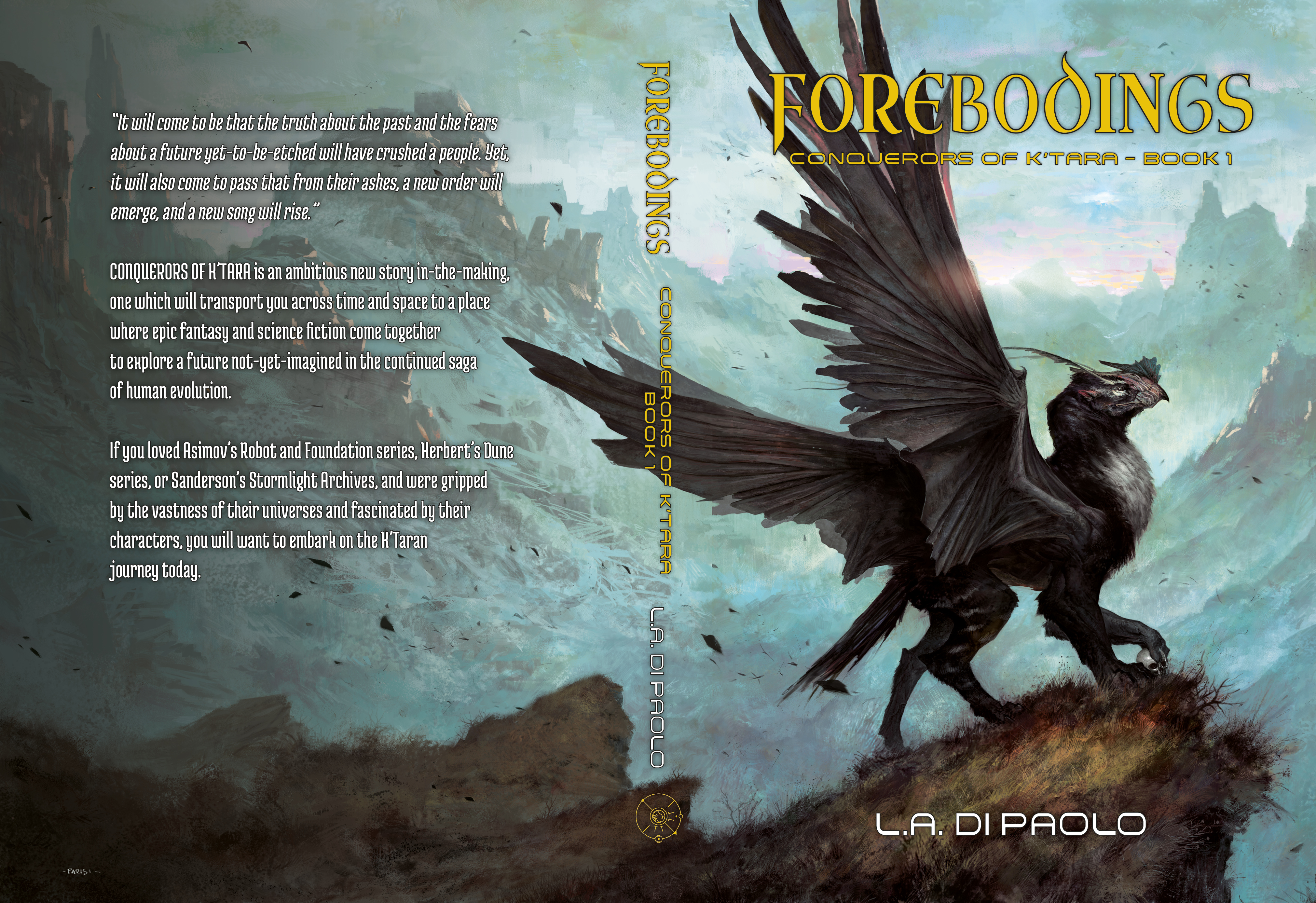
I think you know that the artwork is fantastic — no complaints there.
The text is too unassuming; you have space to enlarge the title to make it more readable, so do so. It’ll be even more readable if you strengthen the borders on the letters to mark it off from the background. Enlarge the byline, too.
Other comments?
For the back-cover text you might achieve adequate readability with little more than a drop-shadow. Set it to high radius and low angle and it should create a darkened cloud around the text fields that will better set them apart from the background. You may need to drop several for adequate shading.
The title is a long, single word that is inherently limited in how far you can enlarge it while still fitting on the page. Once you’ve exhausted that option you still may have a lot of empty space below it, and I would suggest you move the entire title-subtitle component down to just above the griffin’s head and wing-joint. Being more centered could help compensate for the text size issue.
I very much like the griffin. It may be a motif to include in future covers, as imagery on a battle standard or artwork on the nose of a starship if nothing else. I do get the sense that the fantasy market struggles in comparison to sci-fi, so it may be useful to segue into more technological art once the content veers sufficiently in that direction. For example, I’m not a huge fan but there is a similar concept to this in the Safehold series by David Weber, which melds sci-fi with historical fiction. Their layout heavily emphasizes his name since he is an established, marketable author, but more to the point the artwork is entirely sci-fi. It’s almost generic. Granted there is an android in play from page one, but it does suggest that marketing favors sci-fi imagery once the content allows for it.
By low angle, I mean the source of light being directly above the letters to cast shadows in 360 degrees. I specify because don’t know the conventions, in graphic art low angle might mean edge-on and there may have been confusion.
Thank you very much Kristopher, I appreciate the detailed advice, including that about re-using the head of the furan (the name of the species in my novel, and similar to what we know as griffin on Earth). I have been wondering for a while how to merge the fantasy and sci-fi dimensions of the novel, and how to progress from one book to another as the novel turns more sci-fi. Your suggestion is helpful.
Terrific art but the cover overall is bland due to the washed-out colors and the yellow, hard-to-read title. With longer titles you need a taller typeface. I’d increase the color saturation of the art to make it pop among the millions of other book covers beside which it will be displayed.
Don’t be afraid to display your name. You created the book, so show people you’re proud of it rather than embarrassed (unless their is reason to be embarrassed).
I can’t read most of the back cover text but it should be a short blurb and little else. If you want to mention the book being part of a series then do so.
I looked at your site. I’m not a fan of posting progress reports as it presents your writing as merely a hobby. Even if that’s the case you still want to be seen as taking your writing seriously. Doing so also strips away the magic of writing. Readers need not see what’s behind the curtain.
Don’t display books by other authors next to yours. If you want to recommend them, post reviews separately in your blog or on another page. It almost looks as though you’re trying to trick visitors into clicking your title thinking it’s a book by a well-known author.
Finally, refrain from telling potential readers how much they will like your books. Whether they do or not is for them to decide after reading it.
Thank you B.L. It appears I got more than I “bargained” for from you. I appreciate your comments about my site. It’s actually the first comment I’ve received about it, so I will take it to heart and make the changes that seem good for me to make.
B.L.,
with regards to the progress report, you may wish to look at Brandon Sanderson’s website. Brandon is one of the foremost fantasy writers now, and he has progress reports, though his are even more detailed. In fact, I took the idea from him, as well as from the “Novel Marketing” podcasts. one of the producers of these podcasts is also the creator of the Book Table which allows authors to share other author’s books. I will consider your opinion, but this is a case where one cannot please everyone. However, I will take your advice to remove any statement to the effect that “readers will love my novel because…” given that a few of you have expressed the same opinion here. So thank you for this.
Tony:
That’s all well and good, but Brandon Sanderson is a million-book-selling author–and you’re not, yet. He has a fanbase anxiously awaiting his next book, and they have a realistic expectation that he’ll deliver it, because he’s a proven quantity.
For newish authors, it does look and sound as though it’s a hobbyist. That’s the difference, and why BL mentioned it, I would expect.
With regard to backcover text, the advice that you’re getting from Gwen and RK is excellent. If a writer tells me, in his blurb or back cover text, that I’ll “love the book” or compares himself to a famous writer, I will put the book down immediately and not buy. It tends to be a sign of someone that hasn’t been writing long enough to know NOT to do that, and that typically means a book that isn’t well-crafted enough for my time and money.
Exactly right. Established authors can get away with many things the unknowns must avoid like the plague. Conversely, they need not indulge in many things which we must in order to build an audience.
This is why I become angry every time I come across someone selling writing advice as if they are a literary master after publishing one book. Worse, they all post the same tired (and free) advice seen in every writer’s forum while presenting it as their own, or they claim to have the secret to success because they happened to get lucky enough to find an audience.
The dragon is awesome.
I’ve never been a fan of outlining text to make it stand out on a cover. It seems amateurish.
Others here can suggest ways for your text to pop, such as Kristopher’s idea.
Kinda like this…
https://i.imgur.com/PhY42VU.jpg
Thank you.
B.L. pretty much nailed it with their redo.
The biggest problem was the lack of impact. Zooming in on the art and putting proper emphasis on the title took care of that.
I didn’t realize I’m more than one person, and neither did I.
Yabbut, both of you did a bang-up job in addressing the lack of impact there.
Disclosure: client.
Keep in mind that no one is going to see the full spread except you. So maybe shrink him a hair to get more of the awesome wings on the front cover. You could always put all the text on the bottom if you end up with more room there to fit his wings.
There’s something about the angle of his other ear that’s off . Maybe try moving it back and down in a perspective angle or deleting it?
And then I realized I was looking at BL’s sample. Yours show plenty of wing
I only used that version because it was available. I would also have more of the griffin on the cover and include more sky for the titles. My main objective was to show an alternate text color and typeface and increasing the color saturation of the image.
Thank you. I think I will leave the image as is. But I will definitely ask my graphic artist to adjust the fonts.
If you’re loath to crop the artwork, please remember you could offer the full spread as bonus desktop wallpaper to download from your site. 😉 So even if the landscape gets cropped on the cover, it won’t go to waste.
That’s a really nice idea
Hum, that is true, and a good idea. But I still prefer to keep a fuller view of the beast there. His wings are what make him what he is (though the new reader doesn’t know that yet).
Others have pretty much covered the improvements the text needs and the tweaks the art needs; as for me, I’ll point out that your back cover’s “teaser” text makes a decent “elevator pitch” for us, but not very compelling reading for your prospective customers and may even repel rather than attract them. Hint: readers don’t like being told what they’re supposed to think and feel about the story; when you do it in-story (breaking the old “Show, don’t tell” rule), they tend to feel their intelligence is being insulted; and when you do it elsewhere (such as on the book’s back cover), they start to suspect the author’s not a very good writer for having to explain on the packaging what ought to be self-explanatory in the text within. Telling a story is a lot like telling a joke: if you have to explain it, either it’s not very good or you’re not very good at telling it.
Your first paragraph on the back is a bit vague, but it’s not bad: a prophetic-sounding mystical pronouncement like that is one fairly effective way to kick off just about any kind of fantasy. In the second paragraph, however, you take to telling readers what this book will make them think and feel; and by the third, you’re telling them which other books they should expect this one to resemble. You try to spoon-feed these things to your target audience, most of them are going to spit out the bait.
My recommendation: use these paragraphs to tell your readers something interesting about the protagonist(s) or about the setting or both instead, e.g. “Luke Skywalker was a twenty-year-old who lived and worked on his uncle’s farm on the remote planet of Tatooine… and he was bored beyond all belief.” (That’s the first line from the actual back cover of the original Star Wars novelization.) Point either at the story’s central conflict, or (if doing so would be too spoileriffic), at something that points to the story’s central conflict. Try to come up with something a bit like a punchline: some tidbit of information that will strike your readers as odd and maybe a bit humorous, e.g. “…but they’ll be meeting the gods they thought had abandoned them forever soon enough: mysterious pink-skinned bipedal beings not so different from themselves who are on their way here from their mystical dwelling beyond the natural confines of this temporal sphere… a place known as Earth.”
Another version (I did not increase the color saturation in this version but still recommend doing so). I am not a fan of placing text over the main element or across portions of an image that starkly contrast as I show with the spine title. The byline over the mound is fine because it isn’t a key element.
A sun flare could be added behind one of the Os, possibly coloring the title text using a sunburst gradient originating from that same O, and the skull can be highlighted.
https://pasteboard.co/HBhyCAp.png
BL: I like that a lot. And-wowza–I even thoroughly approve of the fonts, too. My one comment, though, is that I feel that perhaps the title lettering should be a much brighter color. Not a washed-out yellow, but something. Can you think of anything? If this were being printed old-school, I’d even hazard a metallic embossing–but as it’s not, got an idea up that sleeve?
I tried white and other brighter colors and they disappeared into the bright sky of the illustration. The only thing I can think of is possibly giving the title dark but textured finish or make it 3-dimensional with more lighting and shading. Perhaps make it stand out from the image rather than be layered right on top. I don’t know if you saw the old cover for my novel Plan B but I applied that technique so it looked like the title was an object in front of the cover.
What if the title color was pulled from that thing on top of the griffin’s beak, or included the red in the gradient?
BL: Read my mind. Back of the beak, on the Griffin’s head, there’s a red smudge. What about deploying that, with….IDK, what about limning it with white or silver? Not a big heavy border, just…the barest hint of a line, to set the red apart, instead of allowing it to jar against the green.
I’ve found that sometimes, playing with bizarro-world colors yields surprising results. For this one, I’d try an uber-pale tint of creamsicle, to see if that works, for example. And when I say, pale, I mean, PALE. Or an equally-light tint of baby blue/sky blue. Crap, even lilac (and the aforementioned red, too, from the head of the Griffon). Green is incredibly tough as a background color, for all the reasons you’ve mentioned, but a yellow shade should work in there somewhere, no?
I’ll see what I can do. I’m not a fan of yellow text. To me a sickly shade of jaundice is a turn-off.
I could experiment a lot more if I had a clean plate of the art with the wings in the horizontal position. Part of the problem is trying ideas with a low-resolution version containing less detail and color depth.
FYI, this is the color average of the sky from the image I borrowed.
https://pasteboard.co/HBqQdw1.png
red 181
green 203
blue 198
cyan 11%
magenta 0%
yellow 2%
Black 20%
https://pasteboard.co/HBr16DL.jpg
B.L., would you want the high res cover? I could send it to you, but I do not know what it means in terms of your services here. Would you provide whatever you come up with back to me to handover to my graphic artist? Or would I need to hire you instead?
If you mean a high-res version of the art without text or other enhancements, that would be helpful to try different versions.
If you like something I try we can work together to refine it or you can forward the idea to your graphic artist. I am not a graphic artist and do not charge for the advice or work I submit. I am merely an author here to help others better there work as a way to pay forward the help I received.
Ok, based on all the comments, I think I’m going to ask my graphic artist to redo the typography per the general comments here to enhance their visibility and effectiveness, and then send that to my illustrator and ask him to reposition the furan so that it does not interfere with the text, as well as reposition the sunbursts and the enhance the brightness of the skull. Thank you very much everyone, for the comments on the image as well as for visiting my site and commenting on that, or on the blurb.
The art is great! And I think everyone else has addressed the type treatment already.
However. The back cover copy. Unfortunately there are a lot of mistakes here that will make the reader put down your book (some of these RK already mentioned):
-The quote. It’s very overwrought. A first revision, removing the extraneous words, would be “The truth about the past and fears about the future will crush a people. Yet, from their ashes, a new order will emerge, and a new song will rise.”
-“Story in-the-making.” Is the book not finished?
-“Epic fantasy and science fiction come together.” It’s tempting to give your book a very broad genre to appeal to more people, but it actually has the opposite effect. And you shouldn’t have to tell us the genre anyway; the cover design should communicate that.
-Comparing yourself to famous bestsellers. Don’t do it.
-Most importantly: You don’t tell us anything about what actually happens in the story. You just assure us that it’s SUPER epic. But readers don’t want to be told “Yes, it’s very very epic,” they want to know who it’s about and what happens to them.
Read the back cover copy on some of those other books and you’ll see that it virtually always falls into the same basic formula (though not the exact wording):
PROTAGONIST just wants GOAL. But when INCITING EVENT happens, OBSTACLE stands in their way. Now they must triumph at the CENTRAL CONFLICT, or else CONSEQUENCES.
This is how you hook a reader: There’s an interesting protagonist and something happens to them that we care about. Done properly, the fact that it’s a gripping universe-spanning epic should communicate itself implicitly.
Thank you Gwen. I really appreciate this advice. Would you and or RK mind giving me your opinion of the revised backcopy, which I can post here if you agree?
Please do. Much as I enjoy critiquing (and occasionally altering or offering replacements for) other people’s cover art, I’ve always had a particular liking for honing text; giving it dramatic flair, making it ring on the ear, that sort of thing. Gwen seems to have considerable understanding of what the readers want, and I can tell you about grammar and the general construction of the language and what kind of phrasing flows smoothly on the tongue and the ear and what doesn’t. (Just knowing all the rules of grammar isn’t enough; you also have to know when to suspend them for something that flows more smoothly, e.g. the original Star Trek‘s split infinitive in “…to boldly go where no man has gone before!” flows better than the more grammatically correct “…to go boldly where no man has gone before!” which is why the later series The Next Generation continued to use it.)