
The author says:
The Powers Cataclysmic
It’s over fifty thousand years into the future. Science, technology, and magic have evolved. Just about everyone can fly by sheer power. Humanity and other sapient races evolved into an infinite dimensional existence within a renewed universe. People use every part of their body, especially their hair and glowing clothing to store and project their powers.
On a reconstructed Earth, a somewhat paranoid man named Thrastara Navarra was a year out of college, and unlike the others, he has yet to realize his adulthood set of powers. Despite infinite life spans by yesteryears standards, there has been an increase in deaths among the people. Dr. Johnas Moorekase knows Thrastara and others like him called Eschaton Potentials are being targeted for their dangerous latent powers, for Lord Neraios is searching for a new vessel to merge with, which could bring about the final Apocalypse. When Johnas meets Thrastara, he rejects Johnas’s offer of help, for Johnas belongs to a group of maligned, heavily clad and long bearded Exorcists and Thrastara doesnt trust them and their god Azzana. It wasn’t until Thrastara loses people he cared about and a family secret when he takes Johnas’s offer for help seriously, for someone he should fear has been in pursuit of the Eschaton Potentials. Arrak and the demonic hordes might be Thrastara’s immediate threat, but his greatest threat lies with the demons from within and from within the realms beyond all dimensions, time, and space. After running out of options, Thrastara has no other choice than to join some of his friends and family, and follow Johnas and his allies to the truth. Will Thrastara finally awaken into true reality?
Please note the genre is Fantasy. The sub genre is science fantasy and superheroes, with an action anime style influence. I’m trying to create superheroes that are relatable and “human” at heart, yet are also exist on a super-cosmic scale. Even the average citizen in the book is powerful. However, people can’t will their problems away because everyone fears each other and everyone neutralizes one another (except the beings beyond dimensions, for the most part, which is the next stage people strive for). People still have to use strategy, politics, diplomacy, and form alliances to win. The battles are usually part of the payoffs. There are also powers that be that set limits what certain people can do at certain times.
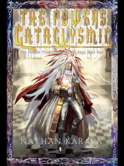
Yeah, I wanted to try something ambitious, and I’ve been working on this for years. Please note this book is in the developmental stages, so much can change. For the cover, the most effort was applied by an artist to the illustration. The reason I went for such a character is to convey how the future might be different (hair evolved to become prehensile, which explains Thrastara’s hair on the cover). 150K words I plan on self-publishing. Sorry for the long explanation. I am the author of the book. Books that might be similar are the Amber Chronicles, the Neuromancer, the Wheel of Time, Star Wars, superhero novels.
Nathan says:
[Note: The contact form I use is one of the only ones which allows users to upload an attachment, i.e., an image. The trade-off is that it doesn’t retain paragraph breaks, so I end up making my best guess when I post.]
First up: Yes, your elevator pitch is waaay too long. You need to focus on what kind of novel it is and why a fan of the genre would want to read it. It’s the same thing you need to do with the cover, but with words instead of design.
Second: All of the problems with the cover are accentuated in the thumbnail: Not only is all the text unreadable, but the figure becomes an indistinct blot of colors. Even at 500 pixels wide, all of the text is hard to read, and while the figure is clearer, all that the reader can understand from looking is “anime influence, maybe fantasy” — there’s nothing inherently interesting about someone just standing there (floating there). Look to your anime inspirations: How can the cover be dynamic? How can it show conflict? What can be visible and attractive at thumbnail size?
I hate to send you/your illustrator back to the drawing board, as the illustration was obviously time-consuming, but you need to (a) figure out your elevator pitch and decide on what elements of the story and setting would be the most attractive to your target audience, and then (b) decide how to portray those attractive elements by illustration and design.
Other comments?


