The author says:
The Spirit, The Scribe, The Journey is a collection of excerpts from personal spiritual journeys. The target reader is someone who resonates with wisdom other Christians received from God. The genre is christian spirituality.
Nathan says:
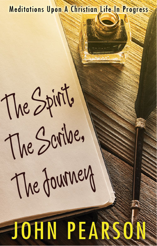
The problem here is that absolutely nothing on this cover conveys “Christian” — the only part with even a sideways connection to Christianity is the word “Spirit” in the title, which is scarcely an exclusively Christian word.
The type also has some problems. The title is in Algerian font, which is “the font resorted to by people who want an elegant or magical font but won’t look further than the fonts already on their computer.” It’s overused for all the wrong reasons. And while the byline font isn’t as bad, (a) it clashes with Algerian, and (b) its position against the bank page calls attention to the fact that it’s sorta supposed to look like it’s written on the paper, but it ain’t. (And neither font looks like it could have been produced by the quill pen on display.)
The blank space at the top of the journal page also looks oddly unused.
I’m assuming that we’re working with a stock image here, and if you’re determined to use it, here’s my ten-minute redo to correct some of the problems.

I added the slight sunrise-y glow because, well, Christianity is about hope, and it seemed right.
I’m not sold on the handwriting font I used (ten minutes, after all), but it at least indicates the direction I think you need to go.
Other comments?


