The author says:
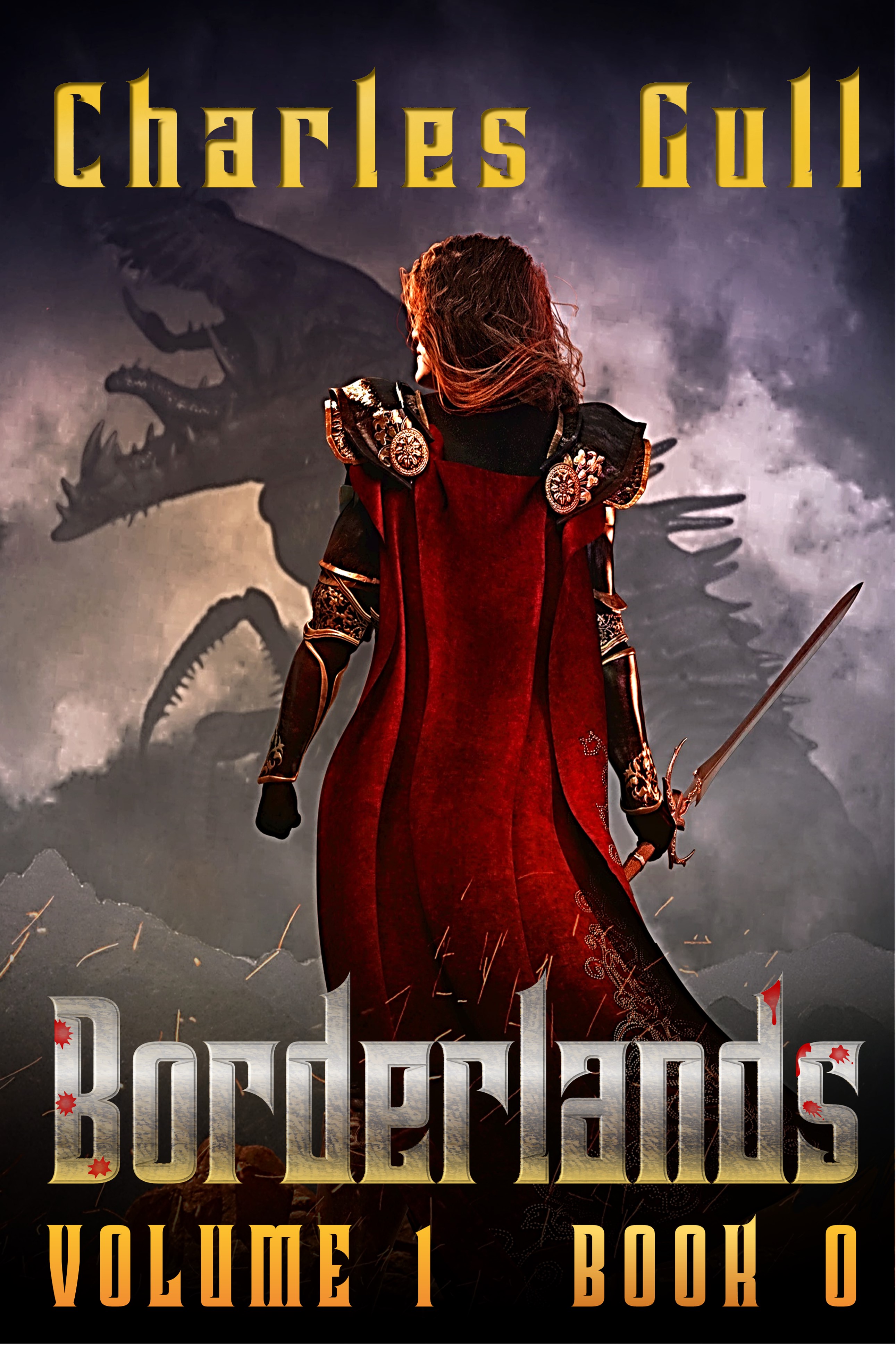
[BORDERLANDS Resubmit – This is an experiment with a view from behind. The motivation is that the gender of the protagonist is only revealed quite late in the book, so I wanted to keep the gender ambiguous on the cover. Ironically, the figure looks more feminine now! Also, I have been having fun with the titling.]
VOLUME Blurb:Trapped in an eternal battle against the all surrounding Realm of Chaos, the nations of the The Rationalle fight to preserve the purity of their oasis and its most sacred relic, The Temporalis. In the shadow of the Realm’s corruption, where steel turns to dust, stone walls crumble and spells turn on the caster the battle-hardened Aether Guard hunt down and destroy the ravening Spawn before it can reach their home. Skill and experienced not withstanding, their sworn enemy surfacing deep within the Rationalle itself catches them completely un-prepared. On this new battle front politics and ambition prove even deadlier than the Spawn the pursue. Can they keep up with their enemy, or will the Realm of Chaos finally desecrate the Temporalis itself? Grimmdark marries Bronzepunk in this hard fantasy epic where action abounds in a unique and immersive world of captivating characters and frightful monsters.
BOOK Blurb: Captain Ganse of the Aether Guard leads a handpicked team on patrol through the insanity of the Borderlands. Long trained and battled hardened, this band of heroes must forsake magic and hunt the vile Spawn with deadly determination, simple brutal weapons and obscure advice buried in ancient book. What starts a another routine sweep soon becomes a battle for survival as they are challenged by horrors powerful beyond record. Now, not even skill, experience and the Captain’s unique family legacy can guarantee the patrol’s survival. In a chain of battles where the soldiers must win every time but the enemy needs but a single victory, can the patrol triumph or will the Realm’s dark blood finally choke the bright heart of their homelands? Grimmdark meets Bronzepunk in this action packed 30k-word novella that launches a unique hard fantasy epic set in a deeply immersive character centred world.
[previous submissions and comments here and here]
Nathan says:
The artwork is of similar quality to the previous resubmission — i.e., quite good — so I have no complaints there, although I don’t understand why you used NONE of the elements in that previous trio of options. I have only two comments — one related to your blurb, the other to your branding:
- Please tell me that you’re not keeping the protagonist’s gender a secret FROM THE READER until the end of the book. It’s one thing to have a character whose gender is misdirected to the other characters for most of the story — think Mulan, or half a dozen Sharespearean comedies — but when a novel tries to keep something as basic to the protagonist (who is usually the viewpoint character) as gender identity a secret, the reader rightly feels played.
- I don’t think that “Volume 1, Book 0” works. (I have a problem with “Book 0” installments anyway; at best, they’re either a “limited-edition promo,” an idea taken from comic-book marketing which really doesn’t work with ebooks, or they’re backfill material for fans of the series/franchise, which you can’t really do if you’re actually publishing this first. What “Book 0” says to me is, “Nothing in here actually matters, because if it did, we’d call it ‘Book 1.'”) I understand what you’re trying to do — the first story of the first chunk of the expansive BorderLands saga — but it’s confusing at first glance. My inclination would be to have a title for this “volume,” of which this is Book 1 (NOT 0!!!), and then have a supertitle proclaim it “A Tale of the BorderLands Saga” or somesuch. (You could look to Katherine Kurtz’s Deryni books or other franchises which have discrete trilogies inside a larger tapestry to see how those have been marketed in the past.)
Other comments?
The spacing feels off to me on both subtitle and author name.
I’m not fan of the red splotches, they look too pasted on. I also think a less fancy font for author name and subtitle would be better. A nice elegant serif font like in your last posts would work. It just feels off to me to use the same font but different textures and colors. A hair more light in the sky will make that monster pop more and draw the eye to the cover better.
I agree with all Nathan’s other points. Book 0 is just odd and not at all enticing
For what it’s worth I thought her a woman at first glance.
Nice job on the layout!
I agree that the kerning on the author’s name and subtitle needs to be corrected.
I also agree about “Book 0.”
I don’t mind so much the ambiguity of the character’s gender as I do the disengagement that comes from having the character viewed from the back. She is just standing there, back to the reader, not even, apparently, reacting to the dragon in front of her. It’s a little too static to be really involving.
I’m not at all sure what the sparks are supposed to add to the title, let alone whatever the little red spots are meant to be. All but the drool on the “d” look like tiny flowers. Again, these add nothing to the effectiveness of the cover.
I would certainly welcome a more quantitative explanation of the phrase ‘needs to be corrected’. 🙂
You’re running with the second concept from the previous round of submissions, and while that was my favorite and I still think this is overall good, I think in terms of details it’s a step backwards.
For starters, the front-facing shot was stronger than the back-facing shot. The former felt like it was drawing me in; the latter feels like it’s excluding me from the story.
And there are a lot of small technical problems. There’s a white line along the border. The increased contrast on the foreground image just makes it look like the two images aren’t part of the same scene. The images have been super-compressed at some point and are now covered in jpeg artifacts. The text is aliased and the author name also has some artifacts. And the vector blood splatters really don’t match (they looked like bullet holes to me).
TL;DR: Still a great concept, but the photo in the previous draft was better, and it needs some minor clean-ups.
P.S. And yes, while I know you have your heart set on the “book 0” thing, I too am going to continue to tell you not to do it.
To me, it looks like she’s facing forward, with a mask/veil on. It doesn’t look like her back. Yeah, sure, one arm is slightly crooked, but–looks like she’s got a fencing mask on. Sorry.
And I have to join the un-huddled masses here–to me, that “Book 0” is just twee. It screams “affected,” I’m sorry to say. And it would make me keep going (past the book, I mean), if I saw that on a cover. It’s just…it’s trying TOO HARD. Just do a book 1, like everybody else.
The artwork, as always with you, is top-drawer. Don’t know where you find it, but well done on that front. You have a ton of great going on here, but I wish you’d warm up a bit to the idea of not hiding from the reader.
I’m ambivalent about piling on to Nathan’s comment about the plotline, because that’s the book–but I do think he might be right. I’m reluctant to address it–as I was the first time you said it–because you obviously have a lot invested in the idea of hiding the protag’s gender.
That level of writing–successfully–takes an incredible amount of authorial skill–to wit, on a level with The Murder of Roger Ackroyd–and for your sake, I really hope you pull it off, because otherwise, you’re dooming this series. Those who are alienated and pissed-off by it will never come back to your books. So…I hope your writing is bloody brilliant. Seriously–I’m rooting for you man, but, it’s a tough thing to pull off, like a double-reveal (like The Sixth Sense).
I agree with the comments saying that the type treatment feels like a step backwards from your previous version/s here: https://covercritics.com/?p=2484
Though it’s not strictly a design issue I have to agree with Nathan about the series naming/numbering. I think even within comics where it started the ‘issue 0’ thing rubs an awful lot of people up the wrong way. I would be with Nathan on his suggestion to instead have something like ‘A take of Borderlands’. Or another alternative might be a kind of subtitle (‘Borderlands: The Beginning’ or similar).
Other than that you have the technical issue noted by others – both images, but especially the background image, are super lossy.
There’s also something weird about the ground level, like there’s some silhouetted rock or mountain shapes there but they are out of style with the rest of the illustration.
Lastly there’s no reason for the byline text to be over the nose of the beastie. Pull the text up and it will frame the image better.
(As always) Many many thanks for all your comments. You guys are the best (even when you are demonstrating tough love!)
Okay, where do I start?
1. The re-pose was a wild late night brain fart on my part. It didn’t turn out quite like my brain was telling me it would. Even then, I thought it might just have its merits. I guess it was a cul-de-sac after all. Hey ho, back to the front pose.
2. Yes, the image quality is not the best. This was a quick hack based on a low res sample image. I should probably have mentioned that in the submission text. Sorry for hurting everyone’s eyes.
3. The ‘white line along the border’ is, I am assuming, the white glowing edge around the central figure (I can’t find a white line anywhere else). That is purely my fault, I was playing around with edge sharpness and over did it a bit. [looks at floor in shame]
4. Okay, the message has finally managed to burrow through my thick obstinate skin. If I separate opinion from fact, the fact is you guys all find it repellent for whatever reason. I’ll drop the ‘0’ thing.
5. Yes, the art work comes from a very talented guy I found on 99Designs. He is obviously quite talented and skilled in what he does. He also has a great work ethic and puts up with all my stupidity and cul-de-sac shit.
[a bit of a gap to the last point]
6. The gender of the protagonist, hmmm. I appreciate your legitimate concerns. Everything you have said is valid and reasonable. I appreciate that I am walking along a knife edge of a balancing line in my writing and I would like to assure you that I wouldn’t be doing it without a reason. Granted, it might be a mad crazy stupid reason, but there is a reason. It exists. Nevertheless, I shall not go into the details of it, or try and defend it here. Instead, if any of you guys have a honest heartfelt concern about this, I can offer the following. I would be happy to forward you a no-cost, no-strings, no-promises copy of the – no longer to be referred to as – Book 0 manuscript. It is a novella of about 30k words. You don’t need to give me any feedback at all after reading it if you don’t want to. It’ll be yours to keep or delete as you wish. Think of it as a token of my gratitude for all the support and patience you guys have shown.
OBVIOUSLY, if you DO read it, then you’ll know the story and will no longer be able to comment on the covers with 100% neutrality. I shall still be interested in any comments you do make. They won’t be suddenly invalid, just ‘flavoured’ slightly. Your call.
(Just so we don’t lose the forest for the trees, I do think everyone likes your cover and thinks it’s quite good. We just want to make sure that, as you tweak it, your tweaks are making it even stronger.)
I am 100% okay with this.
Again, many thanks to everyone for expending their time and energy on my behalf.
I’ve seen the gender thing done well before – in manga and video games. visual mediums where the reader wasn’t expecting to see all of the protagonist’s thoughts. I imagine it would get a lot trickier to do with the POV character in a novel.
Is the protagonist HIDING their gender, or just not thinking about it and it doesn’t come up until the end? I feel like the latter would work better than the former – they don’t mention their gender because they’re “telling the story” as if the interlocutor already knows (I’m assuming you’re using first person – if it’s third person I don’t see how this will work at ALL), the reader makes their assumptions, and depending on what assumption they make it may or not be a big reveal.
Yes, you have struck the nail on the head quite soundly. It is 1st Person [and additionally in Present Tense]. The narrator simply doesn’t mention their own gender. It is a military setting and as a superior officer, everyone else addresses her per Rank and/or Family name. Her gender simply doesn’t come up until quite late in the story (why would it?).
I might have gone through the whole story and not mentioned it at all. However, I did purposely decide to put it in near the end to get the reader to take their eye off the ball briefly, just before the big climax.