The author says:
LitRPG is a niche within the Fantasy genre. Within even that is something referred to as DungeonRPG or GameRPG. It is Fantasy stories that take place within a game or within a world where the rules are clearly set, like a game. For fun i thought wrote a story that falls on the edge of all three of those.
Adventurers enter dungeons every day. Battling evil monsters, defying dangerous terrain, triumphing over devious traps… … but none of them ever ask why? That arrow trap, who reloads it? The pitfall trap, who cleans out the bodies and sharpens the spikes? What if the grates get clogged, where will the blood and gore drain? When you are trying to study ancient lore or plan on conquering a kingdom, you don’t want to worry about all that. You just want peace.
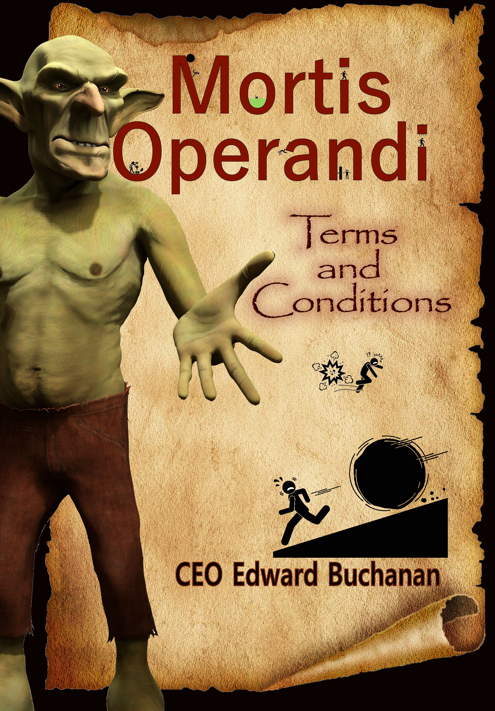
Mortis Operandi is a different kind of company. One that celebrates diversity. One that celebrates value in individuals. With flexible pay and plenty of advancement opportunities, it is a company that knows its workers are it’s most valuable asset. As they design, build, and install traps, rooms, obstacles, and repair they are a one stop shop. The sudden exit of Mortis Operandi’s CEO, the company was facing ruin. The goblin Eft was choosen as the new CEO and boss. The previous CEO made promises and contracts that Eft now has to fulfill, and it is causing a lot of trouble. Restoring the ancestral home of Ogre’s seems easy enough, what if a thriving town now resides there? Along with facing corporate invasion, Eft must take on the tasks he wouldn’t wish upon his worst foe, Customer Service.
*Note the above statements are forward looking statements. In no way do they promote or suggest that Mortis Operandi will project greater sales or revenue. Understand that investing in a company does involve some risks, and possibly much rewards.
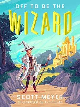
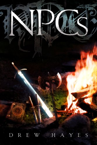
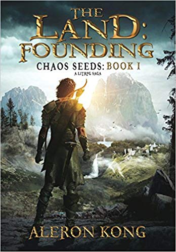
Some covers of books within the Genre for comparison:
- Morningwood: Everybody Loves Large Chests by Neven Iliev
- Off to Be the Wizard by Scott Meyer
- NPCs by Drew Hayes
- The Land by Aleron Kong -I think he updated his cover though.
My previous cover you guys rocked at helping my identify things that needed fixing. This time I think the idea for the cover works for the genre but still just looks crappy. So any suggestions or thoughts are appreciated. Even if I have to scrap this one, I’m hoping I’ll have enough to know what is wrong to ensure I don’t pay someone to make the same mistake. Thank you again.
Nathan says:
Just for comparison, here are the four covers you referenced:
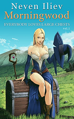
Using these four as a sampling, I think the only commonality between fantasy LitRPG covers seems to be “a cover with solid fantasy tropes.”
Your novel has a quirky hook: This is the company that works behind the scenes to make all the cool stuff happen. That’s really something that needs to be be put front and center. I can sort of see where you were heading that way with a few of the elements you use, but I’ll be honest: It’s a mishmash. Bad fonts, poor layout, and mismatched graphic elements.
I think you need to start over from concept: How can you get the “hook” of your story on the cover? The first idea I thought of was a Mortis Operandi business card being passed from a goblin hand to a dragon hand (or whatever other fantasy creature’s hand) — enough of a fantasy element in both the hands themselves and in the title font (as in The Land) to convey a high fantasy setting, and the business card as the novel element.
Other ideas?