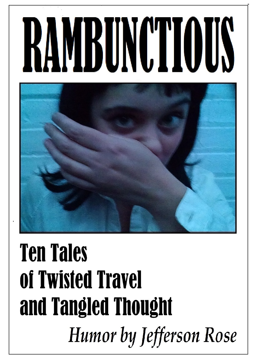
Category: Covers

Hell Can Wait Forever

The author says:

This is the story of a polite and soft-spoken man removed from the consequences of his actions… or maybe not. Though his life has ended many times in many ways, a strange phenomenon he calls “temporal mental regression” forbids it to stay ended. He never lets anyone get to know him very well because anyone who does hates him and considers him sub-human and desires to inflict all the worst imaginable punishments on him. What makes him so bitterly hated is that he is a child molester; and he’s the one telling this story.

To tell the truth, I’m at a bit of a loss for what to show on this cover. Professionally made covers on books about molesters typically show either a battered-looking youngster curled up in a corner with tear-streaked eyes when told from the victim’s point of view, or a shadowy human silhouette (usually male) looming menacingly over some otherwise innocent-looking scenery when told from the perpetrator’s point of view. I’ve mostly gone with the latter arrangement for this draft, but am wide open to suggestions up to and including a complete overhaul; but my budget is quite limited, so please think twice before recommending I hire a pro to design the cover (which, according to Amazon.com, will “only” set me back $700).

Nathan says:

Well, you may not want me to recommend a professional, but…

I’m really at a loss here, because I still don’t understand the core of your book, or the audience to whom you’re trying to appeal.  Would I be right in understanding that this is a semi-sympathetic portrait of a child molester? That’s a hard sell, all right, and I agree that the standard “molester” cover showing a sad-eyed victim wouldn’t work, but I’m not sure what WOULD work. (And that’s without adding in the Groundhog’s Day aspect.) That’s one of the great benefits of working with a professional who can bounce ideas back and forth with you, and have the skills to translate the appeal of your book into visual terms.

I can tell you that your current cover simply doesn’t work — not just for YOUR book, but for ANY book. The novelty font for the title is terrible, and clashes with the byline font. The two image elements are in different styles and convey absolutely nothing to someone who doesn’t already know the novel well (which is chronologically backwards — your cover is what will draw readers to the description, not the other way around).

At this point, even type on an abstract background is better than what you have:

…because I can’t think of anything you can do except NOT try to tell anything about the story on the cover.

Other ideas?

The Heart of a Southern Man

The author says:

Life in the Wreckage of the Sexual Revolution — It is 1983 and Troy Stevenson, former college football legend and corporate executive, has it all — a rewarding career in moss-draped Verona, Georgia, a comfortable suburban home, an adoring wife, and two beautiful kids. For this coal miner’s grandson who grew up in a mobile home, life looks abundant and serene as far into the future as the eye can see. But when an employee who is romantically obsessed with him is stung by his rejection, she files a sexual harassment complaint. His world begins to crumble as word of the incident spreads like wildfire through the small Southern town. His reputation is tattered, his position in the community tarnished, and his family mistreated. Does the future now hold social and career ruin and the inability to provide for his family? Or can he prove his innocence, right the wrongs and restore his good name?

Nathan says:

The problem here is that there’s no drama. None. You’ve got four unrelated stock models who look like they’re taking headshots for their profiles on the company website — only the one of the far right looks even a little apprehensive.  Your color scheme is muted and passive. It just doesn’t look interesting.

Use shadows. Use high contrast colors. Use images that can mean rejection or betrayal — crushed flowers, turned backs, whatever. Give the person who sees this  cover a reason to want to find out about the book.

Other comments?

Revenge of the Exiled

The author says:

What would you give up to save the one you loved? Director Kolteo Ais spends too much time at the office. Ever since the Galactic Emperor disappeared, he’s been the top man in the ruling Committee for Public Safety, and his fellow Directors would welcome any sign of weakness. Now he has a problem: his brother-in-law has returned from self-imposed exile, and he brings with him a secret that could destroy Kolteo, tear apart the fragile order of the Empire, and set the galaxy on fire. Can Kolteo save the Empire? Can he even save his marriage?

— Genre: Science Fiction, Galactic Empire. Audience: Fans of Star Wars, Firefly

Nathan says:

Without the spaceship composited in there poorly, it’s a very generic and lifeless cover; it has no real focus, either in image elements or even in color scheme.  You’d be better off with a nonspecific/premade cover which solidly proclaims genre and drama than this. Sorry, but true.

Of Ash Immortal

The designer says:

I’m new to selling premades, so I’ve been challenging myself to create one in each major genre to get familiar with current trends. This was my “urban fantasy” attempt. The basic concept is that she’s somehow related to the mythical Phoenix, so her current rebirth is into a modern day city. I browsed bestsellers and high rated urban fantasy books for ideas on color/layout/common tropes when designing it, but it still feels off to me.

Nathan says:

  1. If it were me, I’d crop the art to about here:

You don’t lose out on any necessary detail, and there’s more of a focus on the central figure.

2. At first glance, I said, “I’d probably add some swirly-glowing magic.” Then I looked again and say that there is swirly-glowing magic, I just couldn’t see it.  Which tells me that you need to do something different with the swirly-glowies — either a different color tint, or more color to show up against the background, or color in the background a bit.

3. Her face seems… vapid. I’d expect this to be a urban-fantasy take on Clueless or Valley Girl.

Other comments?

The Spectra Unearthed [resubmit]

The author says:

This is my other idea (with improvements from the comments).

Book description: YA fantasy: An exiled princess must unite six elemental clans to overcome the ancient society that destroyed her family. Her clan’s abilities are nature-based, including shape-shifting. This book deals mostly with her relationship with three other girls, and is about her gaining the courage to fight back.

[original submission and comments here]

Nathan says:

I think the biggest problem here is that it still lacks magic.  From the thumbnail, both the bird and the scrollwork behind the byline (both of which are only marginally magical in themselves) are invisible; what you have left is a possibly historical woman.  Is it a historical romance? A historical drama?  You’re missing the signifiers that tell the fantasy-reading audience, “This book is for YOU.”

In the comments to the original submission, Shelley made an example cover which nails those signifiers squarely. There is NO WAY that anyone could mistake which genre that is, which is just about the first thing that a cover needs to convey.

(Looking closer: Something’s weird about the woman’s jaw. She looks like she’s entering a watermelon-seed-spitting contest.)

Other comments?