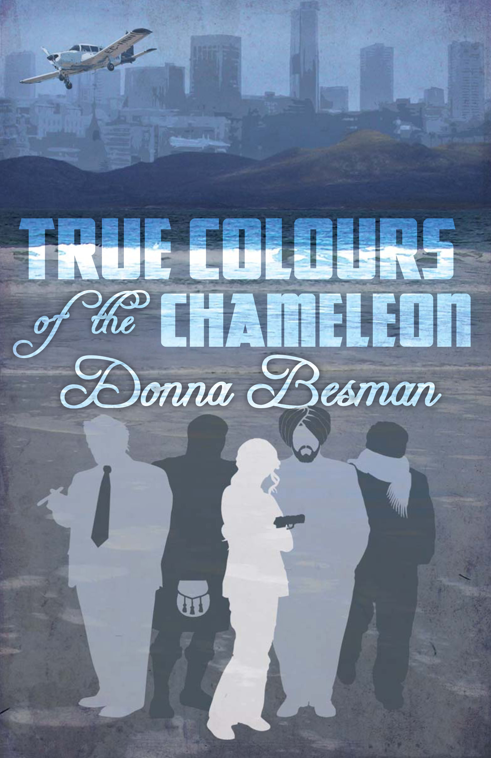
The author says:
Johnny Donal’s life in the South Carolina Lowcountry should be good but love gone awry, lies, double-dealing, and murder combine to make it miserable.
Donal, a retired cop with a successful investigations agency and he should be enjoying life. He isn’t. That he has a stellar reputation as an investigator; that he has a source of independent wealth; that he can pick and choose cases should, if anything, add to his good life. None of it does.
Instead, Donal is troubled. His lover Victoria left him and, worse, he’s batting zero with his attempts to get her back. He also has a client with a strange attitude about the circumstances surrounding her missing husband and Donal isn’t sure that he can trust the woman. Then a friend is murdered and that case intertwines with Donal’s missing husband case.
Despite a double dealing client, negative involvement with influential locals, and political obstacles all cluttering his investigation, the question becomes can the Donal, who has problems of his own to resolve, uncover the identity of the killer and bring him to justice?
Plot and subplots take the reader on a journey filled with duplicitousness and murder. As the story unfolds Victoria returns, but the fears that drove her away in the first place lurk just beneath the surface. All hell breaks loose when the killer tries to take Donal out. Closing the case and bringing the killer to the bar of justice will no longer suffice. Vengeance becomes the only option.
![cover[1]](https://covercritics.com/wp-content/uploads/2014/03/cover1-500x750.jpg)
![cover[1]](https://covercritics.com/wp-content/uploads/2014/03/cover1-99x150.jpg)
Nathan says:
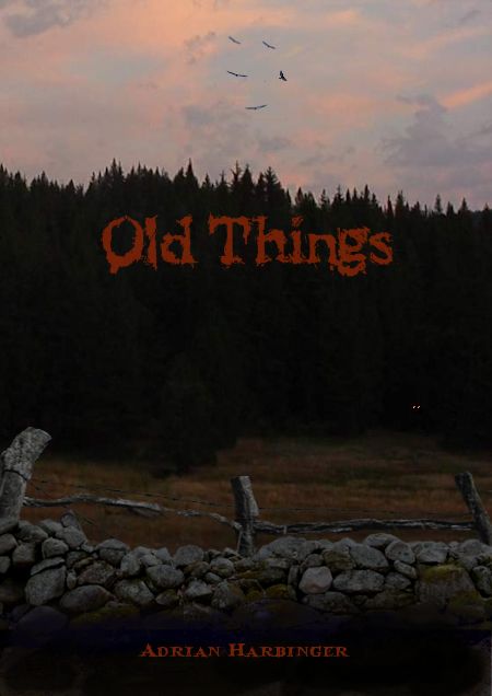
I’ve seen several of these covers recently, which repeat segments of a single image around the layout. I hate ’em. Or rather, I don’t see the point. If an image is strong enough as a focal point (as a chain is), then the repetitions are distracting; if it isn’t, then more isn’t better.
From your description, your book is target at roughly the same demographic that reads Harlen Corben or Lee Child or Michael Connelly. So why doesn’t it look like them, so that those readers will recognize it as one of their own? Here’s what I get from surveying books in that genre:
- strong, narrow type, usuall sans serif
- a strong but nonspecific central image
- bold colors in a limited palette
Going from that, here’s a five-minute redo of your cover:

Now, this is definitely not the final I’d go with; I’m not sure I like the font I picked, the colors could use some tweaking, and the pure black background behind the chain is bland; I’d probably find some grungy texture to be the background, possibly sheet metal or the like. But you can see where I’m going.
(By the way, I know we’re not here to critique blurbs, but yours could use some streamlining. Read it aloud in Gravelly Movie Announcer Guy Voice and see what could be tightened.)
Other suggestions?
![cover[1]](https://covercritics.com/wp-content/uploads/2014/03/cover1.jpg)