Category: Covers

Blackest of Lies

The author says:

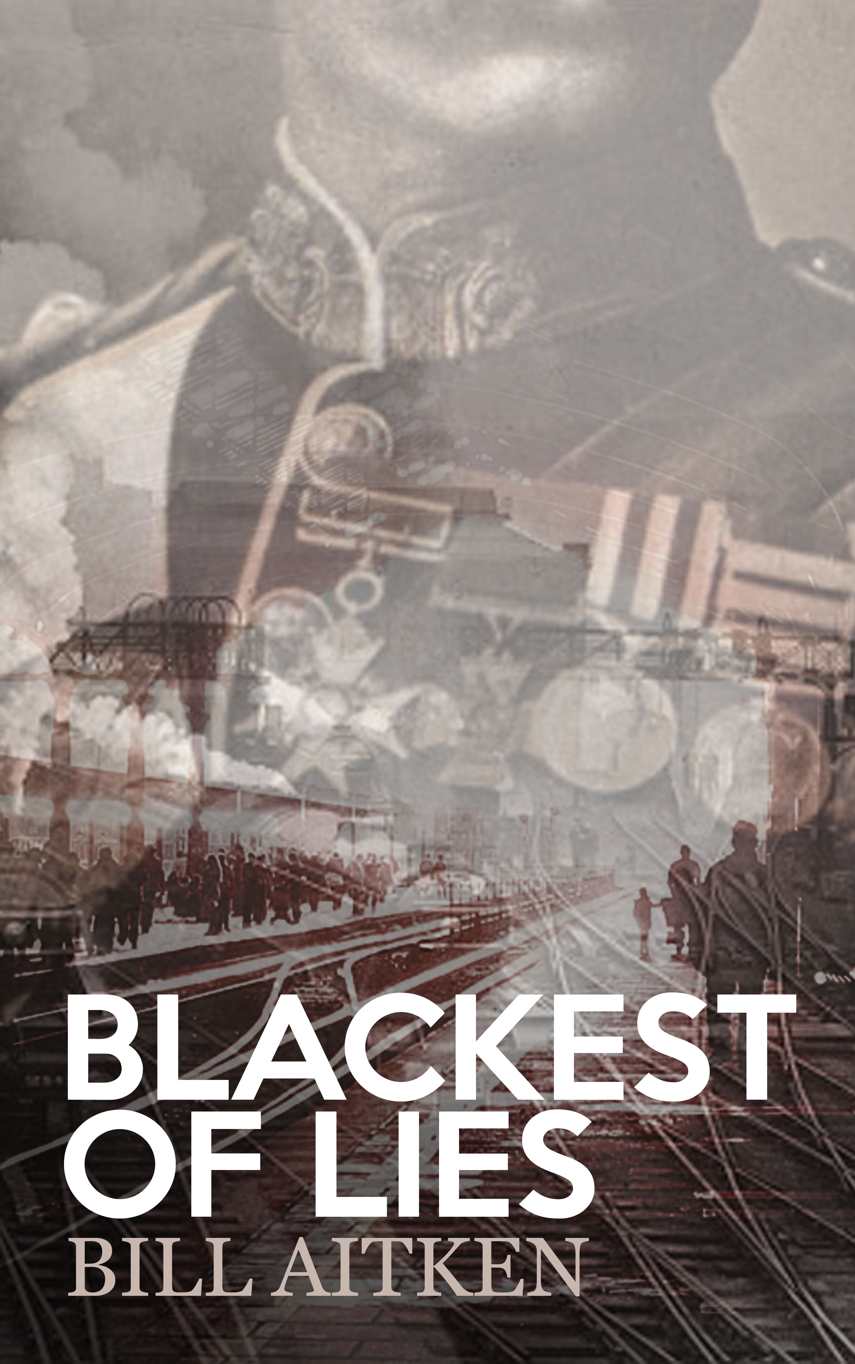
Blackest of Lies is set in 1916. It aims to suggest an alternative view of Lord Kitchener’s death at the hands of the German Navy in the cold waters off Orkney. There were many questions raised concerning the security of his journey which started immediately after the tragedy and have rummbled on until the present day. This book suggests that Kitchener was murdered in his house by the IRA and follows the efforst of the security services to keep the murder a secret by employing a military doctor as a resonable stand-in to fool the public at a distance. But, when he is sent to Russia via Scapa Flow, it is in the interests of friend and foe to ensure he does not return. It is left to Lt Hubert, the man who suggested him, and Anne Banfield of Special Branch to race after him to prevent his death in the coled waters of the Pentland Firth. Thsi book is aimed at those who are interested in espionage, the security branches and the Great War.

blackestOfLies_Cover

blackestOfLies_Cover


Nathan says:

Very confident in its use of images, a muted color palette, and type.  Here are tweaks I would recommend:

  1. I don’t know about most people, but I know I’m not history-savvy enough to instantly grasp the setting from the images shown.  Perhaps a subtitle/supertitle giving just a smidge more info — “A Conspiracy of the Great War” or somesuch — would be appropriate.
  2. I can’t tell what exactly I’m supposed to pick up from the upper image. If it’s the military imagery, it might be worthwhile to move that photo up so that the medals are more clearly seen, and make it a bit less transparent. That would also help the train tracks be more easily recognized as well; readers would benefit from instantly understanding “military” and “railroad” than “what am I looking at?” in that first three-quarters of a second.
  3. I’d probably also try a bit more space between the title and byline, but maybe that’s just me.

Other thoughts?


Logoons

The author says:

The title is a portmanteau of logo and cartoons. I wrote (and hired a cartoonist) 120 single panel gag cartoons. The cartoons are built around a word and its definition. Not multi-syllabic words no one cares for or could ever remember (except for a couple I couldn’t pass up), nor highly technical jargon, but interesting words rarely used in the banter of daily conversation. Readers expand their word knowledge and get a good chuckle at the same time. The prospective cover, for instance, is of one of the cartoons (attached to this email). I’m attaching a couple more cartoons to give you a better feel of the book.


I would be very interested in hearing other voices ( bad choice of words there) in hearing other people’s opinions of the book cover. I truly appreciate the help you and your group offer.


(I’m thinking of putting in a splash of color – perhaps yellow on the feet of the chicken patient and pale blue coverings on the chicken surgeons.)

Furcula copy

Furcula copy


Nathan says:

Thanks, Dennis. I hope our comments are as helpful as you expect. (Bring your A game, folks!)

I definitely agree about the color. In fact, I’ll go one further: I think you should fill that big white background space with color, maybe a light blue.  Even the covers of books of entirely black-and-white cartoons should be colorful. (Look at the covers of any of the Dilbert books.)  And the black border? Make it a color — either a darker version of the light blue, or maybe a burgundy.

While you’re at it, you don’t have to put the text entirely outside the borders of the cartoon; that’s a lot of wasted space.  there’s plenty of room beneath the end of the bed for the byline, and the title could even drop until it starts to overlap the medical monitor.

Anyone else have thoughts?

Trial by Fire

The author says:

Trial by Fire is the first of three contemporary fantasy novels, also known as the Road Trilogy. In a world of swords, steam and sorcery, powerful individuals known as adventurers roam the lands. Some of these have become stone-hearted mercenaries, holding nothing more sacred than the gold in their pockets. Some adventurers have taken a darker path, sowing pain, strife and discord for their own nefarious ends. Amidst these are the adventurers of heroic renown, giving their all to make their world a better place. This is the story of one of the greatest adventurers ever to walk the Road.


With the soil atop his father’s grave still fresh, Virgil Irons now stands alone, preparing to step out on the Road. Intending to be an adventurer like his father – the famous and revered fist-fighter Rufus Irons – he must deal with the pressures of his lineage, the expectations of his peers, and somehow carve out a life for himself. Virgil is a deadly foe, but it will take more than a quick fist to survive on the Road. First he must hone his skills at the secretive Duskshield Academy, a training ground for adventurers, under the expert tutelage of those who have walked the Road and lived to tell the tale. Virgil and his companions, Monty and Ari, are hurled into a dangerous world that they are not ready for, and that none of them fully understand. Fear and mistrust are rife and the three young initiates will need every ounce of training – and each other – if they are to survive.


The story should hopefully appeal to anyone who loves JK Rowling’s Harry Potter books, as well as the Dark Tower series by Stephen King, and is also inspired by D&D and traditional fantasy, with a gritty edge. I’d like to think it’d appeal to those in the young adult category and upwards, though writing for an audience is something I’m yet to master – I kinda just write what I want to write. Thanks in advance for the critiques!

Pageflex Persona [document: PRS0000026_00042]

Pageflex Persona [document: PRS0000026_00042]


Nathan says:

You’ve got a good, strong fantasy-appropriate color scheme. A lot of people don’t understand how important that is, but color is the FIRST thing people will see — before text, before any specifics in the images.

Now, after we get past the colors, I see a couple of problems (or, if you prefer, “opportunities”).

First: As colorful as the flame texture to the title is, it’s still hard to read because of lack of contrast.  Look at the thumbnail: The byline is more easily read, despite being at a smaller character size.

Second: The bracers are… well, bracers.  They’re just kind of there.  Even if bracers figure in the story prominently, they’re just a thing on the cover.  They don’t tell the reader anything except “yup, medieval stuff.”  They’re nice and all, but…

Anyone think otherwise?

A Dodge, a Twist and a Tobacconist

The author says:

This story teams up better and lesser-known literary characters in Steampunk alt-Victorian London. They seek to uncover and overthrow a rising slave empire setting England on its ear and threatening to turn the social order on its ear. From the Indian jungles to the New England countryside they come to end a nightmare of disappearing souls. Lovers of Victorian Literature and movies like the League of Extraordinary Gentlemen and recent Sherlock Holmes movies will enjoy this airship ride to adventure.

new font dodge 25

new font dodge 25

Nathan says:

it’s certainly got the Victorian/Steampunk vibe going on!

A few things:

– While the way you’ve arranged the words in the title is clever, it crosses the line into making it difficult to decipher. The eye naturally flows from “Dodge” to “Twist,” then has to go back to catch the “a” before “Twist.” The same thing happens with “Tabacconist” — the “a” gets left out.

– Even with the filters on the main image, it’s pretty apparent that it’s a touched-up digital picture. Filter harder!

– At thumbnail size, most of the image elements that say “steampunk” get lost.  We see the face, but not the hat lost behind the type, and the Victorianity (is that a word?) of the type is less recognizable. What can you do to make the genre more immediately identifiable from the thumbnail?

– Given that the face is one we (presumably) aren’t expected to recognize, you could reduce the space the head takes up, leaving you more room to space out the words of the title and make it more readable. Just a thought.

– The readability of the byline fades out in the middle (because of the gentleman’s white shirt behind it). If you’re not moving things around on the cover, then I think the byline needs more of a border or outline.

Other thoughts?

The Party Line

The author says:

Attached please find the cover of my YA thriller THE PARTY LINE, about a young American girl in midst of Iranian Revolution. I designed cover with a little help from a desk top artist at CreateSpace.

FrontCover

FrontCover

Nathan says:

I like it.

(What, you were expecting more than that? Fine.)

If I were looking to improve this cover, I would say that the contrast is a little dull.  If the thumbnail were displayed alongside several others (such as it is commonly on Amazon and other sites), I don’t know if it would catch the eye long enough for the viewer even to notice the interesting elements. I’m not saying to make it stark and saturated, but a little more bright and dark couldn’t hurt.

Other than that, I think it looks fine. Anyone disagree?