The author says:
Colby, the newest cop in town, stumbles upon a homicide on her first day. Tom, the italian boy everyone loves, shows up and seems to always be around. Tensions rise within the department and between Colby and Tom, can she save them while she saves the town?
Nathan says:
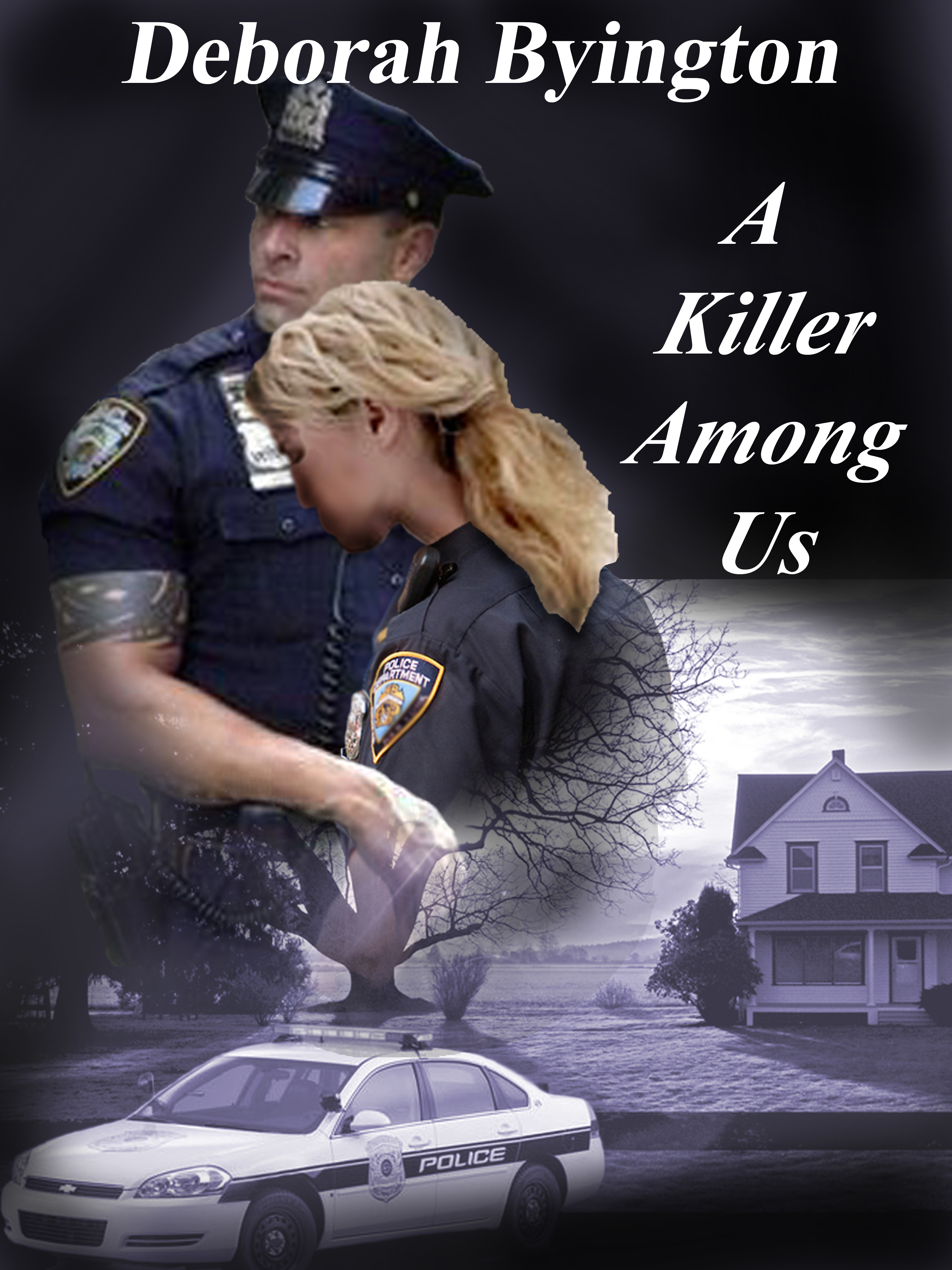
I’m not going to lie to you, there are serious problems with this cover. Let’s look first at the ones that are visible from the thumbnail, since that’s the first impression most people will get.
- Color and contrast are not dynamic. There are plenty of covers with a restricted color scheme, but they make up for it by high contrast — at the very least, some distinct blacks. Here, though, nothing “pops” to the eye.
- The font is dead boring. The longer I do this, the more I come to believe that a reader should be able to get the tone of the book — if not the actual genre — from the font alone. By contrast, all that the Times Roman-ish font here tells us is that the designer didn’t know what font to use and so chose the most immediate default choice.
- The layout has no focus. The title, the cops, the squad car, the house… all of them are in a contest for the viewer’s eyes, and consequently no single visual element sticks in memory or attracts interest.
Now let’s take a look at what become apparent at a larger size:
- Ouch. The officers are pixelated from blowing up a too-small image, the blonde officer’s head obviously does not belong to her body, her hair is cut out with a jagged edge that threatens to become the real focal point of the cover, and the shadow on her face looks like a can of spray pain exploded in her hand. What’s really distressing about this is that there’s nothing about the final pose that’s dynamic or evocative enough that it justifies all the manipulation; it’s a picture of two cops. Surely there’s another stock photo somewhere of a male and female officer that can serve?
- You might get away with blending layers if the foreground figures are fading into the background, but it definitely doesn’t work when they’re blending into a tree.
- You’ve already established “police” with the two officers. Do you really need the squad car to make it “policey” enough?
- The border at the top of the farmhouse photo only emphasizes that these are unrelated images which have been cobbled together.
Here’s what I would do, if an author gave me this cover as a rough concept sketch:
- Lose the squad car.
- Find a picture of two officers that looks good at the resolution I need and position them on the center-left of the cover, and have them looking across to the right side (instead of their current gaze, which looks like they’d rather be somewhere more interesting off to the left).
- Place the farmhouse on the right, in a position that indicates that it’s clearly background to the officers. The human figures are the focus; the house is backdrop. If the original farmhouse picture didn’t have enough sky to fill the space, I’d cheat and borrow sky from some other source (sky is really easy to blend together), letting it get darker and sunset-like toward the top.
- Tie the officers and the farmhouse together by color. You’ve got a late-in-the-day vibe in the farmhouse pic, so I’d experiment with oranges and reds to bring the two images together. Orange and red are also “danger” colors, which fit in well with the crime-thriller theme.
- Put the title at the top, byline at the bottom, and find a good font. (The easy way to do this: browse police thrillers on Amazon and see which covers stand out at thumbnail size because of strong fonts. Then go to a free font site — FontSpace.com and FontSquirrel.com are good places to start — and find something that approximates what you found on Amazon.
Good luck!
Anyone else have comments?