The author says:
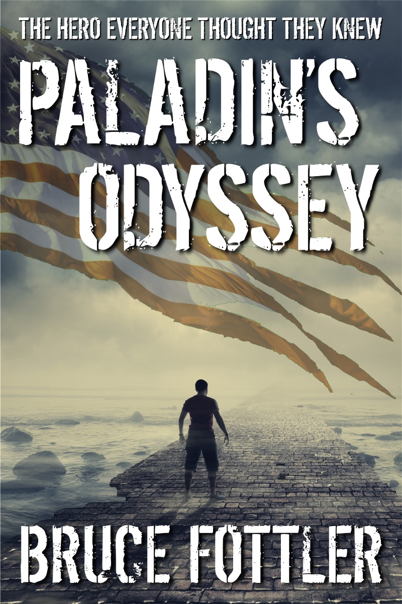
Resubmit number three. A change of direction as I found an image that I think better conveys the story. It keeps the torn flag imagery but creates a new focus on the character and his odyssey.
Nathan says:
[Note: You can see the previous covers here and here.]
It’s a terrific cover. One thing I would experiment with is deepening the saturation at the very top and very bottom — enough to give the cover a bit of eye-catching color, but not enough to overpower the post-armageddon vibe of the rest of the color scheme.
Other ideas?
That’s awesome — I didn’t think the other ones were bad at all, but this is raising it to another level.
Agreed.
This is very nice.
I am seeing some artifacting in the flag, especially in the red stripes. Soften up those jaggies and you have a winner!
Nice job, indeed! Congratulations! The cover looks very professional!
My only suggestion might be to increase the saturation in the flag every so slightly–perhaps in just the central area–so that it reads more immediately. Because the blue field of the flag is largely covered and the color of the white stripes is the same as the sky, I’m not sure if it’s readily apparent that the wavy brown stripes are an American flag. I can easily see where at first glance they may be taken as the results of claws ripping through the light ground revealing a darker background.
It’s a shame it doesn’t have that eye-catching color. If this could be added without detracting from the cover in any way, it could make a huge difference.
**Whew** I have to confess that I was nervous about resubmitting this one because I very much liked how it turned out. I was afraid you’d all find a major problem I missed.
I’ll play around with the suggested improvements. Waffles, I hate to admit that the artifacts you noted were actually intentional. I made the outer edges jagged in an attempt to enhance the torn condition of the flag. I guess it didn’t quite work as well as I’d hoped. I’ll smooth them out and see how it works.
Thanks again for your comments on all my cover submits. I wouldn’t have come up with this cover if you all didn’t keep pushing me to improve on the others.
I love it. Maybe make the flag a little clearer as the white especially blends in with the background.
Love it. The only thing I might suggest is to consider an unembellished font for the author’s name. I think doing this will enhance both the title, because of its “stressed” font, and the author’s name for its lack of it. Other than that, nice job.
I like this version too, big improvement. The only thing I can suggest if maybe something off in the distance he’s looking at? Real faint, ruined city or something?