The author says:
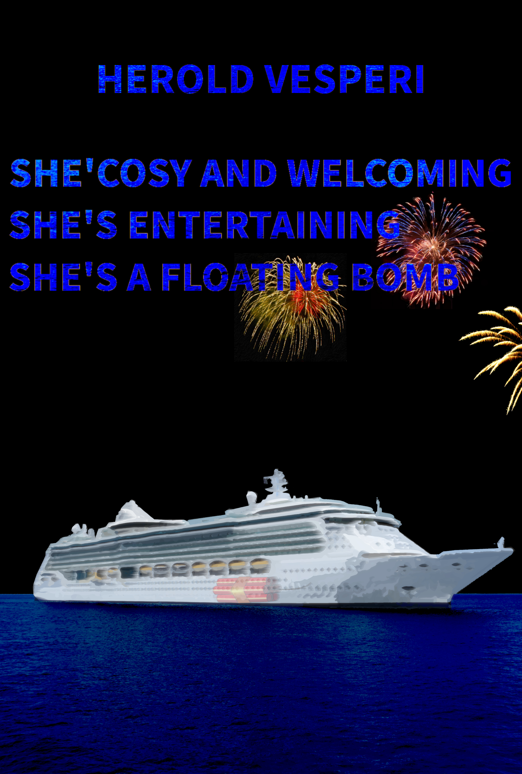
Title: She’s cosy and welcoming. She’s entertaining. She’s a floating bomb.
Subjects: Safety in the cruise industry. Big risks taken by the management encouraged by the cheap money from the financial system. An industry forced to cope with the fossil fuels depletion.
Setting: No precise setting, but a big chunk of the book is dedicated to the sinking of the Costa Concordia which happened in Italy. Style: journalistic approach by a non expert who spent several months collecting information and browsing all the resources. It includes a lot of commentary on the view of the facts presented by the current media overall.
Book presentation on the online publishing platforms: A critical view of the cruise industry. An analysis that takes into account the economical, political and technical side of the problem and shows the inherent dangers carried by the business driven choices that affect the design of the new ships. Compounded by a critical view of the image that we get from a subservient media. Through a review of the way the events of the past were reported and how the stories are still told today this work underscores the weaknesses and the faults that were not meant to be seen by the public, it shows how confusion and misleading reports managed to hide all those flaws and weaknesses in plain sight. It also underscores the lessons that have never been learnt because the business cannot afford to learn while they chase the myth of eternal growth. The result of the frantic search for endless growth can be seen in the huge debts that weigh heavily on the accounting of all the major lines. Debts that dictate the pace of their operations, leaving little time for maintenance. Debts that determine the technical choices behind the design of the new ships. Debts driven policies that leave many open questions about the impact they have on the safety of the passengers.
Nathan says:
Any critique here would have to be divided into two parts: Technical and conceptual.
The technical flaws are what present first:
- You literally have a typo in the first word of your title.
- The title is long and ungainly (three distinct sentences??); it seems more like a subtitle without a title to attach itself to.
- The title is borderline unreadable with deep blue type against a black background, and the fireworks behind it take it from “borderline” to “solidly.”
But the conceptual flaws, which present only when one reads the description as well, are even bigger and more important.
Without reading the description, the average reader would have the impression that this was a (poorly presented) suspense thriller set on a cruise ship. The idea that this is a nonfiction critique of the industry would entirely escape the reader.
Look at the covers of other nonfiction surveys and exposés. They go out of their way to clearly inform the reader — in words rendered in clear, sober type — that this book specifically deals with a particular subject matter.
Go and do thou likewise.
Well, right off the bat, the title is all but unreadable. You need to get a lot more contrast between the text and the background. And try to find a less boring, off the shelf typeface.
The superimposed bomb (I suppose that’s what that is supposed to be) is not working at all. It’s barely visible at full size and will be invisible when the cover is seen as a thumbnail.
I think that the entire cover really needs to be rethought from scratch.
In addition to the comments above:
* If you don’t have one already, you’ll need a much higher resolution image of the ship.
* Lose the fireworks.
Yes, unfortunately–and I have zero desire to pile on here–this cover is not good and it’s not ready for Prime Time by any means. The ship graphic is really poor in quality. It’s low resolution, fuzzy…just not good. The TNT or the Dynamite that’s meant to be in the hold (?) is indistinguishable until you stare at it for a while and prospective buyers just won’t do that.
I get that you’re trying to juxtapose the fireworks (hooray, such fun!) with the bomb (boo, hiss, bad stuff!), but it’s not working. The water is the wrong color and absurdly flat. Andd yes, dark blue text on a black or rich black background is…unreadable at any speed.
I strongly recommend a total rethink. It requires a non-fiction-esque, espose cover, for one thing. Not this, which made every single one of us think “fiction!” initially. I sent five folks over here to look and asked them all–“Is that fiction or non-fiction” and they all chose the former. Taht’s bad, really bad. You are chasing off your own best buyers, who are seeking non-fiction and won’t stop at your cover because it says it IS fiction.
Everybody here has heard me say this far too many times, but your cover is clickbait. That’s its only sole job. Its purpose; its raison d’etre. You are not allowing it to do that. You need to redesign this; use far better graphics; use far more readable text and text colors (for black and/or dark blue, always try a yellow, a pale one, like a lemon-creamsicle color, or white/cream or the like. Or even a screaming chartreuse green, if one must: https://neon-colors.fandom.com/wiki/Screamin%27_Green as an example. You can see that against either black or that dk blue.
So, yes, go take some classes in cover design, through the simple expedient of shopping for competitive-style books on Amazon. See how those folks did their covers. Emulate the ones that sell, conceptually (not literally!). Remember, always steal from the best.
Good luck.
Hoo, boy! Even just from seeing the thumbnail in the feed over at Lousy Book Covers, I could tell this draft was going to have to be scrapped altogether and you were going to start over from scratch. That’s even before I found out this was supposed to be a non-fiction book.
Much as I hate to add myself to the dog pile here, the other critics and our esteemed host are right: this cover’s wrong for your book in just about every way it can be. Over on the aforementioned Lousy Book Covers site, this cover would earn itself the cut and paste, false flagging, font boredom, and typo tags at the very least, and possibly the actual title please, text and more text and WordArt tags as well. (Honestly, with your placement of the title and byline, I thought Herold Vesperi might actually be the name of the cruise ship on which what appeared to be your suspense thriller novel was set.) In short, you’ve done everyone—including yourself—a huge favor by bringing your mistakes to us to be corrected before your cover could end up on Lousy Book Covers (as it almost inevitably would have).
So now that you’ve dodged that bullet, the question is what you should do to ensure your next cover stays off Lousy Book Covers as well. As already noted (several times by several different critics) here, you’re going to have to start over from scratch. In your case, that means even before you try to come up with a new image for your cover, you should try to think of a better title; preferably something “catchy” and more concise.
As Hitch noted, the best way to educate yourself in cover design is to go see what kind of covers are on the more successful published books in your genre. While I’m not sure how many books have been published about the failings and shortcomings of the cruise industry in particular, a rather famous exposé that might be a good template for your book would be Ralph Nader’s hard-hitting 1965 book Unsafe At Any Speed, which exposed how the automobile industry’s corruption and corner-cutting had allegedly endangered a great many of its customers. While there’s been some valid push-back on many of his allegations since then, and the imagery his publishers chose for the cover design over half a century ago would certainly never work today, isn’t that a great title for grabbing a prospective reader’s attention?
Likewise, while some sub-title or tagline for your book is acceptable (Unsafe At Any Speed‘s sub-title was The Designed-In Dangers of the American Automobile) your main title should be something concise and to the point. To spitball a few ideas:
The Bad Ship Concordia
Cruiser Corner-Cutting
The Floating Time Bomb
Death Trap Sailing
Costa Concordia Catastrophe
Again, feel free to add in plenty of sensational extra details in a sub-title or tagline (e.g. How Corruption & Corner-Cutting Constructing the Costa Concordia Cost 27 Passengers, 5 Crew, & 1 Salvage Operator Their Lives), but stick to something short and memorable for the main title; since your book’s exposé focuses mainly on the 2012 Costa Concordia disaster and what this allegedly reveals about the systemic failings of the entire cruise industry, maybe that should be the focus of your title as well.
Once you’ve got your title and sub-title (or tagline), you should then be careful to keep your byline completely separate from them: if the title(s) should be on top, the byline should be on the bottom, or vice versa. How you place them will also (of course) depend on what imagery you use. Considering that the Costa Concordia disaster was well-documented at the time in pictures taken by both amateur and professional sources, you should have no trouble finding a high-definition picture of the ship suitable for your cover that you can acquire for little or no cost; emphasizing that this disaster was a historical event with such a photograph will also help establish that your book is non-fiction.
A final word of advice: try thinking like you’re putting together a promotional poster for some kind of in-depth news exposé film or television special while you’re designing your cover. Just as Hollywood would design its posters for a feature-length documentary about the Titanic disaster very differently from the ones it designed for James Cameron’s fictionalized Titanic movie starring Kate Winslet and Leonardo DiCaprio, you should likewise be thinking like you’re making a documentary—which is more or less what you’re actually doing, albeit in literary rather than cinematic or televised form. In addition to cover design, you should also maintain this mindset while writing the summary and blurb for your book at the sales site: imagine how you’d speak if your book were made into one of those films or TV specials and you were the narrator, and write your description for the sales page in that same tone.
Thank to you all for your the advice. I quickly made an emergency change to fix the typo. Soon it should be visible on the publishing sites (ironically all of them manually reviewed the book, or at least they say so, but none of them warned me about the typo).
I also tried to make the title more visible, but with little success. I’ll need to work more on it.
The comment about the thriller will require some time to ponder. Given the argument my goal was to give a little bit of contrast between the merry and the drama. The drama behind the party atmosphere of a cruise is what I intended to highlight.
I know that a lot of people quickly skip the description if the cover does not look like what they are looking for, but for the moment I’ll have to rely on that to let would be readers know what it is about.
Herold:
I’m sorry, but here is one quick comment/correction: No, people won’t skip the description. They will never click the cover and never go to your sales page.
It’s literally like putting up a “Do Not Enter” sign at the entrance to your own store. That cover is going to stop sales dead in their tracks, not because it pisses people off or they skip the description on your sales page–but because they will never get to your sales page. It’s too bad a cover to make anybody click.
There’s this other bizarro-world school of thought, by some DIY self-publishers, that if a cover is bad enough, bizarre enough, that people will click to see what it is–but that’s utterly false. That’s not how this business works.
I really urge you not to publish your book with this cover, but it sounds as though you already have. Best of luck to you, but…well. We’ve all said our piece. But as the others have said, there are scads of uber-affordable sites with great available graphics AND AI that could really, really help you at dirt-cheap prices.
Hitch
Sorry to say, this does not work on any level. From the low res image, to the unreadable text treatment, to the fireworks. It’s so easy to find a cheap, nice image (try shutterstock). And don’t try to get fancy with the text. I don’t like the title, but at least add a blurb that will tell the reader something about the book.