The author says:
Enter a world where fiction becomes reality… When struggling writer Lucas inherited a mysterious book from his grandfather, he never imagined his own literary creations would spring to life from the pages. But after his fictional protagonist Easton escapes the book and begins exploring our world, Lucas finds himself trapped within his own magical story. Now, he must navigate a perilous fantasy realm, facing dragons, trolls, and warring kingdoms as he searches for a way home. But the line between creator and creation blurs as Lucas discovers the consequences of his writing extend far beyond the page. With each twist and turn, this gripping portal fantasy explores the power of imagination, and the bond between an author and his fictional characters. Can Lucas escape the book, and reclaim control of his life? Or will he be forever be lost in a world of his own making…
Nathan says:
I like the concept here. Let’s see if we can tweak it:
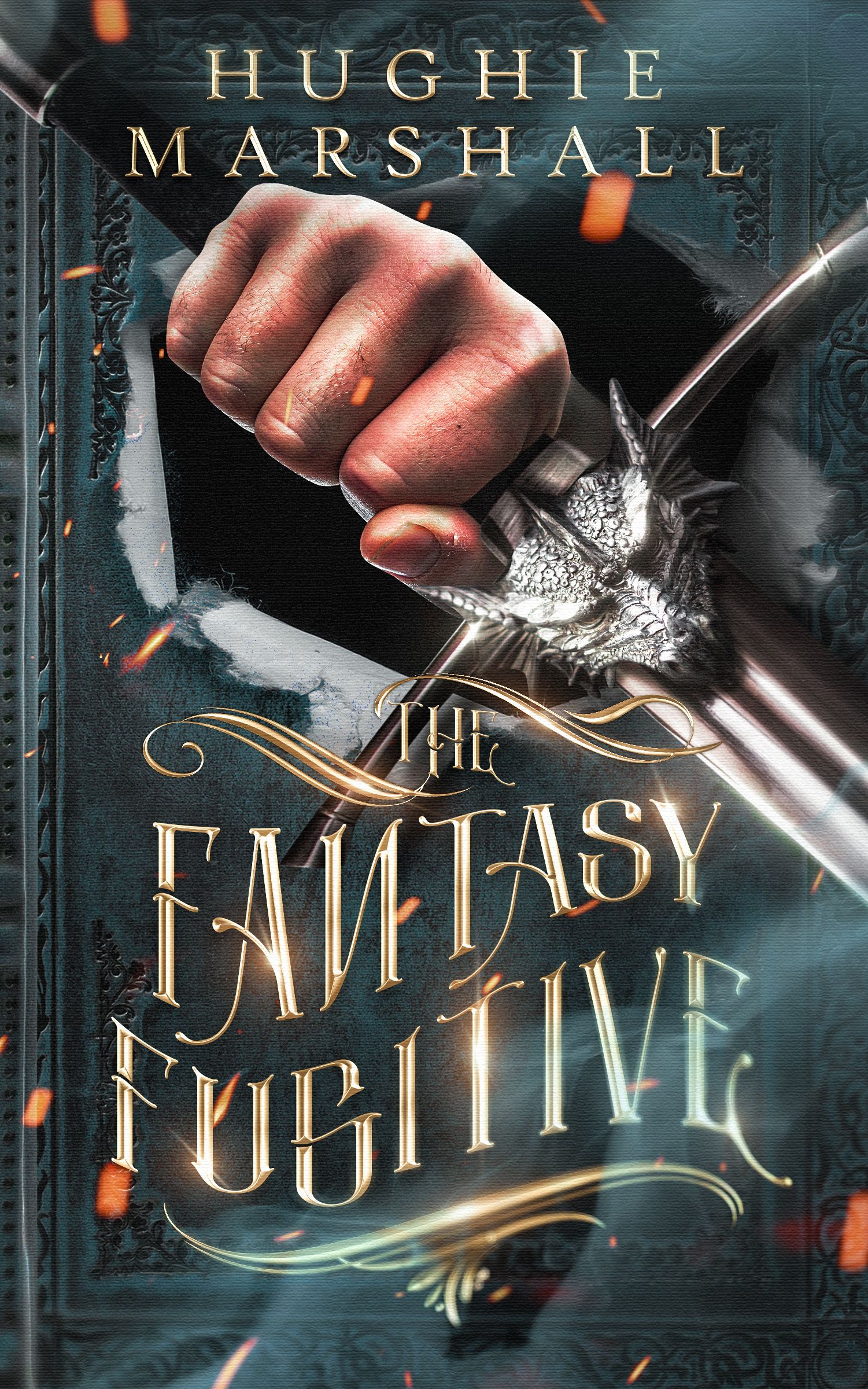
- As you can especially see in the thumbnail, the hand is a lot more immediately visible than the sword it’s holding; in fact, in the thumbnail, the sword is overlooked entirely. Reducing the contrast on the hand and making the metallic areas brighter could even this out; you’ll have to test it with various settings.
- The big problem here is that the title ends up being unreadable when you combine an ornate font, metallic effects, WordArt-style distortion… When I saw that there was also a reversed letter, I could imagine a reader saying, “Screw that,” and turning his attention to another book entirely. Remember that the primary point of type is to be READABLE. I would start with thicker letters (either a variation of this font, or another font altogether) and again, use the thumbnail as a guide.
Other comments?
It’s a nice idea…but far too overdone. The type is overdesigned to the point of illegibility, the decorative swashes serve no purpose other than to further obscure the art and the designer apparently felt compelled to throw in the gratuitous glowing spark-things that seem to be an obligatory addition to every fantasy cover whether they make any sense of not. The covmr needs to be simplified and given more focus.
A writer gets trapped in a fictional world he partly authored himself? So… it’s a kind of mash-up of the premises of Sega’s Comix Zone, Cool World, The Pagemaster, The Neverending Story, and (to a slightly lesser extent) Jumanji? Well, I suppose there may well still be some innovations in fiction to be made from this particular kind of story.
As ever, the new must be born from the old, however. Examining the promotional materials for the works I’ve just mentioned (video game box art, movie posters, and—well, The Neverending Story was a book before it was a movie, so you might want to have a look at what kind of cover it had before marketers started slapping images from the movie on it) should be particularly instructive for designing your cover. You’ll doubtless want to add your own unique spin to the design, but all such designs need a foundation before you can start adding things to them, see?
As for what you’ve got here with this draft? Well… at best, I’d say you’re trying too hard. All the basic elements of your story are on the cover, but that’s mostly why it doesn’t work: all of the elements are there at once, strewn rather haphazardly around the cover so that none of the meanings of those elements are immediately accessible to the viewer. The first element to draw one’s attention is the hand, seemingly balled up into a fist; it then takes more time than any casual browser on Amazon or Barnes & Noble (or whatever) has to realize the hand is actually wrapped around an ornately detailed sword hilt, and then that the hand and sword are bursting out of an old-fashioned vaguely medieval-looking grimoire cover (much of it hidden under the gaudy and needlessly complicated metallic lettering of the title).
Besides all that, this cover draft also seems to over-emphasize the “medieval fantasy” elements of the story at the expense of the “writer gets sucked into the story he was writing” element which is pretty much your book’s central premise. In the genre of fantasy, the whole “swords and sorcery” sub-genre is getting pretty crowded these days, whereas the “protagonist gets sucked into a story within this story” sub-genre has only produced relatively few well-known works. (Aside from the ones already mentioned, I can’t think of many more; The Last Action Hero, maybe?)
If anything, I think rather than showing the protagonist trying to break out, your cover should show something about how he got pulled in to the story’s world in the first place; maybe a shot of him sitting at his writing desk with a pen in hand recoiling in horror as somebody’s gauntlet-clad hand reaches out from the book and grabs him by his shirt’s collar to haul him into it. Alternatively, depending on how up-close-and-personal the tone of the story is, you could show that hand emerging from the book and reaching toward the fourth wall to grab the viewer. The point of your cover is to grab and keep hold of the prospective reader’s attention long enough to convince him or her to take a closer look at the sales page; if your picture is an almost literally gripping image, that’s so much the better for you.