The author says:
Salmon Fishing In The Yemen meets Pulp Fiction. This is a crime/comedy novel – with added salmon! Set in modern-day Scotland it involves a scheming Russian oligarch and his bungling henchmen, an ardent eco-protester and a faded Hollywood bombshell trying to revive her career by doing a stint in a Glasgow panto. The hero is an itinerant loner who lives off-the-grid ( a sort of modern-day “man with no name” – which is why the title is a pun on a Clint Eastwood film) who has a very individual sense of right and wrong and a creative way of bringing the wrongdoers (in this case the Russian and his henchmen) to justice.
The book is aimed at lovers of Carl Hiaasen, Tim Dorsey and other “Florida noir” writers where Florida is replaced with Scotland but the overall tone and feel of the story is the same. UK writers in the same vein would be Caimh McDonnell and Keith A Pearson. It is the first in a series of books featuring this hero, Cullen, and all titles are puns on Eastwood films (Pale Ale Rider, Bronchial Billy, Dirty Barry, etc) and share similar style covers.
Nathan says:
Hmm… This one’s difficult. I have no doubt that current “Florida noir” novelists could use a cover like this, but in their case, the biggest draw is their name on the cover — that one detail tells the potential reader a lot more about the novel than anything else on the cover.
I don’t know. I can see that the gunsite is an attempt to add some crime/danger to the mix, but I wonder if it’s enough. Here are the things I would try, and then A-B test them with my friends:
- slightly less goofy typefaces on the title/byline
- adding “A Cullen Crime Novel” above the title
- changing the background “sky” so that it starts as burgundy at the top and fades to the current aqua by the horizon (I don’t know why, it’s an idea that just struck me)
Other comments?
It reminds me somewhat of many of the covers Christopher Moore has had…but A. his name is well-known and B. the covers form a kind of branding.
While the artwork is really very nice I am not sure at all that it conveys and real sense of what your book is about—at least not as described. The lightness/comedy, perhaps…but that is not enough: it’s much too broad. The cover needs to be a little more focused than that. You need to convey some idea of the theme of crime, for one thing, let alone the time, place and characters—especially since you would seem to have a pretty colorful collection, from a Scottish setting to faded Hollywood bombshells, Russian Oligarchs and grubby anti-heroes.
Not one of which is even hinted at in the cover.
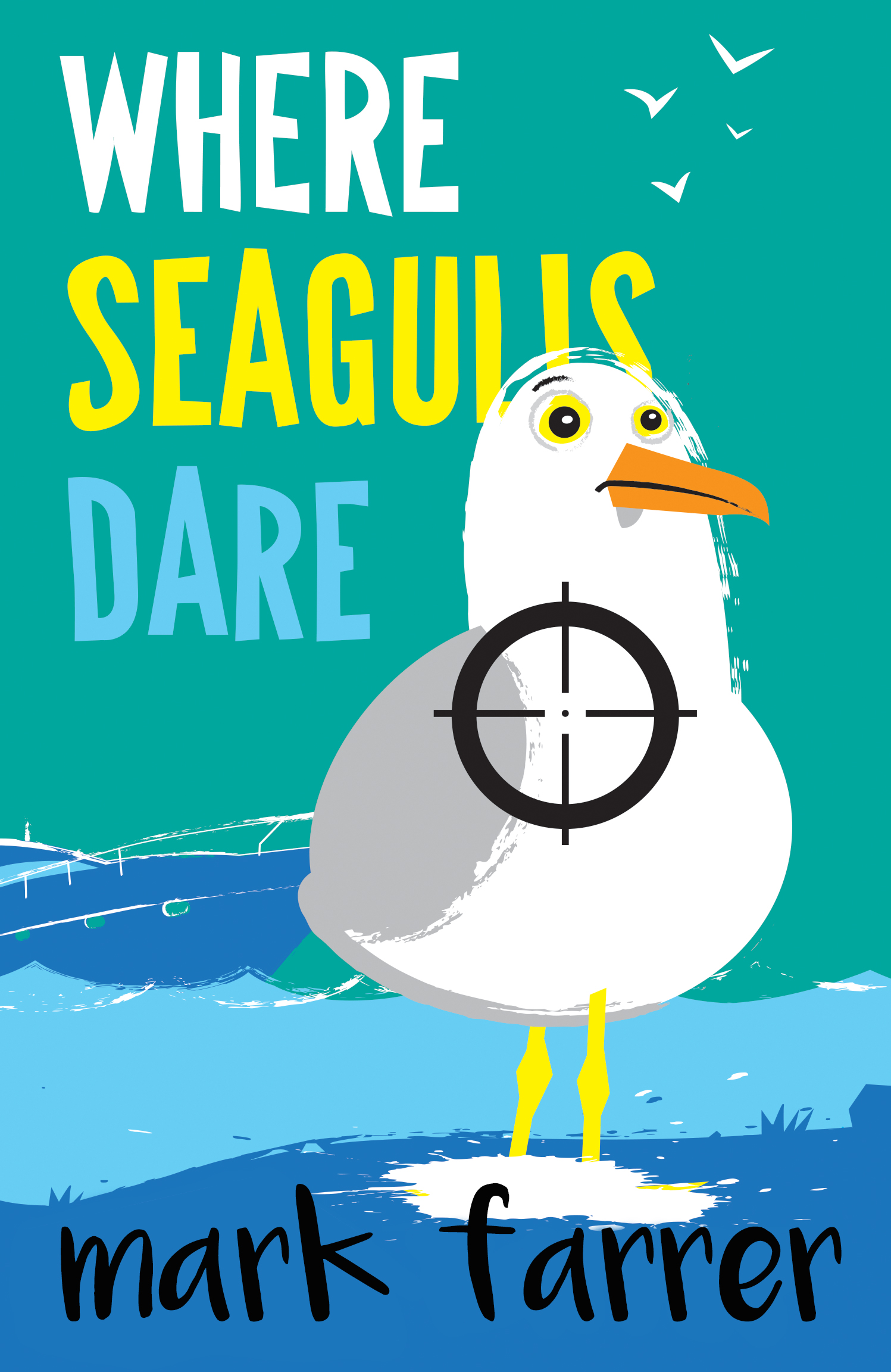
A seagull with the reticle of a gun sight superimposed does not remotely do the trick.
I think that perhaps subjectivity has gotten in your way here: YOU
know what the book is about so everything on the cover—from title to imagery—has some immediate significance for you. But this would not be the case for the uninformed potential reader.
Frankly, as nicely done as it is I really think you need to consider redoing the cover art entirely from scratch.
(By the bye, your explanation about why the title—and all the titles in the series—is a pun on an Eastwood film title seems a little too much of a stretch.)
Further: Without knowing anything else about the book and going just by my first look at the cover, I thought it was going to be a comic novel with a seagull as the lead character.
I mean, there is the title, this terrific-looking funny seagull and the word “seagull” emphasized.
Yeah, I admit it. I thought it was going to be a humorous novel around a seagull, or something sea-wildlife-y, too.
It is really well done, which makes me reluctant to say it’s not right for the book. But I’m not sure that it’s the right cover for this book. As mentioned already, Hiaasen has a name as do the others and that’s what sells those, not the covers.
Not quite sure what to suggest, to be honest. I like that you’re homaging Hiaasen, et al, but this needs a bit more edge. IMHO.
Lastly, I am a big Eastwood fan and nope…I didn’t get that Where Seagulls Dare was a play on an Eastwood (particularly) film; I assumed it was a play on the Alistair MacLean book/movie, Where Eagles Dare, of course, but I’m not sure that anybody would immediately think, “Eastood.” My immediate thought was “Burton.” (FWIW). (If you stick with it, I’d at least go with Ale Rider, rather than Pale Ale Rider.)
I know what you mean! When I saw the cover I really liked the art a lot…and was completely taken aback when I read the description of the book.
I’m glad to see that you second my thoughts about the title.
I agree with Ron and Hitch; the cover is great but not for your book. You need a new one.