The author says:
The Hoarders have taken control of the world’s resources and withdrawn into massive fortified enclaves. Without their knowledge, people scrambling for a living outside of the walled cities are being snatched and implanted with tech that renders them into zealot-like killing machines.
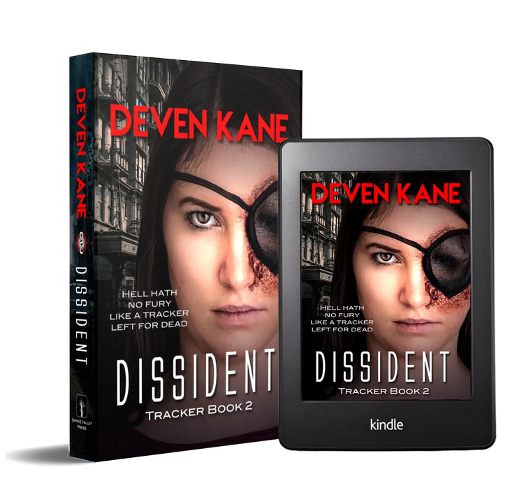
This book is the second in a trilogy with YA, Sci-fi and Dystopian markets in mind. It is an ensemble cast, set in our world, Pacific Northwest, probably Seattle area.
Nathan says:
Any time we look at a later book in a series, we need to also ask, Does this continue a steady branding from the first volume? Because if any changes we suggest break the branding continuity, then it’s not helping by helping.
For reference, here’s the first book:

I can see that you’ve got a common eye motif going here, but I think it’s more cerebral than immediate, i.e., someone looking at the two covers might think, “Oh, *I* see a common motif!” but someone just glancing at the covers won’t immediately relate Book 1 to Book 2. That might be an easy fix: Move the right eye to the same position on each cover. You might also experiment with some texture over everything but that right eye, so that the bright skin tone doesn’t stand out so much, and add something to mimic the “divided” appearance of the first cover.
Other comments?
Nathan makes some good points, as usual.
I think that the cover really only needs some fine-tuning.
I am not crazy about how the girl’s face runs off the right-hand side, cutting off the patch. For one thing, it makes her good eye, which is near the center of the cover, a little too prominent. It actually dominates the cover.
But then…if there is more patch showing, it would really just be a black shape in the middle of the cover. Perhaps something more interesting could be done with it.
Nor am I sure that anything is gained by the inclusion of the building in the background. It seems to add nothing to the effectiveness of the cover.
IDK. I sort of feel like the patch is far too new and shiny-looking for a dystopian future. I mean, isn’t dystopian by definition sort of grungy, second-hand? (I do realize that it can have bright/shiny elements, à la Hunger Games’ cities, but still.)
In fact, the whole cover is much brighter than the first. There’s not much Dystopian about it. Presumably, the prospective buyer will know it’s SciFi, know it’s Dystopian..because without already knowing that from the first book, I don’t see that on the cover. Other than the title font, which arguably says Sci-Fi. All in, this cover could be Action-adventure; Dystopian; a mystery; military adventure…just saying.
Other than that…it’s a perfectly serviceable cover. I cannot tell a lie; it doesn’t knock my socks off. I don’t think that shifting the girl’s head will make it a sock-knocker, either. I don’t have any great suggestions for fixing it, which means that I suck. Sorry, hopefully some of the others will have better, more usable suggestions.
I like it. I have a tiny suggestion, adding some detail to give the picture life, specifically adding light to the building to make it look like part of the scene and some motion to her hair so the pic doesn’t look so static. I’d probably add some additional scene behind her head and likely beneath the text continuing the building but very faint and shadowed or even adding some vague high tech or archaic shape, something obviously -different- from normal.
I made her lips less smiley and more angry but it needs work, I’d also probably thin her face just a bit too and probably add a few more scratches or bruises and maybe a hint of tech to the patch (I was thinking a hair more mesh like or older ripped looking cloth)but I’m okay with it as is.
(example, I didn’t touch the tablet version) https://imgur.com/a/DP4iuVJ
But all of that was just nitpicks, it’s a good cover. If I were trying to match that other cover linked here I’d put more texture on this one but I like this cover better because it’s much easier to see what’s going on so I’d go easy on that texture.
Shel–here’s my question, though.
If you hadn’t seen the description, what would YOU think this novel was about? What genre? I realize that the publisher here has an advantage–an extant fan base or reader base, from the first novel, so perhaps it’s not as important–but I just…I don’t necessarily get sci-fi, or dystopian, OR YA from it. That’s my kibitz.
The character looks more like a MI5 villain than a survivor of a dystopian future and, as you say, I don’t see any of the genres mentioned on the description.
To be honest, I would have had no idea that the setting of the book was a dystopian future just from the cover alone. Were I seeing the book for the first time—being unaware of anything previous in the series—I would assume it to be just some sort of contemporary thriller. (In fact, that’s what I did think since I like looking at a submitted cover before reading any description of the book.) This is where a better use of the background might work. At the moment, the static shot of tenements really conveys nothing of setting or time. (This really goes for the cover of the first book, too, as attractive as it is: it says very little about the actual nature of the novel.)
The description talks about walled cities and fortified enclaves. Where are they? Where is any hint of the implanted tech that turns people into killing machines? None of that is even suggested by either cover.
The cover is “serviceable” as Hitch says…but it doesn’t serve your book as well as it could.
Frankly, you might ignore much of what I said in my original post since none of my suggestions really address the main problem with the cover.
I would have thought dystopian/futuristic because of the damage to the eye. It isn’t the sort of wound young girls walk around with now. A hint of grit in the black bits would really bring that home.
I think the face could actually be smaller to show the background a hair more and add some dystopian touches to that. Or move her over and cut off a bit more of the patch. but I really do think it works as is.
I think this art will really appeal to it’s target audience. Especially if there’s a hair more color/light added to the building so the buildings don’t look like a novel background but an action background.
Funny thing about this cover: the first thing it brought to mind was one of the pieces of box cover art for Command & Conquer: Red Alert 2. Then I also got to thinking of the character Eden Sinclair from the 2008 movie Doomsday, occasionally shown wearing an eye patch over the cybernetic replacement for the (right) eye she lost as a child. While these aren’t exactly the same kind of stories as yours (Red Alert 2 is an alternate-history real-time-strategy war game, while Doomsday is basically Escape From New York crossed with Mad Max: The Road Warrior), I’d say at least your story’s genre is within striking distance of theirs. As such, you might be well-served to modify this cover just a little to copy the aesthetics and general tone of their box art and movie poster advertising.
Following the example of Red Alert 2, I’d recommend pulling back from your (protagonist?) cover model’s face just a little bit and centering her on your cover in the same way the Soviet officer is centered in that box art. While her face is both beautiful and distinctive, she’s obviously not all there is to this story, so you should leave a little room for background imagery to show… well, some of the background of this story as described in your synopsis. On that note, like the backgrounds for both the Red Alert 2 box art and the Doomsday movie poster, you should give us a glimpse of something distinctive from the background of your story.
The rather dreary-looking tenements behind the gal on your current iteration of the cover do hint at the grim tone of your story, but on the whole, they’re awfully generic architecture that you could find in almost any modern city these days. Instead, why not show us one of those “walled cities” you mentioned in your synopsis? For all the border walls going up in our time, a walled city is not something we typically see these days; so, if you allow prospective readers to glimpse a somewhat derelict-looking version of—say—Seattle (sort of like how it looks right now, except even worse) lurking in the background behind the gal with a rather hastily-improvised-looking wall around it, you’ll have the tone of your story and a fairly informative overview of its setting and situation all established in one shot.
Basically, you’ve got a pretty decent cover here that has some distinctiveness already; all it needs is a little more.
I’m not as sanguine about this as RK is. I think for a reader to make the connections he suggests there needs to be a preexisting familiarity with the books/games he refers to. But I think that if someone sees these covers cold, on a shelf or on a website, with no preexisting knowledge, they would be hard put to know that either book is about tech-enabled humans living in walled enclaves in some dystopian future. The books may be intended for the “YA, Sci-fi and Dystopian markets” but I don’t think that comes through remotely clearly enough…especially the YA angle.
Technically, I’m not suggesting the readers should connect these books to Red Alert 2 or Doomsday; what I’m saying is that those works’ aesthetics were pretty straightforward about what they were advertising. Red Alert 2 was basically about a tech-enabled Soviet invasion of America in an alternate timeline’s version of the 1970s; Doomsday was about a vaguely dystopian future in which the surviving residents of a plague living amid the ruins of their cities in walled-off Scotland have descended into barbarity and cannibalism. Are you picking up on some of these things in their box/poster art? I sure am.
As for the subject at hand, the main problem I’m seeing is that pretty much only the (presumed) protagonist appears on the cover, with the background being either all but non-existent (first book’s cover) or irrelevant (second book’s cover). The guy on the first cover is properly positioned and the gal on the second cover looks appropriately distinctive for having that eye patch, but again, they’re missing background. The only context provided (the shattered window and the decrepit-looking tenements) is generically gloomy stuff that tells us nothing specific about the situation.
One reason I’m rather sanguine about these covers is because the necessary tweaks to fix the cover are so easy to find: The designer informs us these books are set in the “Pacific Northwest, probably Seattle area,” right? If nothing else, a depiction of a ruined Seattle complete with a shot of its distinctive Space Needle looking rather decayed and rusty would sure say a lot to the prospective reader, don’t you think? Even if Seattle is never actually mentioned in this book (because the characters either don’t actually go there or don’t remember what the city’s name used to be), a shot of that in the background would say just about everything the cover needs to say, in my opinion.
One reason I could hardly help laughing when the synopsis mentioned the book’s setting was that it made me think of a joke from the Honest Trailer for the 1987 movie Robocop: “Journey to a futuristic Detroit that’s become a bankrupt crime-ridden hellhole! [Cuts from some of the movie’s footage to real-life pictures of the ruins of several of Detroit’s abandoned buildings.] Basically, present-day Detroit.” So now we have a trilogy of futuristic books about a dystopia somewhere in the vicinity of Seattle, in which a privileged group hide behind their city walls from an anarchic wasteland full of violent thugs? Sounds a lot like present-day Seattle to me… except, you know, with the thugs being the ones skulking around an anarchic wasteland behind barrier walls inside the city (until CHAZ or CHOP or whatever they were calling it fell apart and got dismantled) and the “privileged” being the ones outside those walls; and, well, those thugs don’t seem to be cybernetically enhanced as yet.
Seriously, though, the gal with the eye patch would work just fine on her book cover if she were properly centered just like the guy on the first book’s cover. Both covers would also be so much better if the protagonist had a shot of a walled-off Seattle (with that Space Needle clearly visible) lurking somewhere behind him and her. After that, all that remains to be done is the captioning; and I’d say the title and byline and tagline are all pretty good as they are.
I agree with you about the placement of the girl’s head (and replacing the block of apartments with ruins). The patch would then be a pretty large blank black shape on the cover and would probably dominate it…maybe a good reason to take Hitch’s advice and break up it’s surface in some way.
Well, the patch could be smaller. That probably wouldn’t be too difficult a manipulation for the designer, especially since I suspect the patch on this cover is already a cut-and-paste job. It’s not cheating as long as you don’t get caught!
A quick google image search for the descriptors you used to describe your book, “YA Sci-Fi Dystopian,” brings up a host of covers for similar stories. Many of these covers use the same three building blocks – (1) strong title typography, (2) a silhouetted or highly contrasted central figure who is set against (3) a background that gives some indication of the setting and genre lean (alien saucers, ruined cities, steampunk gears, etc.) Your cover seems to have all of these elements, but each could be improved. Your typography is consistent across the two books, but it isn’t memorable. The font for the author name seems quite generic. There is a lot of room for improvement and distinction in your typography. The image of the model you have chosen is not bad, but the very static pose and lack of color correcting make the stock image quality obvious. Additionally, she is a bit too large in my opinion. Finally, you give a hint of a dystopian background, but because the model is so large, we don’t see enough to know what is actually going on.
As Hitch mentioned, this cover is serviceable. But I would encourage you to see this as a draft. Now that you have identified the basic elements for your cover, I would work on fine tuning them. My practical suggestions would be to (1) continue working on your typography to create a more distinctive brand. Typography is one of the most distinctive elements on YA Dystopian covers, and is often what links the series of covers together. (2) Shrink your model. This gives you more space to show off your distinct brand of dystopia through the background. I also love Shelley’s idea of adding some windblown hair strands to bring some movement to the cover! (3) Make sure you choose, or ideally craft from several images in photoshop, a background that is distinct to your series and gives the readers some information about your world and its setting. (4) Color correcting! Most YA dystopian novels have high contrast and distinct color palettes. I know I am repeating a lot of the critiques already given, but I think all of these points deserve reiterating!
I definitely think this cover fits more with your desired genre than your first. I would recommend working this cover to completion, with distinct colors and typography to define your series, then reworking your first cover to match this one.
I certainly agree with Emma, with the caveat that the dystopian connection is not really apparent at all…in either cover. Making, as Emma suggests, the face a little smaller and choosing a background image that is clearly and unambiguously that of a ruined city would help immensely. The next trick would be to make sure that it is clear that the setting is in fact the future and that the story is not set in the present or in, say, some ruined city in Poland during World War II. You need to make sure there is a visual connection with the future. Perhaps something to suggest the implanted tech you referred to. That would do the trick very nicely.