The author says:
The Renegades is Book One in a New Adult, dystopian science-fiction series, set in a near-future US, in a state no longer run by elected government, but an oppressive, high-tech corporation. BACKCOVER TEASER: “When everything has been taken from you, do you try to return to the past you lost, or take a leap of faith into an uncertain future?”
Nathan says:
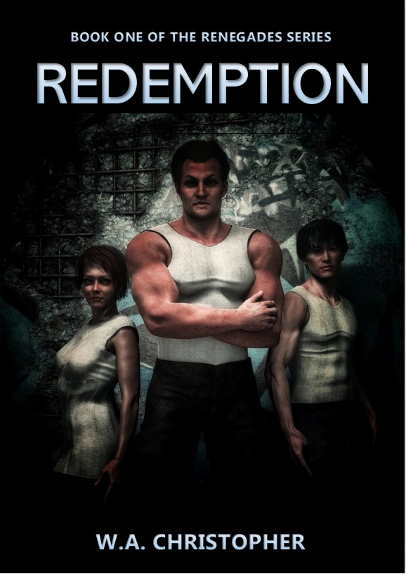
First point: There is no reason to use Poser or any of the other “pseudohuman”-generating tools anymore. Say what you will about AI, but its images don’t have limbs looking not quite right, as the main figure’s right arm does.
Second point: Everything’s awfully murky. From the lighting, it seems like the main figure’s pecs or forearm are the most important part of the image.
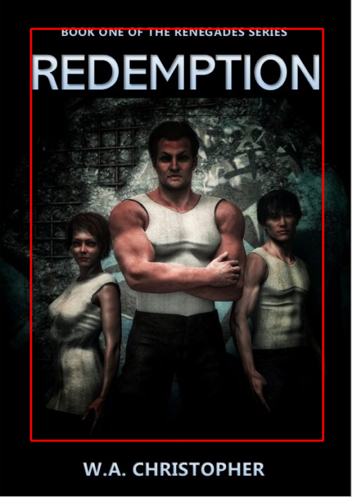
Third point: A lot of wasted space. There’s no reason that the image could be trimmed like this to make it more visible in thumbnail:
 Fourth point: Nothing in this cover — not the main parts of the image, not the typefaces — say “dystopian science-fiction series.” (Maybe the pattern behind the figures is supposed to convey that, but “maybe” doesn’t cut it.) One of the first things your cover needs to convey is the genre, to let fans know that this is a book for them.
Other comments?
With all due respect to our esteemed host, AI actually does tend to screw up limbs and (especially) digits in certain ways: extra fingers and/or limbs on people sticking out at unnatural angles are one of the many telltale signs of a picture’s being AI-generated. That said, unless what’s dystopian about the future depicted in your novel is that everyone is forced to be plugged into some kind of crappy virtual reality simulator (like e.g. Mark Zuckerberg’s Meta) where everyone’s avatar looks like one of the plastic-skinned people from a cheaply rendered 3D porn game and everyone (including girls and women) is forced to wear the sleeveless and collarless white undershirt colloquially known as a “wife beater” on said avatar as well, the cheaply rendered plastic-skinned models of Poser (or whatever software you’re using) are not the right kind of imagery for your book’s cover. Even though you’ll probably have to tell the AI image generator to re-generate an image several times before it gives you a believably realistic scene from the dystopian future in question you’re seeking to portray (and even then, you will probably have to do some fine tweaking in post-production to cover up obvious errors in the rendering), even the not-so-great AI image generators (e.g. Perchance) can probably give you something that looks far better than what you’ve got now.
Also, yes, there’s nothing about the imagery provided on your current cover draft that specifically says “this is about a dystopian future” to me. From the look of everything, I could just as easily believe this is a present-day hard-boiled detective novel about a tough-as-nails bodybuilding private eye (who’s just not into wearing that cliched classic trench-coat-and-fedora kind of clothing; not all detectives are, you know) living in a slum who goes around solving local mysteries and (occasionally) making citizen’s arrests as part of his day job to help feed his wife and son. You want to indicate this is the future—even the near future—you’ve got to show us something—some technology or some kind of behavior—foreign to our rather dystopian now.
What that specifically means for your particular story, I don’t know; that plot summary you gave us is a pretty generic been-there-done-that-and-got-the-T-shirt kind of setting for your story. If the past four years have taught me anything about politics, it’s that just having elections doesn’t mean the officials thereby elected (even making the highly unsafe assumption for the sake of argument that they were legitimately elected) will actually be running your country, state, and/or locale. As demonstrated by some of the scandalous details emerging about some of the rather Orwellian projects e.g. USAID and its network of “Non-Governmental” Organizations (NGOs) have been funding with taxpayer dollars with little or no oversight from our President or Congress or any other elected officials, corporations and other allegedly “non-governmental” organizations have already got a rather disturbing amount of political power and influence over some of our states right now.
As for having “everything… taken from you” and trying to decide whether to attempt to claw back what you’ve lost or take a chance on acquiring something new and different from the uncertain future, see: 2020, the COVID-19 pandemic, and the “new normal” that’s been emerging in its aftermath ever since; enough said! The question concerning your book’s cover amid all these tropes familiar to us here in real life is: what does your story do differently that might be of interest to your prospective readers? What totally-plausible-but-hasn’t-actually-happened-yet event occurs in it that might intrigue them enough that they’ll be willing to buy your book to find out more?
Whatever it is that’s new and different, that’s what needs to be on your cover. Not to put too fine a point on it, but if somebody were to release a novel right now about a shadowy cabal of corporations and governments (and those so-called “NGOs”) taking advantage of a worldwide pandemic to enslave and oppress ordinary people and strip them of their liberties in the near future, then (as mentioned) “Been there, done that, got the T-shirt” would be just about everybody’s reaction these days; but if someone (a time traveler, maybe, or a clairvoyant or just someone really prescient) had released such a novel in 2019 or earlier, can’t you just imagine how intriguing almost any of the unusual imagery from these dystopian times would have been to people back then? Said prescient novelist would need only to show a picture of one of our closed-down buildings with quarantine signs that spoke of such then-unknown concepts as “shelter-in-place” and “social distancing” and “essential personnel only” and so forth in order to have the makings of a very intriguing book cover; go thou, and do likewise.
Man, doesn’t anybody else here have anything to say about this submission?
RK: Mon sweet, after your thoroughgoing analysis, what’s left to say? Seriously, you and our esteemed host have covered it all. There’s no indication of genre, no indication of Dystopia, Sci-Fi, anything. It could be about anything at all. (I concur, BTW that AIs still tend to turn out polydactyl creatures, humans and others alike—but still, they are vastly, vastly better than whatever turned this one out!!!).
To me, it’s a total overhaul. Start over; and figure out what needs to be conveyed on the clickbait, er, cover first. Not last. And for the love of heaven, there are a bajilionty Sci-Fi fonts out there, most are free or nearly-free that would scream, at least, it not more “SCIFI HERE!” Use a grunged Sci-fi font, and you’ll be halfway home on genre identification. Something like Duster, maybe. Or Broken Drive. But, you gotta get there from here.
And omg, can we get some action? That pose looks like I’m getting ready to stream a ModSquad rerun. Don’tcha guys think? (Don’t put the woman in the front, either, please.)
Again–start over—backdrop, dystopian capital or city 0or ?, or a wrecked android or something. And figure out what needs to be conveyed on that cover. The author hasn’t given us enough info about the book for me to guess what should or shouldn’t be on there. Spaceships? Time-travel tubes? Sex bots? I really have nothing to suggest yet.
Sorry, RK, that’s all I have in me now, bud. –H
Thanks to everyone for all of the comments,and for taking the time to make them. Sure, a lot of it stung a bit, but that’s part of the process, isn’t it? Getting the honest thoughts that friends and family are too scared to tell you. 😀
If it taught me anything, it’s that I should probably leave cover designing to the professionals from now on. And that’s okay – I don’t mind staying out of a wheelhouse if I know I don’t belong there. Thanks again for being so honest with me – I mean that, you’ve saved me from making a proper chump of myself, and I’m grateful.