The author says:
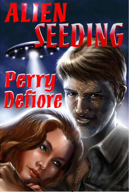
Alien Seeding is the story of an architect, returning from a project in Mexico. Somewhere north of Laredo, a pale illumination bathes his car in light. He’s abducted by aliens, endowed with a magnetic attraction for women, and sent out to be an ‘alien’ seeder. Art by Gabe McIntosh, fontwork is mine.
Nathan says:
The biggest problem that I see is that the byline placement seems more like “Oh crap, where am I gonna fit this?” rather than planned. If there is any more bottom margin in the original artwork, I’d put it across the bottom; if not, in the bottom right corner.
The other problem is that the font chosen seems corny. If that’s your intention, great; there’s nothing wrong with a tongue-in-cheek alien abduction story. If not, something more serious — epic, even — might suit your purpose better. (I tried to find covers to some serious alien abduction novels on Amazon, but it’s awash in alien-abduction romances — not the same thing.) Here are some ideas:
Other comments?
Professional book illustrators will leave at least 1/3 of a cover available for type. Sadly, the illustrator in this case didn’t bother, forcing you to cram your title and name into whatever space happened to be left over.
A good example of what I mean is this illustration a friend of mine did. http://www.stephenhickman.com/Miles-Errant.jpg
Nathan is right about the typography. Aside from the choice of typeface, there is really nothing gained from the addition of assorted special effects, none of which are applied consistently.
I’d guess the font style was chosen to echo the tongue-in-cheek sci-fi comedies like Mars Attacks, Spaced Invaders, or Earth Girls Are Easy.
Supposing I’m right, the effects aren’t doing it any favours. Check out those movie posters to see what they did.
It’s a shame your artist didn’t give you more room for typography; it really limits your layout options!
You’re right, it’s a darkly funny story in a 50s pulp style.
In that case, play it up. Use exclamation points and overblown language. Leave no doubt.
Yes, I agree. (And a wildly different font.) I really was NOT sure and that makes it hard to judge, in terms of reading material and one’s immediate reaction to it.
This does look pretty tongue-in-cheek, kinda like the album cover for Thomas Dolby’s Aliens Ate My Buick. (Album covers being square, of course, he had much more space for his title and byline than you do.) Is there any chance you could convince the artist to raise the image about a tenth of the way up the cover? You wouldn’t have to shrink your title too very much to fit the remaining blank space up top, and it seems to me that just as people don’t care about seeing the characters’ feet, they also wouldn’t mind too much if anything below the gal’s lips (e.g. the guy’s arm) were to be covered up with your byline.
Well, this: “…endowed with a magnetic attraction for women, and sent out to be an ‘alien’ seeder,” sounds like erotica with an alien abduction plotline thrown in.
Without knowing if this is meant to be tongue-in-cheek or erotica, it’s too hard to tell what the font should be. What I do know is that in either case, it definitely should not be THAT font. (And definitely not in that layout. I suggest you go BACK to your illustrator and ask him to do the job a bit better–creating some space for the title/byline.)
Of course, it could very well be both. Ribaldry, which is pretty much tongue-in-cheek erotica, has been around for nearly as long as humanity has. This story pitch sounds very much like an old Aliens Made Them Do It kind of plot, which has certainly been known to lend itself to humor before.
this was my impression, that it was a sci-fi sex comedy; wacky alien sex shenanigans
Perhaps something a bit simpler…
https://i.imgur.com/xnxVpfX.png
https://i.imgur.com/jI0KM28.png
I feel like if the main character man is a seducer, he may have to be more attractive on the cover rather than intimidating. He looks mean. Maybe put him smiling but grinning and only half of his face is strange skin. I feel like as an alien seducer he need to be more cute. Just my thoughts. I think he looks like he’s going to kill the girl not romance her. Or maybe just looking lovingly down at her, or picking up her chin and looking into her eyes. I would not maybe pick it up because of the angry look on his face. Maybe make it more passionate, less angry. I like the font style and the girl. Looks like 1970’s like retro. Cool. Good Luck. Maybe these are girly comments, maybe the book is meant for men?
I can’t imagine that this cover signals that it’s meant for men. It feels like a cover meant to appeal to women–but I could be totally off-base around that.
What’s odd is, you wouldn’t think that a man wants to identify with an ugly protagonist, or that a woman wants to be with one. Hmph.
I kinda am thinking that the storyline of an alien who is irrestable to women sounds very attractive to a man to read I’d think. I feel like the cover tries to appeal to women, but maybe they should try to appeal to a male audience. Men don’t care how good looking the guy is, women do. The guy looks a bit scary, but after all he is part alien.
That creature would need some REMARKABLE pheromones. I’ll say that for it. 🙂