The author says:
Genre: YA Sci-Fi Romance
Like any good journalist, Sloane Masterson, feels compelled to uncover all the facts after witnessing mysterious loner, Hayden Lancaster, perform several superhuman feats. But the truth might be more than she bargained for, and even more dangerous for her heart… Because even at Hayden’s insistence that their relationship must stay in the “friend zone,” their fierce attraction threatens to go supernova. And if they follow their hearts, there might be deadly consequences—Hayden’s intergalactic enemies could permanently erase Sloane’s memories. Now Sloane must make a choice…protect herself or forget the boy she loves forever.
Nathan says:
It certainly rounds the bases for the genre. I would only point out three things:
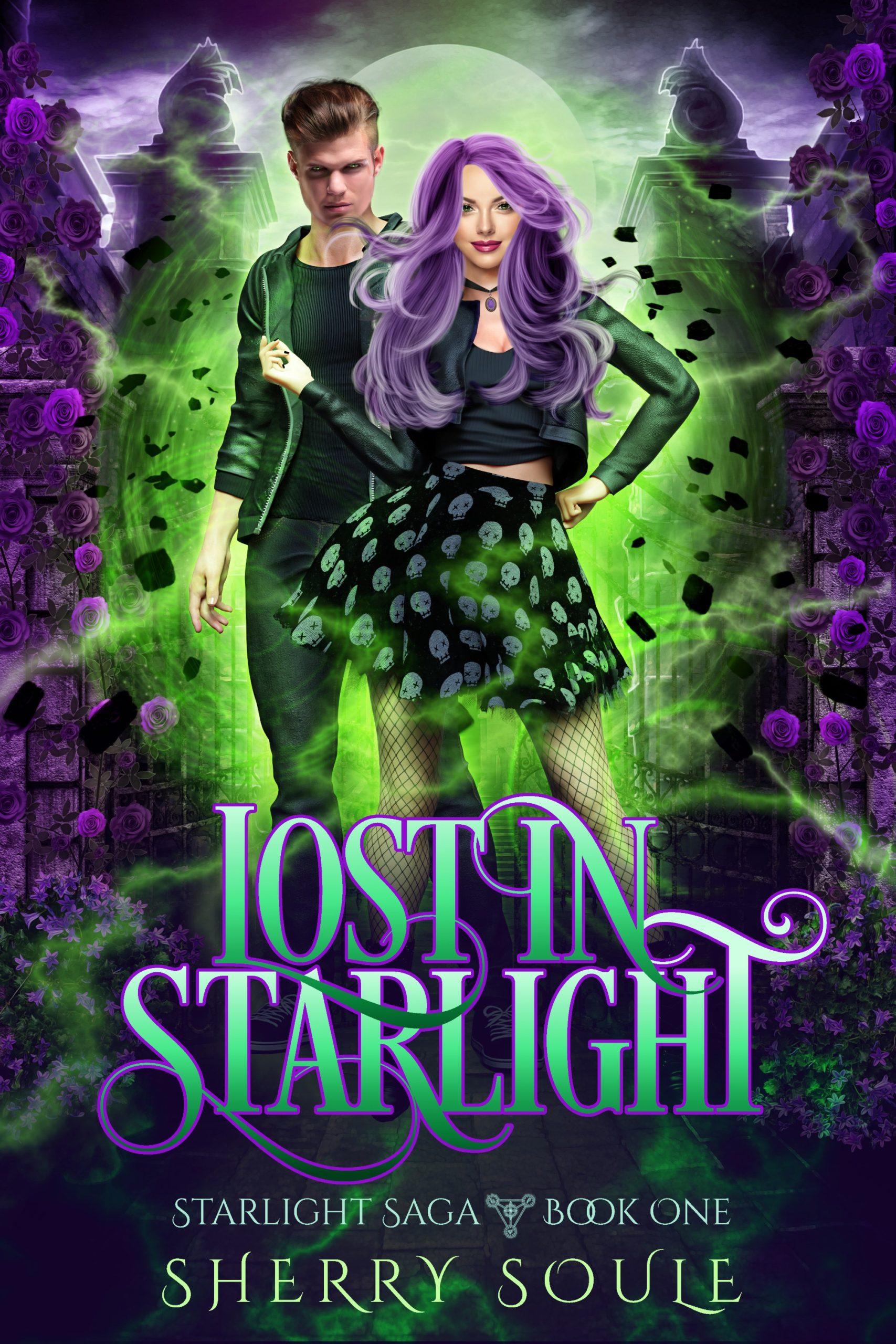
- That male model’s face is waaay too familiar. I wouldn’t be surprised if you found it on the books you’re marketing against.
- The difference in lighting schemes between the two models’ faces is pretty hard to ignore.
- Her hair is not only more stylized than any other detail on either head, it casts no natural shadow on her face; the result is that it looks pasted on.
Other comments?
Pretty cool.
While you’re at it changing out the male’s face, be sure it looks less pasted on.
Pretty good.
You may want to soften some of the cut-and-paste quality of some of the elements. Nathan has already mentioned the male’s face, but the girl’s hair does not look like part of the picture, either.
The background may be a bit much of a much: there are so many overlapping textures that they all tend to blend together into blobs.
The author’s name tends to disappear at thumbnail size.
Pretty good start. My suggestions:
Better color grading and lighting match to everything is in the same space.
Remove the flowers so we can see the background through the “magic” and make it less busy.
To me it looks awkward having main elements of the image so close to the top. If there is more that has been cropped I’d restore it, move the byline to the top and make it more readable, and have the title and sub at the bottom.
I agree with other commentators that the guy’s face looks like it was pasted from a photo, which conflicts with the rest of the cover art. I would also make the bottom type bolder (i.e. thicker lettering) to make it stand out more at a thumbnail scale. Otherwise, very nice!
There are a lot of good intended element inclusions here, but overall, god, it’s busy. I mean, really busy–my eyes don’t know where to go. They tend, after testing a few times, to go to the limey-green “glow” around the two characters. So…around the hem of her skirt, as it happens. Not sure that’s what’s intended, here.
The hair on the girl–that’s tough. I get it, it’s tricky to create purple hair (A Purple Mane! Everybody Sing!) for your heroine, but it’s just…it doesn’t simply say “hey, baby,” it jumps up, bitch-slaps you and drags you down the street sort of hair. It’s too much and not cleanly enough added. If you’re doing this yourself (if so, congrats!!!), you might consider paying a pro to help you with just that element.
I take it that they’re standing in what, the entranceway to a walled estate? And this is the gate? Noting the walls and finials? There’s a depth-perception issue here, at least to me. The pillars (rocks and concrete, it appears?) seem to be nearly level with the female character, in terms of distance from the viewer. But the finials look far away, as if they are rooftop items, not the top of a gate. (Or the entire gate is angled away–bottom of the gate closer to the viewer and the finials further away????) If this is meant to be conveying a specific idea or plot element, I don’t think it’s quite getting there yet.
The lighting discrepancies have already been mentioned.
Cinzel Decorative is a nice font that everybody likes, but I tend to agree with CC Participant that the weight of that text (…Saga Book One, and the byline) may be too light. There is a Cinzel Decorative Bold and you may wish to try it. Not quite as elegant as the regular, but not quite as invisible from a few feet away, either.
You really did hit a lot of the genre’s hot buttons and for that, I completely congratulate you.
I knew this style looked familiar! You’re the author who submitted Shadow Magic here some three years ago. Then—as now—you tended to do a bit of cloning and cutting and pasting on your cover, though you did cover it up a bit better that time. With cut-and-paste cover design, I suppose (technically) it’s not cheating if you don’t get caught but… well… you got caught; your patchwork boy and girl here could earn you a cut and paste and The Borrower tag on Lousy Book Covers.
Now—as before—I recommend using an actual picture of a couple for your cover so that the lighting on their faces and clothing will be consistent. You can still manipulate their hair colors if you want (although these days, people tend to think hair dyed in unnatural colors indicates one to be some kind of left-wing demonstrator rather than a practitioner of occult arts), but you need viewers to believe the people on your cover are in fact together in the same place and time and interacting with each other. Patchwork people can only make your cover look cheap and amateurish.