The author says:
“Toobs” is a character-driven literary novel, set in the present day. Takes readers on a wild ride through the dark funhouse mirror world of “Munchausen by Internet syndrome”. Single-line description: “A website dedicated to exposing medical frauds causes a chronic illness influencer to question her own reality.”
Target audience is women 25-45 or so, comp books are “Self Care” by Leigh Stein, “Fitness Junkie” by Lucy Sykes, “Cover Story” by Susan Rigetti. It’s the type of book I’d like to see featured in Cosmopolitan Magazine summer beach read round ups.
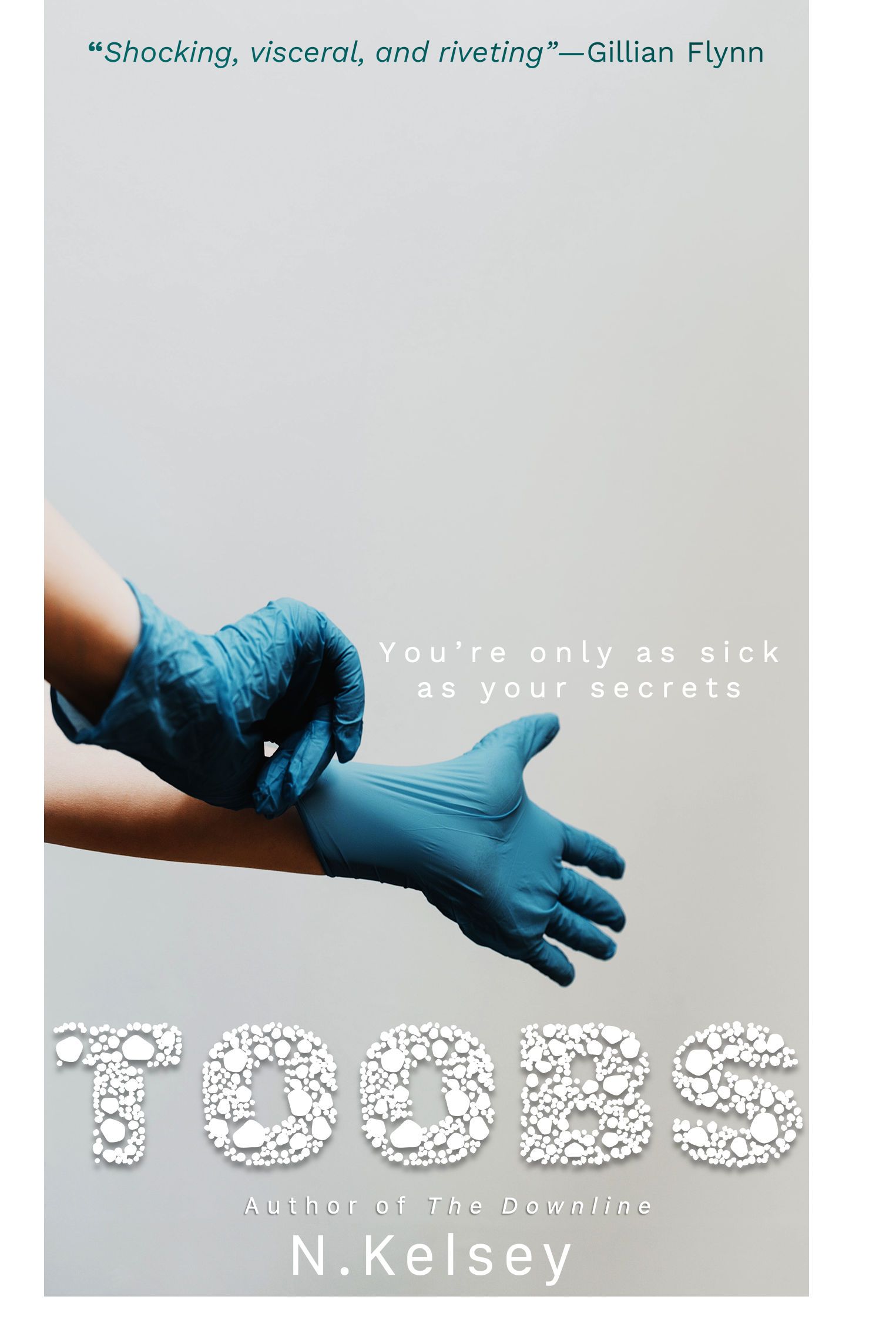
Cover should convey “this is a dark, intriguing book about medical stuff”. Want to stand out among bright pink swirly and girly cut-paper or watercolor blob covers.
Nathan says:
I think the first problem is that you’ve set two targets — “character-driven literary novel” vs. “shocking, visceral and riveting” medical thriller. I’m not saying that a medical thriller can’t be character-driven or have literary value, but those are two different shelves in the bookstore with different visual tropes to attract readers. (And neither of them are “bright pink swirly and girly.”)
The first step to making something look “dark” is… well, make it literally look dark. (Or at least stark and contrasting.) It also helps distinct elements of the cover stand out, as opposed to the midlevel warm gray that the thumbnail becomes.
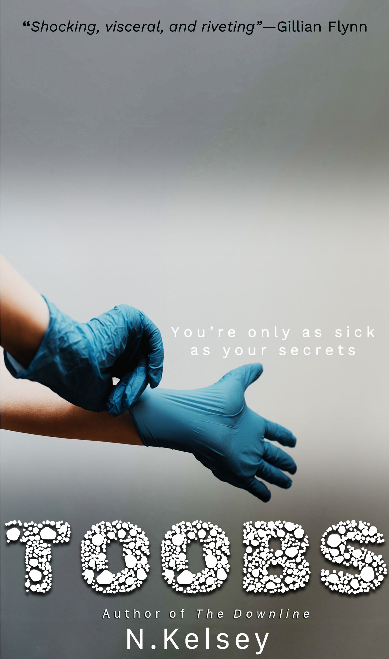 See what I mean?
And for heaven’s sake, ditch that title font. I get that it’s trying to convey “viruses” or whatnot, but it’s just goofy.
Other comments?
All right, so (for once) the imagery provides a fairly straightforward message: this book contains medical stuff. From your description, I’d say by “thriller” you mean the thrill in your book comes from the psychodrama of the protagonist going crazy (and maybe getting a bit violent?) from having doubts about what’s real and what isn’t. One could make the case—by that standard—that Joker (2019) was a medical “thriller” something like that, albeit dealing with psychiatric and therapeutic matters rather than anatomical medicine.
Anyway, yes, a cover for a “dark” book should in fact be dark: as our host says, dim the lights there. Using that cutesy “Petri dish” textured typeface for your title marks you as a rank amateur, and you should definitely dump that in favor of something more serious and professional-looking. Also, I’d be hard-pressed to think of any “bright pink swirly and girly” books I’ve ever seen anyone’s mom (or any other gal in your target audience’s age range) reading on the beach; Gillian Flynn’s highly successful Gone Girl—for one (which, as Honest Trailers put it, “everyone’s mom read on the beach”)—certainly doesn’t have anything like that on its cover.
Something else worth mentioning: you’ve got a lot of free real estate for your title and byline (and any other text) both above and below the image, so you’ve really got no excuse for cramming so much of your text into the smaller space below. I recommend putting your title in big bold lettering in the space up above the gloved hands and your byline (along with the “also-wrote” line) in similarly large lettering down below it. “Go big or go home” is the approach you need to take for advertising your novel.
The white type on light gray isn’t working, of course.
I am not sure that the decorative typeface chosen for the title is working well, either. If the goal is to get across the idea that the book is a “dark, intriguing book about medical stuff,” the title typeface looks far too cartoony. The gloved hands convey “medical” but nothing more, making the cover image generic and not very informative.
I see nothing appealing here, and the self aggrandizing sales pitch doesn’t help.
To what does the title refer? The potato snack? TV? A guy’s junk?
If people assume that last one then the treatment of the typeface is most unfortunate.
It’s also odd to see the byline treated as an afterthought, particularly with so much patting of oneself on the back.
The gloves suggest something medical but the image is too vague. Is it brain surgery or a prostate exam?
To repeat, there is too much empty real estate.
Yowch.
I do have to say, with regard to the title, and the graphic, I agree that all I saw was a proctology exam, or maybe a Colonoscopy or…something like that. Like…not comfortable, but not terrifying or thrilling.
I have other thoughts that I’ll scribble later, but I did want to comment on this.
Well, firstly:
I wouldn’t ignore that blurb, as has been largely done here. (In the real meaning of the world blurb, not the bastardized meaning, aka “description.”) If I had a hot blurb like that, from Gillian Flynn, by God, I’d make sure it was bloody readable. On this cover, it’s completely wasted.
I assume that there’s some important meaning to the nonsensical word (Toobs) title. I mean, if it catches, great, but it makes it harder for you to sell, really, if people have to commit the unusual order of letters to memory. BUT, this isn’t “Title Critics.com,” so…
I just think that the positioning of the hands, the precise point at which the gloves are in the process of being put on, etc. all screams “proctology exam.” It just does. I guess we’re all conditioned, now, from movies and TV to think that, but…that doesn’t make it less true. That point, where the physician makes some comment, snaps on the gloves–it’s invariably a lead-in to some running joke, or some probing of some orifice. If that’s what more than one person thinks when they look at it, that’s not good.
To me, that feels at odds with a book in which the MC is questioning her own reality.
The title font has already been discussed and I devoutly hope you chuck that over.
I wish I had a better, firmer suggestion for you than “start over,” but…this is not, to my mind, remotely conveying what you need it to convey. Make better use of the Flynn blurb; find more exciting and dramatic colors than what you’ve used; (pink is not needed!, nor the everywhere-the-last-few-years blobs of color)…what you have here, even if the the imagery is good, is not eye-catching.
The coloring is too insipid to grab someone’s attention and that’s what you want. Hell, maybe reddish-orange gloves, alone, would solve 40% of the issues here.
Good luck. I’d very much like to see the next iteration.