The author says:
Quiver and Quake is a fantasy novel set in the Renaissance-inspired world of Authland. It follows the story of a girl who is determined to find the source of the earthquakes that constantly shake her island. The target audience is young adult fantasy readers, though it is also appropriate for middle-grade readers. It is intended to appeal to readers of Shannon Hale, Andrew Peterson, and S. D. Smith.
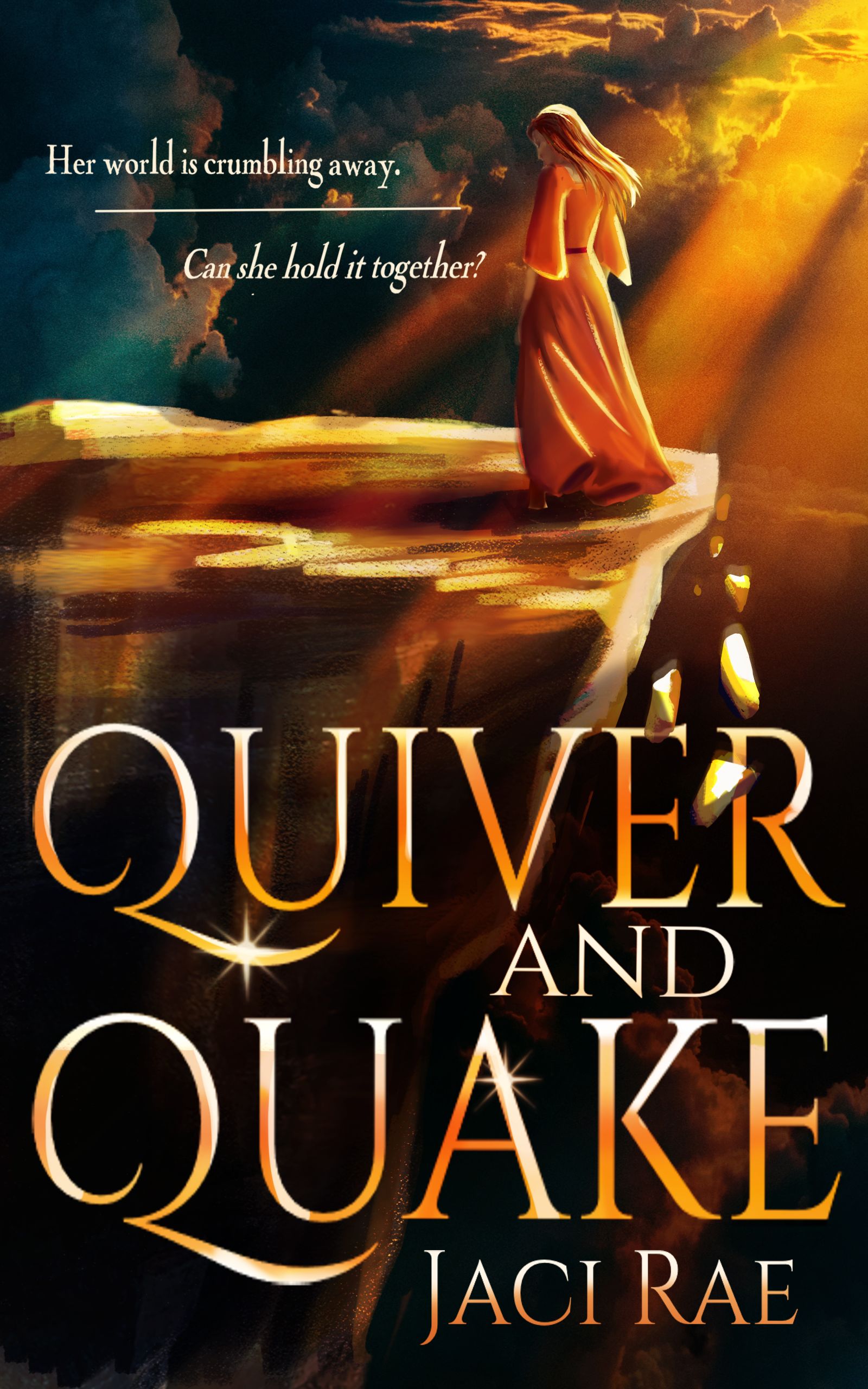
Note: I am also the cover artist, but if the art doesn’t work, my feelings won’t be hurt in the slightest. This is just a quick mock-up of an idea I liked. I wanted to make sure that the cover worked on a macro level before spending hours fiddling with the details. If the design doesn’t work at a basic level, I am more than happy to scrap it and start over.
Nathan says:
The main complaint I have about this is it doesn’t feel magical enough. (It doesn’t feel Renaissancish enough either, for that matter.) My first guess, looking at the cover without reading the description, was that it was a religious memoir or novel — the combination or a long robe/dress and the sunbeams, I guess.
Other comments?
I like the general layout, though I feel like the placement of the image seems a bit high. The rocks through the title are cool.
I agree with Nathan that the genre is a bit unclear. If it emphasizes magic/fantasy, then perhaps do some magical swirls, have her casting magic, or throw in a magical creature somewhere. If the emphasis in more on the Renaissance-esque setting, try having her garb match that vs. non-descript dress. (E.g. several layers. If she is poor, perhaps an apron and vest. If she is rich, maybe split sleeves or a split tunic dress and gorgeous fabrics. Her outfit is going to be a huge draw if the world is Renaissance inspired, so make it stand out rather than blend in.) She’s a bit of a scientist type (since your description mentions her trying to find out the mystery of the quakes) then you could have her with a satchel, spyglass, or similar.
While I like the overall golden and sunny look, it wouldn’t hurt to bring in a bit more color or carry through that deeper green from the upper left into the bottom right corner in the shadows or into her dress.
It would be nice to separate the author name out more so it doesn’t look like part of the title. You could do this by shrinking down the oversized title some and putting it on a separate line, centered, with a contrast font. Or move the author name to the top. (If you lower the main image and tagline slightly, there should be enough space.) Center the author name if you can and do a sans serif font to contrast the title font. The name itself doesn’t need to be quite so big.
It’s nice enough art and the general design is adequate. But it stumbles on some details.
You unfortunately succumbed to using not only an overused typeface but the need to add superfluous special effects, such as embossing, shading and sparkles.
The tagline is much too small and the horizontal rule between the two lines adds nothing.
The art appears to include some photo elements (the clouds!). It would look better if the entire thing had been painted. I would also take the art to another level of finish: it is almost too painterly with the result that there no solidity to the rocky cliff or falling debris. However, I see that this is just a sketch so I won’t belabor that point.
You may want to get across the impression of “earthquake” more vividly. A half dozen small rocks tipping off the edge of the precipice doesn’t really convey that idea very well.
My first thought was: Biblical fiction. I thought the figure was either Mary Magdalene or a long-haired Jesus in a robe.
Honestly, this was me, too. I thought it was a monk before I studied the longer hair and determined “girl.”
That probably doesn’t bode well for conveying the genre.
Same. Even the title had me think it was about the Quiverfull movement
It looks to me like a positive (non-fiction) book about the Quiverfull movement. So yes, def. Christian/religious vibes
Lovely imagery, but I saw Jesus talking to God.
I like the title treatment. The font is okay but one with more of a sci fi vibe might help. I like the art. But think if you add some detail to the robe to make it look more like a dress that would help fix the Jesus vibe. Having her a bit more active, like running or ducking would also help with that. Maybe turn her around and have her be more clinging to the edge? Or running from the crumbling edge while looking over her shoulder.
I’m not 100% sold on the tagline. Maybe try being more specific: Authland is being destroyed by earthquakes and Hername intends to use her magic to stop it- even if doing so will cost her life— I don’t mean use that but naming the events clearly would make it easier to identify genre. Because her world is crumbling away could mean her faith.
I also wonder if the entire thing would look better flipped to face the other way?
I do agree it looks sort of biblical. I do think the covers pretty but was wondering if you could change the cover from all one tone to different colors to show some contrast. Purple is a beautiful color with orange as well as blue. I feel it may be too monochromatic. I think it needs a bit of contrast in the lettering and dress (a different color) to make it stand out. Maybe if the robe wasn’t orange or brown it wouldnt look biblical as much. Love the font though. I think you should seperate title from the author though. It is beautiful artwork though. Maybe a few tweaks.