The author says:
This novel is Christian WW2 fiction, set before and throughout the war in the US, Europe, and Russia. A young German-American returns to his homeland and ends up serving as a medic in the German army throughout the war. It’s a story of friendship, faith, family and forgiveness, geared primarily towards the Christian reader. Written with adults in mind but appropriate for younger readers as well.
Nathan says:
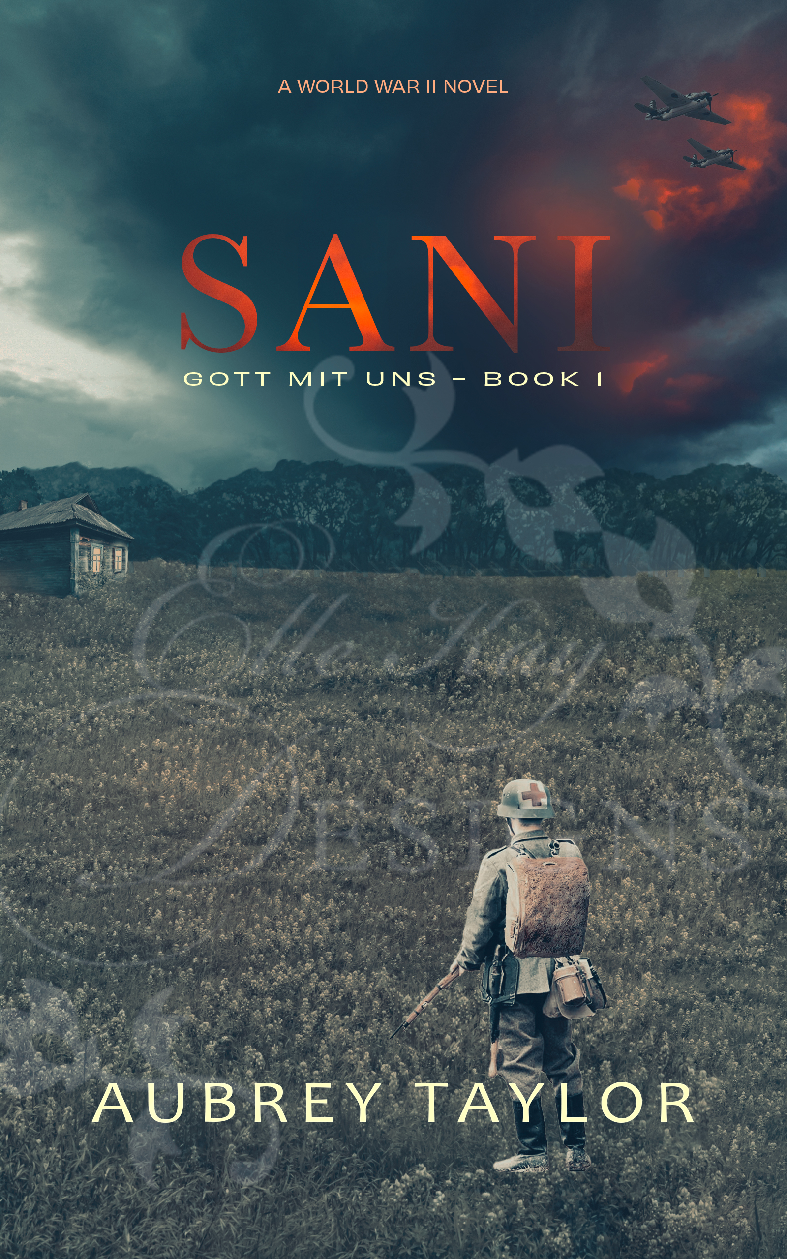
Unfortunately, very little of that can be seen in the cover, especially in thumbnail — it just becomes a murky mess with an unreadable cover. Even at larger sizes, all of the important elements of the image (the soldier with a pasted-on backpack, the house, the planes, even the title) are swallowed up by the dim background which has enough texture to it that those elements can’t stand out.
My advice:
The sunrise to the right gives the connotation of hope, which is a big part of the appeal of Christian fiction. It also gives a good contrast to the title. You could maybe fit a couple of airplanes above the title. (Leave out the watermark — I can’t puzzle it out, and all it does is distract further on a cover that needs no additional distraction.)
Other comments?
Too much and not enough.
There is no focus: nothing dominates visually. Small elements, all of pretty much equal weight, are scattered across the cover. The center of the cover, where the eye naturally tends to go, is empty.
The title is small and made difficult to read by the unnecessary shading. The red in the sky seems to have been added randomly with all but invisible aircraft.
All in all, there is really nothing to suggest the actual theme of the story.
Hey, Ron:
I think that the shading inside the red of the title would have been okay with a much larger, heavier-weight font, say, a sans-serif, so that the ombre effect (effectively) were visible.In this, it’s not.
The central point of the cover is wasted. When your eyes go go the cover, seeking (as they always do) the center, you get…scenery. And dim scenery, at that.
I would significantly upsize the Stukas (?) and the red “fire” behind them, making them quite prominent. I’d lose most of the background. I’d increase the size of the soldier and I would kill off that faux pasted-on backpack. The reader doesn’t care about the authenticity of a backpack; they need to solely know ‘soldier,’ right?
So…I’d emphasize whatever that’s meant to be, in the sky, assuming that has some relevance. Ditto the soldier and I would find something else that says “WWII,” rather than some other, any other, time frame.
As Ron said, it’s both busy and slow at the same time and it’s not helping your cover. it’s too hard to discern what the actual genre is of the book: Litfic? Mystery? Suspense? Sci-Fi, for that matter? It needs something else.
https://imgur.com/a/nX47CMH
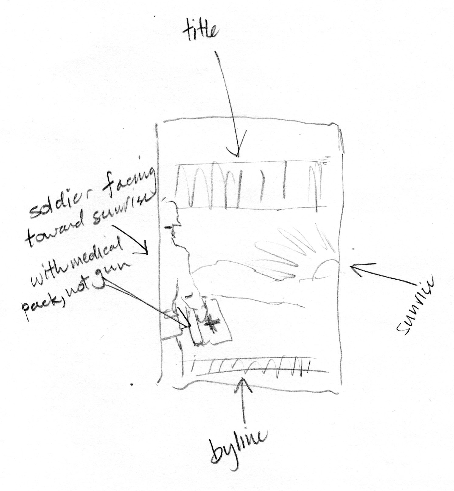
Based on Nathans great advice!
Made from all free images so you can have it.
I’m wondering about that series name though. Having it in German might be confusing to readers as to whether the book will be written in English or is a translation, which would likely hurt sales for an American market.
PS. if this image doesn’t suit you there are tons of public domain WWII images on Wikki Commons that can be colorized. This image is a composite of 5 images (plus lots of drawn elements)
Hey, Shel:
I was noodling about your mockup–what do you think about the idea of making the the cover in B&W/Grayscale, save the two red crosses? And, maybe (if the person doing it is talented enough) the yellowish-white shade of the sun, behind “Sani”?
I was thinking that that might readily and quickly say “WWII” and the red would stand out quite noticeably. Just a thought.
https://imgur.com/a/nX47CMH
I love the idea but not for this book.
The more I remove the color the more it becomes thriller/horror. I do like it a bit muted though like in the second version. The first version might be best though because brighter color is ‘happier’ and it’s a book of hope. Getting a war book to say ‘hope’ is going to be tricky….lol
I was thinking that it would immediately channel pre-50’s, making it more abundantly clear, but hey…I see what you’re saying.
Shelley, you know, it didn’t even seem that my post ever went through, got frustrated and gave up. Two months later I hear from my designer that she saw it on here (ah the joy of technology)… Anyway, I tried to click on the link but I guess you’d taken it down in the meantime. Any chance you still have it in your file somewhere, I’d love to look at it!
I think I posted a few versions and could only find this one to repost
https://imgur.com/a/zNEghwy
I like most of the ideas, but the execution needs improvement.
None of the elements match in tone and lighting. It looks like a really good mockup.
The watermark needs to go.
As mentioned prior, you have all that real estate in the middle, yet the medic is small and placed behind the byline. I’d prefer to be looking right over his shoulder, as if we’re there with him.
If the shack is significant, make it bigger and include something that tells us why it’s significant.
I like the title treatment and the way it seems to extend from the fiery sky, but agree it needs to be larger and be sans-serif.
I agree with Nathan’s comments, especially the thumbnail image.
Most people will see your book cover online at a very small size — make sure your cover is readable.
After you do a new layout, reduce the view size to 20% or 25%.
Also compare your book cover to other titles in the same genre.
And view it in BW