The author says:
Jack Sinclair can lift a car, but what good does that do him? He doesn’t have any _real_ powers like the League of Order downtown, so he figures it’s best he keeps his head down and pretends he’s not a superhuman. But then a supervillain called Bloody Bones attacks his high school and he has to step up and protect his friends.
Vanguard and the Bloody Bones is the story of a young, modern-day Bronx kid who lives in a world where superhumans are real, and heroes and villains battle over the fate of the world. Jack only survives his fight with Bloody Bones because another group of high school students teleport in and defeat the threat for him. These kids are from The School, the premier training facility for young superheroes. They recruit Jack to join them at The School, setting him on the path to becoming a hero called Vanguard.
Vanguard and the Bloody Bones is the first novel in an eight-book series called Becoming Vanguard. The series is Young Adult, dealing with Jack’s years in high school, and is meant to appeal to kids of about the same age.
Nathan says:
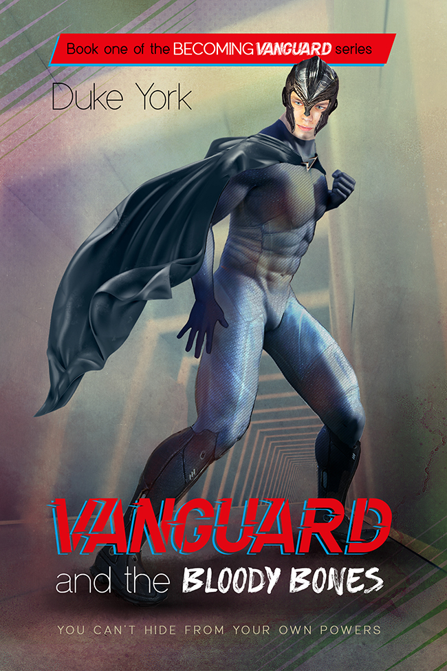
Hmm. The first thing that jumped out at me was the shadowless face under the helmet, compared to the heavy shadow defining the body.
The second thing that jumped out at me — and boy, was the jump strong! — was the odd shape of his upper legs.
Beyond those, I think that there’s this unexamined instinct to put the entire human figure on the cover, when a cropped-down version might work better. If the image were reduced to this…
…you could put the title across the (problematic) legs, not lose any important details, and have a cover that conveyed more information in thumbnail.
Other comments?
I will have to second all of Nathan’s comments about the anatomy.
I will focus on the mix-and-match quality of the rest of the design, especially the typography. Right off the bat, there are too many typefaces. The main title alone has three different ones. And of all the different typefaces the one working least well is the thin sans serif: it is virtually unreadable. Narrow yourself down to just two typefaces for the entire cover and be constantly aware of legibility.
Hi:
Okay…I want to strongly agree with Ron’s comments about the fonts. It’s far too busy. It also feels a teeny bit like a comic-book cover. I realize that this is always the risk with superheroes; when you depict him or her being superheroic, well…it’s going to look a bit like a comic. but presumably, this is a tween/Teen/YA novel, right? I think toning down the fonts to legible and not so mixed would help with the tone of the cover.
I agree that the leg musculature is just off a bit. (I used to hang out at Venice Beach, back in the legendary day of Arnie, Frank Zane, et all and trust me, those legs are a bit hinky.) I see what the illustrator was going for, but they are slightly off.
I would actually consider zooming in more on the character. For one thing, it would allow the face to be larger and crisper. I’m still debating how I feel about how the wedding tackle is handled. (So to speak.) I don’t know what the typical conventions are for teen readers today. I rummaged around recent comic book covers today and the anatomically-incorrect Ken Doll method appears to be the rule. (And yes, I mean, appears. I do not claim expertise in this.)
Is the smudge a soul patch, on his chin? Or is it inadvertent?
Yup, I would zoom in more, make him fill more of the cover, make it feel more dynamic that way. I would rethink (unless it’s really too late) the series branding, which requires that you use two fonts for that alone. You’re probably already attached to it, so…that’s all I’ll say about that.
Two last comments that are only very tangentially related to the cover design–I guess it’s because I’m mature, but the nom de plume of Duke York kind of kills me and not in a great way. It’s your book and the name you’ll be stuck with, going forward, so ’nuff said. Make sure that 8 books from now, you won’t hate it.
I assume that you already know about Rawhide and Bloody Bones; which exist in Southern US myth and legend, as either two creatures/monsters, or two parts of the same thing. (And if memory serves, Laurell K. Hamilton had an early Anita Blake, Vampire Executioner novel by that name, too…)
I’ve noticed that you refer to Bloody Bones as a Supervillain, but then you use it as an object–THE Bloody Bones, both in the description you sent us and on the cover. As a reader, I find that a skoosh distracting; I can’t be sure if you’re describing it or naming it.
If Bloody Bones is the villain’s name, then presumably, it oughtn’t have “the” in front of it. If it’s a description, eg., “the Harris Antelope,” then it should be so referenced. But we call The Joker THE Joker because the “the” is used as part of his appellation, his name. Of course, if you were speaking to him directly, you wouldn’t. Hmmmm….
(Weird ridiculously irrelevant digression and observation: I’ve noticed over the years that DC seems to have a naming convention that includes “The,” whereas Marvel doesn’t. It’s not The Magneto, after all, or The Thanos, and so on and so forth. But it is The Joker, The Penguin, The Riddler and so on.)
ANYWAY, I apologize for my digression–I would simply make sure that however you refer to the villain, with “the” or without, you are consistent.
That’s it from me.
Overall I really like this.
The mix of fonts doesn’t bother me at all. I like it. It’s all perfectly readable to me. I don’t think it would lose any impact if you change the Bloody Bones font to a thicker version of the sans serif font you’re using and the only reason I might recommend changing that is because the font you’re using now might be difficult to mesh with other titles. So you might want to play around with all of the titles to see if it works.
I think you could fix the aforementioned leg thing by sliding the title up and placing it across the character so it covers that lower hand, his waist and part of the leg, but I also think you could easily fix that leg by trimming a bit of the bulge from the back.
You might want to add just a hair of color to his face.
But if you did opt to move title up, you could then put the series identifier on the bottom, or author name, which I think would make it have less of a comic book vibe.
Aside from the protagonist’s cut-and-paste face and dubious anatomical proportions, this cover just kinda has me saying “meh.” I’ve seen both better and worse covers for this genre, but with this one my complaint is mostly just that it’s rather boring: the guy in the cape standing there with the hallway in the background looks like he’s posing for a school photo and the hallway is actually a matte painting the photographer brought as one of the optional backdrops students could request to be used for the shoot. I get that the illustration is going for more of a “live-action” look with all the black-and-bluish-gray muted colors and stuff (Movie Superheroes Wear Black, after all), but live-action doesn’t have to mean boring.
If the hero must pose like he’s about to punch somebody, I’d recommend putting somebody for him to be punching in the frame with him; and if you want to allude to this being a “superhero in high school” story (a sub-genre comic book writers have been doing pretty much ever since Stan Lee and Steve Ditko rolled out Spider-Man in 1961; so surely not too difficult to do in a prose novel), I’d also recommend showing something more like an actual high school in the background. While how generic (like Midtown High where Peter Parker was a student as a teenager) or high-tech (like Xavier’s School for Gifted Youngsters) the school looks is pretty much up to you, do at least show something other than just the hallways, such as one of the classrooms, or a sports field, or maybe a shot of the exterior. Having a few other students and/or faculty lurking in the background would be good too; though they need not be too detailed or in focus, you could also use them to hint at what kind of “superhero in high school” story this is: e.g. if everyone else is wearing capes and tights and the like and nobody’s even throwing a second glance the protagonist’s way for being similarly attired, this is obviously more like Xavier’s school, whereas if the students are mostly wearing shirts and jeans and everybody’s looking and pointing at the guy in the cape and tights, this is obviously more like Peter Parker’s school.
In short, you don’t have to tell the whole story on the cover, but do at least try to make it look like there is a story. A guy in a cape and tights and helmet (who doesn’t even look that much like a teenager, to be honest) standing in a vaguely trapezoidal hallway doesn’t suggest much. A guy in a cape and tights and helmet standing in front of (or in the midst of) what’s obviously a high school, in contrast, suggests a “superhero in high school” story; which is what you’re selling.