The author says:
“Pillowside Mirror” is a historical fiction novella that young adults may be interested in. It is about a woman living in the 1920s who learns to confront the toxic office workplace that she enters every day – after a nightmare.
Nathan says:
Wow.
Not in a good way.
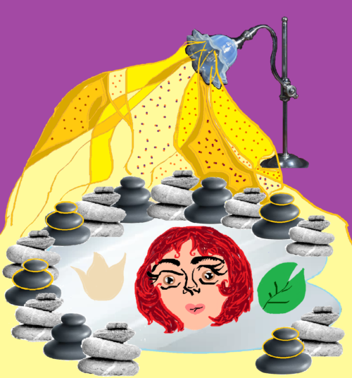
From the file name — “Book-Cover-Best-Idea.png” — I assume that you’re only intending this as a concept sketch, not the finished artwork, which is a good thing. But It’s still not good. The combination of images — a face in a pool or puddle; stacked pebbles; a lamp that is, I dunno, spreading seeds or something?… None of it, individually or as a whole, conveys anything about the book, and certainly has no relation to the description you sent.
The purpose of your cover is to attract the attention and interest of a reader who would want to read your book. Can you honestly say that any part of your cover would catch the attention of someone who wants to read about workplace sexual politics in the 1920s?
Thanks to the art deco movement, the period of the 1920s has some very clear and recognizable visual motifs. Use them.


I am afraid that I have to agree with Nathan down the line. There is simply too much mix-and-matching of art styles/image sources. There is no clear suggestion of the nature or theme of the book, let alone the period in which it is set. I suspect that all of the image elements are significant and meaningful—but only to someone who has already read the book, which is putting the cart before the horse.
I really think that the only solution is to start over again from scratch.
What is your specific sub-genre? Is it more slice of life, thriller, office romance, overcoming workplace bullying, or a surreal/dreamlike exploration of psychology, etc.? Once you’ve nailed that down, look for books in that genre (from all time periods) to see if there are any common themes or tropes. E.g. woman standing with her face obscured, moody lighting, etc. Then brainstorm how you can use a couple of those with a 20s/Art Deco bent. E.g. use a 20s silouette model with a hat/short hair, or use an Art Deco font.
Put aside all the symbols you want the cover to have – that isn’t what the book cover is for. Think of how you can convey in a few seconds (especially at thumbnail size) the general setting and sub-genre of the book. You want potential readers to give it more than a glance and think, “wow, that looks like my sort of book!”
You might want to re-think the title itself. The title you have is pretty, but it’s also pretty abstract. It might work if your subgenre is a surreal horror, and the book dives in and out of bizarre dreamsequences – but if most of the book is in the real world than it is better to pick a title that fits with other ones in your genre.
Lastly, remember that the cover needs to leave a lot of space for the title, so you shouldn’t crowd it with lots of ideas. Keep it simple, conveying one main thought the reader can pick up on within a second or two, vs. lots of small elements competing for attention.
Hi:
Well, to me, between the description, the title and the mockup, this has Eau-de-Lit-Fic all over it (Scent and smell of Literary Fiction), which may very well mean that it’s not your intent for the cover to draw customers and, in fact, for it to be standoffish about the grimy commercial aspects of publishing.
As Jennifer Rothnie said, it’s a pretty title, but it could be for literally any book, leaning toward romance/LitFic/drama/women’s fiction. The ambiguity of it won’t help sell it. If you couple that with a confusing, ambiguous cover image, you’re killing your book in the womb. Unless a miracle occurs, nobody will find it or buy it.
Even if this layout were well done, (I don’t understand many aspects of it), I think it would be far, far too busy and busy equals off-putting on books. You have a split-second to attract your buyer. To do that, you have to know who she is. Everything about her. Her age, her education level, her likes, her dislikes and what attracts her to a book. Your cover has one job: it’s clickbait. That’s it. It’s not the cover’s job to tell the story–that’s the book’s job. Trying to make the cover do the book’s job disrespects the cover and insults the book. 😉 Let each do their own thing as they each do it best, right?
You can find that pretty readily by doing the research that Jennifer suggested to you–go through your shared genre and find books that are selling like hotcakes. Not just from known, trade-pubbed authors, but from Indies like yourself. What elements do they put on the cover? EXACTLY what elements? Is it a face, this season? A wall? A landscape? Is it….and so on. And then sit down and think about what theme and what emotion you’re trying to convey.
Don’t use elements or objects or items or things on the cover that nobody will understand until after they’ve read the book. Don’t think of your cover as containing Easter Eggs that the reader will “get” when they’re done–they won’t, don’t and don’t care. Sorry to sound harsh, but it’s true. If they’re voracious readers, they won’t remember your cover at all, most likely. They certainly won’t by the time they get to the end, and they won’t think “Oh, right, THAT’S why there’s a rock with a golden ring painted on it, on the cover.” Not gonna happen.
Again, do what Jennifer suggested–start heavily researching your genre, even if it’s broadly Literary Fiction and whatever sub-genre and spend DAYS in there, absorbing the atmosphere. Then rethink the cover from the jump and do everything in your power to keep it simple. One strong graphic element, if humanly possible.
Good luck. I will be interested to see where this one goes.