The author says:
Aimed at women of all ages, Samantha Goodyear quits her high-pressure accounting job to work grape harvest in France where she falls in love with the heir to a wine domain. When the romance ends disaster she heads to Napa to make a wine of her own.
Nathan says:
I actually have no criticisms at all. It seems perfect for the audience and subject matter.
We were actually given the full wraparound cover, and I do have three comments there:
- The white text against the maroon background is a little hard to read
- Between the more generous spacing of the blurbs and the tight wrap of the text next to the author photo (especially with the outer margin), the sales copy looks cramped.
- The “Reader Favorite” badge doesn’t impress anyone (sorry) — that particular badge has been featured on too many unimpressive books.
Other comments?


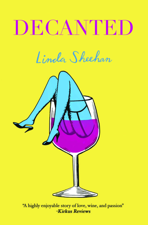
The only thing that bothers me is the disembodied appearance of the legs. Combined with the blood-red contents of the glass it makes a disconcerting image. Softening the upper part of the legs so that they blend into wine might look a little better https://www.charliehills.com/gallery/picture.php?/657/category/3
I concur about the legs. They’ve been bugging me since I saw them, as if they are a pair of unconnected legs. I think it’s the lack of butt definition–I mean, you don’t see the curve of the butt, there, so it looks as though–well, not sure, but it’s peculiar. I think some judicious blurring would help. That, or something that indicates “buttocks start here.”
That might also solve a problem you could run into at Amazon, which is notoriously, notoriously prudish about what may and may not be advertised with the AMS program. I honestly don’t think this would pass, as-is. (Even less likely with buttock-definition added, BTW).
Otherwise, this seems fine. I struggle a bit with the claret-red and yellow together, but that’s a personal like/dislike of mine and should be disregarded entirely. Good job on researching the genre! (And oh, how I wish we saw that more often!)
What is a “Napa wine dynasty”? I did not know that Napa wine had any children.
I love the cover, it’s a great job.