The author says:
[Jacket Copy – Literary/Historical Fiction] In 1978, the tension on the streets of Managua was electric. The whole city teetered on the edge of becoming a war zone. The Somoza family held the people of Nicaragua in a stranglehold, stripping the country of everything of value and making beggars out of honest citizens. The only thing that kept them in power were the feared Guardia Nacional. In order to survive, Paco eked out a living as a street musician, busking and playing university parties. His politics were those of someone never sure of where he would get his next meal.
But when a violent government crackdown erupts on the streets, he’s forced to choose sides in order to survive. Thrust into a fierce guerrilla war, what begins for him as a struggle for survival becomes something more. The heavy cost of the revolution becomes clearer with every battle fought, and every traitor executed. Paco must find the balance between fighting for a cause he increasingly comes to embody, and maintaining his humanity.
Every Arm Outstretched examines historical events through the lens of the human heart. How do we determine right and wrong when society itself has become corrupt? Do we owe our ultimate loyalty to our comrades or to our ideals? And can the end ever truly justify the means?
Nathan says:
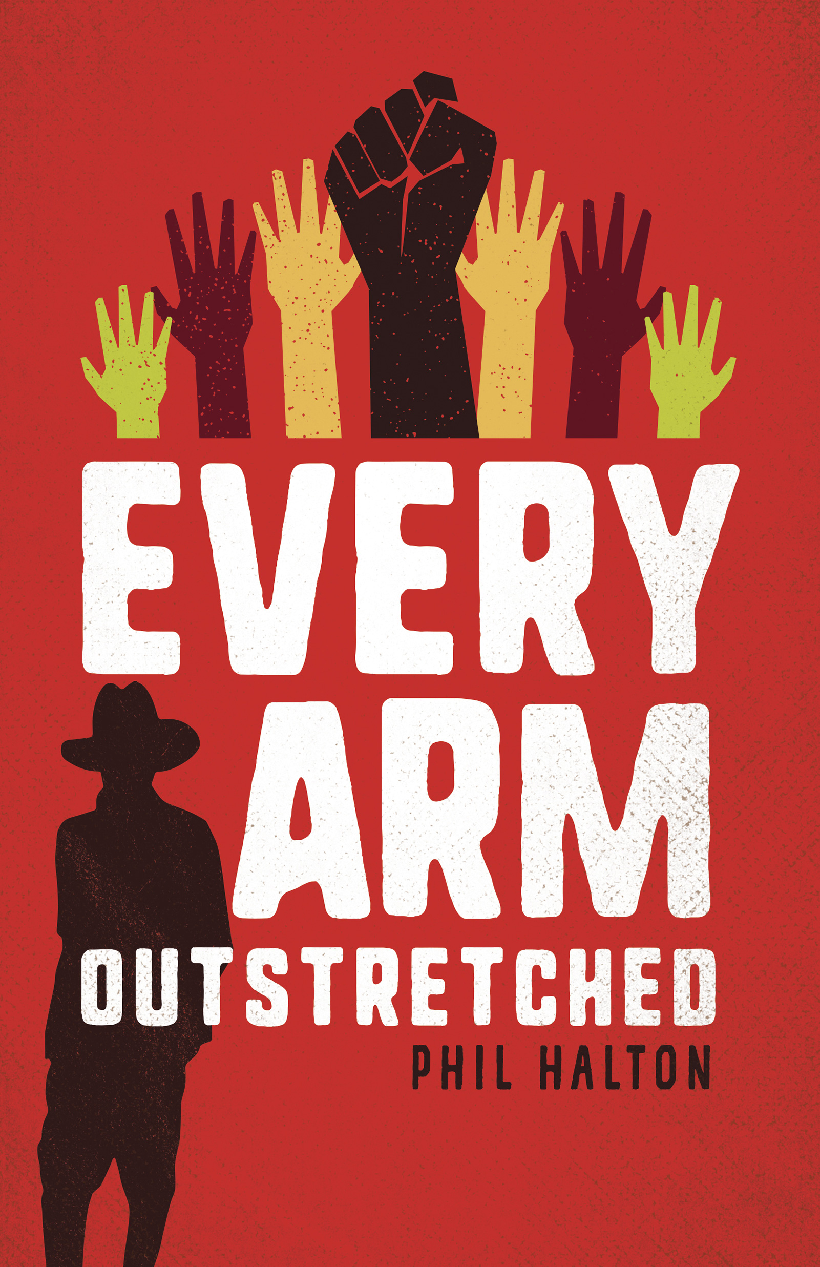
It’s a very well-done cover. My only major issue is that, in 2020, the symbol of the raised fist has become very much associated specifically with Black Lives Matter. While your usage of it here is correct historically, I fear that its presence on the book might give the wrong first impression to readers.
The other thought I had was to give some small indication of guerrilla warfare. Perhaps the otherwise innocuous silhouette could include the silhouette of a long gun (probably an AK-47 would be even better, but I’m not confident that that can be rendered identifiably in silhouette).
Other comments?
Great job! The only thing that really jumped out at me was the figure at the lower left. It’s a jarring mismatch with the hands…and looks tacked on, like an afterthought.
Keep the cover simple.
Nathan’s concern about the fist might be alleviated by making it an outstretched hand like the others. Or making one of the other hands black and making the fist a non-specific color, such as yellow or green. This might also serve to break up the strong symmetry in the graphic. A little asymmetry might hint at the unrest and uncertainty that would be part of such a story.
If you were to think of adding a gun, I would put one in one of the hands rather than retain the figure.
Perhaps the real concern might be that the cover really doesn’t inform the potential reader about the nature or theme of the book. There is not much, for instance, that suggests the actual subject or setting. For all anyone might know, the book is about racial unrest in the States.
Nathan’s comment about the symbolism is spot-on. All I see here is Black Lives Matter–both “hands up, don’t shoot” and the BLM fist in the air. I think it’s highly likely that many people will see that too.
Offered FWIW.
Hmmm… well, before BLM, the old raised clenched fist was usually visual shorthand for revolutionaries associated with various stripes of Marxism (e.g. take a look at the cover to Jack Chick’s “The Poor Revolutionist” tract which he began publishing back around the time Marxist hippies were still something of a going concern); which I should point out, the Sandinistas in the 1978 Nicaraguan Revolution certainly were. (For that matter, so are the BLMers, actually). Still, I agree doing the stenciled symbol in black does suggest BLM specifically these days. Maybe a few swaps in the palette so the fist’s some other color would do the trick?
I mean, for those of us old enough, it immediately evokes the 1968 Olympics, when it was (then and still is) the Black Power salute. Yes, yes, RK, it’s obviously been used to mean many other things–primarily revoluciones, but…this is today, 2020, in a year marked by riots.
I don’t see how you get around it with this, without putting some huge long explanation on the cover (“Hey, dear reader, this isn’t ‘hands up, don’t shoot’ or the ‘black power salute,’ it’s this whole OTHER THING over here…”).
It’s the author’s choice, but…that’s what I see. My take was, and still is, “pro-BLM book.” That’s what it looks like, as though it’s about everything that’s happened since Ferguson.
Even if you completely support BLM, etc., and one’s immediate take, upon seeing the upper-half of that cover is positive, doesn’t that simply mean that it’s conveying a completely different message than that which is intended? A completely different topic? To me, the impression is enhanced and strengthened by the other hands, saying “hands up don’t shoot!”.
Just my humble opinion, and worth exactly what someone is paying for it.
Hi Hitch – thanks for this feedback. It’s worth more than what I paid for it, as I think that despite the history of the symbol, an American audience in 2020 undoubtedly sees it differently. I am going back to the drawing board to make sure that the cover evokes the right message.
Hi, Phil:
Well, I asked 5 people that I know, of various different backgrounds, political affiliations, (deliberately) etc. and every single one of them saw the same thing, without any prompting from me.
One person did say “Black Panthers,” but that’s just a variant on what I said, so…I think you are wise to go back to the proverbial drawing board.
It’s a shame, as it’s a nice graphic; maybe you can hang on to it for something else, or another book on the topic, down the road when (hopefully) things won’t be so fraught, as they are now. Good luck to you!
After taking a second look at the cover I can’t but help thinking that it might be too literal. “Every Arm Outstretched” accompanied by an image of…outstretched arms. You may perhaps want to come up with something equally simple and graphic that relates more specifically to the story you are telling, the characters, situation, setting and time period.
Terrific feedback, thank you for taking the time to post it.
This an almost perfect cover for me, but I have to agree with Ron. You need to change the image of the outstreched arms to something less redundant. You could use a symbol related with the FSNL to illustrate the relation with Nicaragua.
I wanted to say FSLN, sorry.
Thanks for the feedback, Jose – very useful me.
Maybe the BLM association is a moot point. Some people would make that connection but unless your audience is under twenty, they’ll have seen it before. But I would say that the only indicator of the book being set in Nicaragua is the silhouette of the guy in the hat, and that’s not super clear. Every time I see the guardia nacional walking around, even in peaceful times, they always have guns hanging from their shoulders. But there are other ways to indicate revolution rather than just protest. I like the different colors of the hands, the silhouette. I had to look up FSLN, you got right on with the colors, though most people won’t get that connection.