The author says:
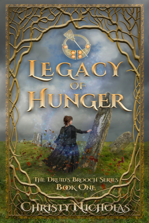
Legacy of Hunger – Set in Ireland, 1846, historical fantasy drama/adventure (not romance). Not an actual scene in the book, but a conglomeration of several pivotal scenes. The standing stones are a portal into the fae world.
Nathan says:
The cover is beautiful as-is, at least for print sales; I think that some tweaks for the ebook cover would be prudent — pull in closer (it’s okay to have the series title across her skirt, honest), and separate the byline from the background more clearly, so that salient details are more easily seen at less than full size.
Other comments?


An awfully nice start! Congratulations! The artwork is especially lovely.
I have to admit that I have never been a big fan of frames. They need to add something significant beyond being decorative. I am not sure that is the case here. Especially since it is almost overwhelmingly distracting. I would try to focus on the main image more, which is much more effective in conveying the sense of the story. At the moment, the girl and the stones are reduced to a small fraction of the cover so it is really difficult to discern what is going on…and it is impossible at thumbnail size.
Essentially, the actual cover is effectively what is contained within the open area of the frame, which is only about 1/3 of the total space available.
If the idea is that the stones are a kind of portal to a fairy world—and this would apparently be an important theme of the novel—then this is something that needs to be made much more immediately clear.
I would either eliminate the frame or find one that is much less intrusive. I would also increase the size of the art so that the girl and stone takes up much more of the frame.
I’m with Ron. I love the art–lovely!–and I would completely lose the frame. I think it interferes with your byline, too, or the author’s byline, if you are the designer and not the author.
I would consider using a different font for the byline. You have two foofy fonts, on the cover and that’s a bit much. I like the 2nd foofer for the tagline/series name. I’d consider using a simple serif or even a sans serif for the byline. I admit that I personally don’t love the titling font. But…it’s not inconsistent with the genre, which is important.
ALSO, with Ron, I would suggest pulling in on the character and the stones a bit. If you drop the frame, you have a good amount of “zoom” that you can use, so that we get to see this lovely custom art better.
Don’t forget–the Thumbnail is your Envoy! Your ambassador to the buying world. The more of the cover they can see, and be enraptured by, the better off you are.
That’s my $.02, FWIW.
I have to second what Hitch has suggested about the typefaces. One decorative typeface on a cover is more than enough…and limit it to the title. And you may well want to take her suggestion and experiment with some alternatives.
What Mies van der Rohe said about architecture applies equally well to book covers: Less is more.
You’ve got everything nearly there, but every part just needs a little adjustment to get up to being a professional quality.
Like Hitch and Ron say, the fonts aren’t quite working for the series name or byline. The fancy font distracts the eye too much from the title and just look crowded and hard to read in those contexts. And like Nathan says the illustration is getting a little lost at its present size.
The other main problem is texture and palette. Everything on this cover looks rather muddy. It’s a common issue that comes up with digital art of this style. As the artist works more and more into the painting, it’s easy to lose the contrast and sharpness. So the artwork itself needs to have its levels of contrast and saturation played with a little.
I’ve gone through how I would address this, as well as a few other tips for getting this up to its best version https://covercritics.com/?p=3010#comment-area
Though it’s not ominous, I’m reminded more of a cemetery than a fae world by the drawing. Perhaps a ring of monoliths rather than a row would help. I know you’re going for this magic feel, but except for her head, the woman is a little blurry. For the genre, though, I think you have the right idea.
I’m not a big fan of borders either, but I kind of like what’s going on in this one – especially with the theme of trees and druids. The darks and lights are nice too. But on the thumbnail, it looks like crap – I can’t see the woman, the byline is unreadable, and all the nice detail of the border becomes a grey circle that cuts off what would otherwise be more space to see what’s going on in the image.
One last thing: the title is pretty clear in color, but in black and white there isn’t a lot of contrast with the background. Not a deal breaker, but it might be possible to make the title stand out just a little more.
Borders can be fine…but this one overwhelms the cover, forcing the more important imagery to take up a disproportionately small space. The border adds absolutely nothing to the cover while at the same time detracting from it.
I can certainly see the potential confusion with a cemetery…but perhaps their nature might be clearer if they were larger…and eliminating the border might allow the art to be up to 150% bigger.
Yeah, you’re definitely right about the border. It seems like borders used to be a lot more common in books, and especially ornate title pages, etc. A lot of fantasy, like Lord of the Rings, used to use the huge border idea well:
https://www.adazing.com/wp-content/uploads/2013/03/LOTR14.png
https://i.pinimg.com/originals/bf/71/5e/bf715ee5dfbaf5f604b4e7c76d8660c2.jpg
Nowadays it seems to be the mark of an inexperienced designer (as in me). My first book had a nice little border around it that did nothing to help the design.