
The author says:
A middle-grade soft science fiction/coming-of-age novella that will hopefully appeal to fans of Sir Philip Pullman, Robert C. O’Brien, and Margaret Peterson Haddix.
Graeme Pendlebury is a genius. Or at least his fellow fifth graders think so, and he’s in no rush to correct them. He dreams of enrolling at MIT and becoming a physicist. . . Until he goes there and finds a pencil case, with his name on it, full of diamonds. Things only get weirder for him after that.
Nathan says:
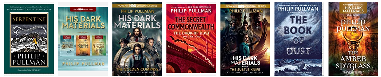
Here’s a selection of Pullman’s covers:
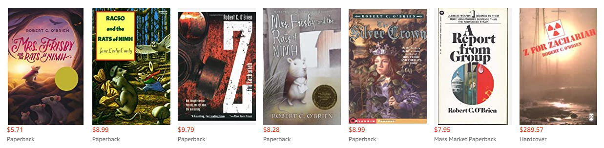
Here’s a selection of O’Brien’s covers (definitely some older covers in here):
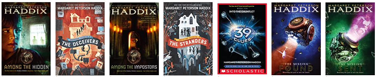
And here’s a selection of Haddix’s covers:
If your readership is their readership, then your covers need to at least have some commonality with their covers, to signal to those readers, “This book is for you!” That means dynamic, colorful covers. Yours is minimalist, low-energy, and borderline incomprehensible (it might make sense once one reads the synopsis, but if so, you’ve got those backwards — the cover is what intrigues a reader first to move on to the synopsis second).
I think you may have started with, “What cover do I have the skill and resources to put together easily?” You need to scrap that and start with, “What does this cover need to sell the book to my target audience?” Then figure out how to get there.
Other comments?
Sorry, it’s a complete genre miss. I thought it was going to be poetry or perhaps quirky political commentary when I saw it. There is nothing about it that would attract a young sci-fi reader.
Also, the pencil case? on the cover looks a bit like a cigarette lighter. It’s why I thought it might be some political commentary on vice taxes. 😉
If you can’t afford a cover artist or make your own, you could probably find a relevant sci-fi art design on DepositPhotos or another stock site. You can then look for a typography designer, which generally runs less than buying premades or customs.
Honestly, in thumbnail…I thought it was some sort of toaster box with a monster head coming out of it, chasing little floaty somethings to eat. Seriously.
Or a rabid Thing, from the Addams Family. I don’t know, but this feels like it’s wildly off-base.
Well…
I certainly like the graphic nature of the cover…but, unfortunately, it is not working on several counts.
1. There is not a single clue to suggest that the book is science fiction.
2. There is nothing to suggest that the story is aimed for middle readers.
3. I think that the pencil case is largely recognizable to you because you know what it is. Like Jennifer, I also thought it was a cigarette lighter.
4. The symbology of the cover is also too subjective…let alone obscurely presented: the diamonds are only recognizable after close scrutiny.
5. The dull monochromatic color is working against you as well.
6. And the hand looks like a monster snapping at the jewels.
You need to make it absolutely clear, in a glance, what sort of book this is, what it’s theme is and who it is aimed for. While I am all for graphic minimalism, goodness knows, why not think of going a little more literally illustrative? Get a pencil box, lay it on its side on a table, have some pencils and (presumably) fake jewels spilling from it…and take a photo. If there are some middle grade text books alongside, that might go a ways toward suggesting your target audience. And it would cost you nothing.
Over on Lousy Book Covers, this is what we typically call mystery meat: a cover that leaves us scratching our heads with no idea what kind of book it’s supposed to be. Your description’s rather vague too: science fiction and coming of age I get, but what kind of science fiction one gets from a kid finding a pencil case full of diamonds with his name on it… well, it might be time travel/alternate universes/both or something else entirely. Regardless, your cover’s not telling me any more than your description, and even your description’s saying too little.
Beyond that, I should point out that while a pencil case full of diamonds might feature prominently in helping get the story’s plot started and maybe even as an engine that continues driving the plot, chances are the story isn’t actually about that pencil case; it’s a MacGuffin. Trying to advertise your story by putting that on the cover would be like advertising Indiana Jones & The Last Crusade by showing the Holy Grail the various important characters in that movie were all struggling to reach on its poster: “Um… OK, that’s a nice cup you’ve got there, Mr. Spielberg, but what’s the story? Who’s in it, what are they trying to achieve, and what exactly is it these characters actually do?”
You’d do better to show some important character or plot point or theme hinting at the story’s genre on the cover, e.g. if this is some kind of time travel story where that pencil case full of diamonds comes from a future version of the protagonist, maybe show the kid as he’s discovering the case and have a “ghost” of his older future self looming over him in the background; if that’s too spoileriffic, one needs not show the future self’s head in the frame. If the story’s about alternate dimensions and their alternate versions of the protagonist, you could do the old “split panel” trick, showing two obviously different versions of the protagonist (e.g. one wealthy and well-dressed, one abjectly poor and covered in filthy rags) in two pictures side by side as they each discover this MacGuffin for themselves.
So on, and so forth; the point is, have the cover show us what kind of story this is, not merely its most prominent MacGuffin like what you’ve got now.
All I can do is underscore this. Well said.
What the others have said, really. You need to immerse yourself in book covers of the relevant genres and demographics to get on the right course!
I’d add that I’d say Pullman, O’Brien and Haddix are pretty different writers operating in different sub-genres appealing to slightly different markets. A book cover really needs specificity so I’d have a think about which writer you think is the best comparison. If you have test readers maybe ask them what they find it akin to? It’s sometimes hard as an author to get that distance to know where your book fits.
What your synopsis hints at doesn’t sound very comparable to Pullman or O’Brien. It does sound plausibly like a set-up into a tale more like some of Haddix’s – an intriguing treasure hunt, realistic or low fantasy/SF in genre, all pacey and quirky. If that’s about right, then focus on her covers for research. Go on Amazon and scroll down to the ‘Customers who liked this also bought…’ part to scout for other covers that seem relevant.
Your title is opaque and doesn’t give anything away in terms of subject, tone or hook. So you’ll probably want to come up with some kind of much more communicative tagline to feature prominently on the front cover too.