The author says:
Genre: SciFi – cyberpunk
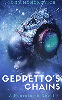
Pitch: Moon-based hackers infect Earth with a neurological suicide virus. After her mother is infected, our thought-scanner heroine heads to the lawless Moon colony to find the cure.
Reader appeal: sci-fi technology, exploration of potentials (and potential abuses) of neuroscience, mind-bending concepts.
Nathan says:
You’ve got some snazzy artwork there. I might suggest more distinct stars around the edges, to indicate the outer-space setting.
Assuming you’ve got enough margin on the artwork, I’d move the live area upward so that the title doesn’t lie across the chin; the face isn’t immediately recognizable as such as it is.
I’m not sold on the typography for the byline and series title; it definitely needs to be a lighter shade to stand out from the background, and the typeface doesn’t work for me. Fortunately, there are commenters here who will suggest some good replacements.
Other thoughts?
I think that all this needs is some fine-tuning.
One of the first things I noticed is something Nathan pointed out: the tangency of the title with the chin.
The author’s name looks crowded into the top of the cover, it needs to be brought down a little and, along with the tagline, needs to have much more contrast. It is nearly impossible to read at the size shown here.
I don’t especially mind the choice of typeface but I do kind of wonder about “Geppeto’s” and “Chains” being different point sizes.
Finally, to be honest, while the artwork is certainly beautiful I really don’t see much real relevance with the story as described, aside from the image of something going on with someone’s head—but that seems to be too tenuously vague a connection with this plot description: “Moon-based hackers infect Earth with a neurological suicide virus. After her mother is infected, our thought-scanner heroine heads to the lawless Moon colony to find the cure.”
Hey, Ron:
Well…the artwork is surely eye-catchign and as cyberpunk, the covers run a bit like LitFic–entirely whatever you want in your head that moment, lol. And the MC is apparently some telepath, or the like. (“Thought-scanner”), which is somewhat portrayed by the doodad there on her noggin.
I noticed that the image size we received is rather small, nearly thumbnail-ish and I seriously hope that the original is larger and crisper.
While I can feel the temptation to go wild with the titling fonts, there’s so much going on in that image that a taller, narrower sans-serif might just do the trick.
Offered FWIW.
Other than joining Hitch in hoping the actual finished product will be considerably larger than this barely-larger-than-a-thumbnail submission, I’d generally agree this only needs some minor tweaks. The main things: I’d bump up the contrast in general (seeing a blue character against a blue background is a little tricky) and make the titles and byline yellowish-to-flaming-orange so they’re a bit more legible in thumbnail. I’d also recommend having both lines of the main title centered instead of justified to the right.
(I’m presuming the future portraying in this story has a kind of techno-telepathy: basically, instead of some mystical psychic power which has never yet been scientifically proven to exist, you get the power to communicate from mind to mind by hooking people’s neural pathways up to some kind of transmitters and receivers that translate thoughts into wireless electronic signals. A “thought-scanner” would probably be someone with a sufficiently sophisticated version of this technology installed to be able to tap into these transmissions and maybe the transmitters themselves in order to read other people’s thoughts without their permission.)
I think that merely suggesting the broad genre of a book isn’t really enough. The cover should also tell us something significant about the book itself: what sets it apart from other books in the same genre, what are its ideas or themes?
It’s a beautiful illustration but I think it is too generic and I think that it doesn’t really tell us anything about what the novel is specifically concerned with. Where is any suggestion of “neurological suicide viruses” or a “lawless moon colony”? There might perhaps be some suggestion of a cybernetic brain implant (but probably really only after one has read the description and back-fitted it)—but I think that is much too general: it would fit dozens of other cyberpunk novels.
All the elements of the cover are there in potential, but it’s just being let down in enough ways to not look quite professional or enticing.
It need a little bit of fine tuning on several fronts to really work. I’ve gone through that here! https://www.kathrynrosamiller.com/post/cover-advice-geppetto-s-chains
Excellent suggestions! (And I am glad to see you apply the test of converting the art to B&W…something I have always recommended.)
I am still not too sure if this is the right art for the book as it is described, but you certainly made far better use of what the author made available with striking results.
The illustration is really beautiful, that’s the biggest selling point. I agree that the typeface covering the chin takes away from it. For me, the face blends in a bit too much with the background. The author’s name at the top looks weird to me without a margin–too close to the top. On the full image, the title looks fine to me, but when I look at the thumbnail, it feels like it’s hugging the right side too closely. I’m not expert on typeface, but those are a couple things I notice.
I was confused about what the woman is supposed to represent, until I read your description about “mind-bending concepts”. The book was published over a year ago, so too late to change anything. I assume you’re looking for feedback to improve the next one.
Joey mentioned that he “was confused about what the woman is supposed to represent, until I read your description about ‘mind-bending concepts.'”
That is probably putting the cart before the horse since a cover really shouldn’t depend on a blurb to make it work.
Gorgeous artwork! Definitely a cyberpunk vibe. The author name and the Neurtopia Novel at the bottom kind of disappear. Either pump up the contrast, size, and move them away from the edge… or all three.