Month: August 2018

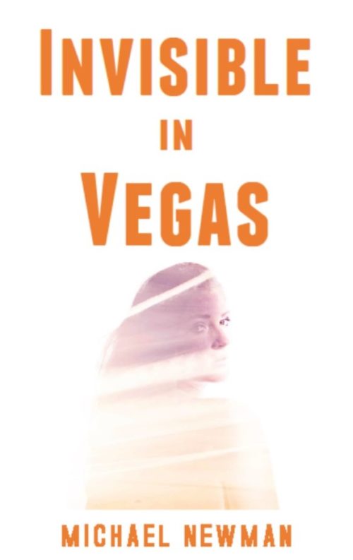
Invisible in Vegas

The author says:

This crime fiction novel is set in present day Las Vegas. The target audience is adult men and women who enjoy Robert Crais, Michael Koryta, Reed Farrel Coleman, James Swain, Jonathon King, and James W. Hall. The protagonist is Gus Donnelly, a man whose grandfather and parents opened a Las Vegas casino in 1959. Along with his best friend Marcus Anthony, he is searching for a poker chip from his family’s casino worth $10 million dollars. The cost of failure is the death of his girlfriend. I’ve done my amateur best on the cover. The photo is free.

Nathan says:

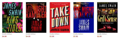
Technically it’s a nice try.  Conceptually, it needs some work; I can’t speak for anyone else, but to me the cover says “dramatic thriller” — the kind that is usually targeted to WOMEN, not men.  I don’t know whether it’s because a female face alone on a cover is a trope more usually aimed at women, or what…  But let’s take a look at the covers for the authors you cite:

What I’m seeing, more often than not, is clear color and large type — any image is so much an afterthought that, in some cases, it’s practically invisible.

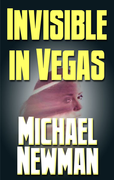
With that in mind, here’s a two-minute redo:

See what I mean? It’s not a good cover by any stretch (because two minutes), but it conveys more clearly its affinity with the authors you cite.

Other comments?
The Hidden Dragon

The designer says:

This book is a dystopian action, soft sci-fi. The target audience is adults age 19-30 or so. The book has LGBT+ themes, and later books in the series will contain somewhat less action and more political maneuvering as the story progresses, though action will still be present. The story primarily focuses on a violent rebel group that seeks to overthrow the repressive government. I am not the author, just a friend who is also not a professional designer. I did make this cover, however, and the author also agreed to changes based on your feedback.

Nathan says:

It’s a very eye-pleasing cover, although I’m not crazy about the typeface used for the series title, especially as it clashes with the other typeface used.

My bigger question is whether it communicates what you want it to about the story and setting.  It’s got a bit of that Hunger Games vibe, but that series isn’t the be-all end-all of dystopias; what can you do to communicate “dystopia” or “repressive government”?  Uneven paint in place of the smooth red background?  Rust and bolts on the dragon?  A militaristic stencil in place of one of the fonts?

I’ll let the others give more ideas.

Forebodings

The author says:

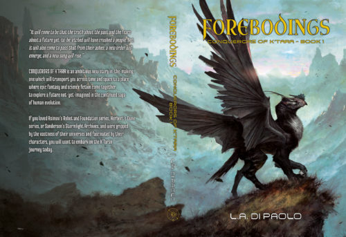
The book is a sci-fi/fantasy novel set 3,000 years in our future on a distant planet which evolved to develop both an ecology and a human society that is fantastical. The sci-fi aspect of the novel enters in a few scenes in Book 1, but will more fully reveal itself in the next books when the planet is invaded by its gods…from Earth. The target audience is YA to adult. This might appeal to readers of Herbert, Sanderson.

Nathan says:

I think you know that the artwork is fantastic — no complaints there.

The text is too unassuming; you have space to enlarge the title to make it more readable, so do so.  It’ll be even more readable if you strengthen the borders on the letters to mark it off from the background. Enlarge the byline, too.

Other comments?

The Silent Market

The author says:

Real estate investing, where to find good deals, etc… The silent market is all the deals that are not on the market. fyi-The photo was of myself on Santa Monica Beach, CA.

Nathan says:

I think the biggest problem here is that it simply doesn’t look like a how-to book.  There’s a soft, spiritual vibe here, more appropriate to a personal memoir, or maybe a self-help book.  With that photograph, even the tagline seems like it’s some sort of New Age-y quip — “The best real estate deals are the ones which you find inside yourself, meditate upon this.”

The best thing you can do is to look at real-estate how-to books and learn how the consumers of such books are used to being marketed to.  You don’t have to go for slavish imitation, but you do have to include enough expected elements on the cover that your target audience will understand that this book is for them, instead of being accidentally mis-shelved in the wrong section at Barnes & Noble.

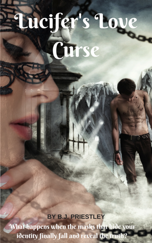
Lucifer’s Love Curse

The author says:

Lucifer’s love curse is set in 21st century im America. The story is about Lucifer the fallen Angel, who is also a vampire. He falls in love with a woman and learns he had a curse placed on him that would change him entirely when he finally accepts her love.

Nathan says:

This is a nice amateur try, but it doesn’t reach the level needed to show it to the world.

  • The semi-transparency of the various images adds nothing, and just makes it hard to comprehend each one. (The chain is especially irritating.)
  • There’s simply not enough clear contrast in the image. Desaturate it and take a look, and you’ll see what I mean. Make the darks dark and the brights bright so that figures stand out from the background.
  • The cover image was made without considering how much space the title should take up; that’s why, even with a too-small title font, the type overlaps awkwardly with image elements.
  • The byline shouldn’t look like a footnote. You could easily take out the tagline that adds nothing and fill that space with your name (tip: you don’t need “by”).

Other comments?