The author says:
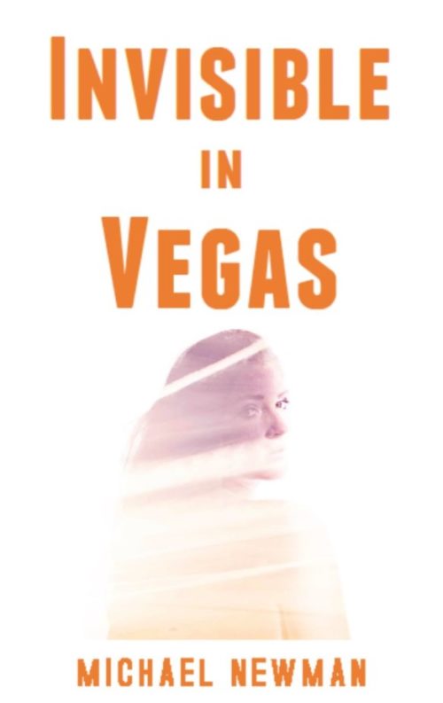
This crime fiction novel is set in present day Las Vegas. The target audience is adult men and women who enjoy Robert Crais, Michael Koryta, Reed Farrel Coleman, James Swain, Jonathon King, and James W. Hall. The protagonist is Gus Donnelly, a man whose grandfather and parents opened a Las Vegas casino in 1959. Along with his best friend Marcus Anthony, he is searching for a poker chip from his family’s casino worth $10 million dollars. The cost of failure is the death of his girlfriend. I’ve done my amateur best on the cover. The photo is free.
Nathan says:
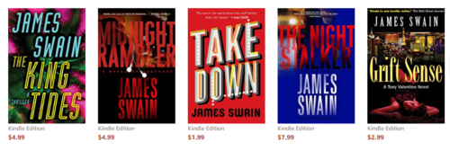
Technically it’s a nice try. Conceptually, it needs some work; I can’t speak for anyone else, but to me the cover says “dramatic thriller” — the kind that is usually targeted to WOMEN, not men. I don’t know whether it’s because a female face alone on a cover is a trope more usually aimed at women, or what… But let’s take a look at the covers for the authors you cite:
What I’m seeing, more often than not, is clear color and large type — any image is so much an afterthought that, in some cases, it’s practically invisible.
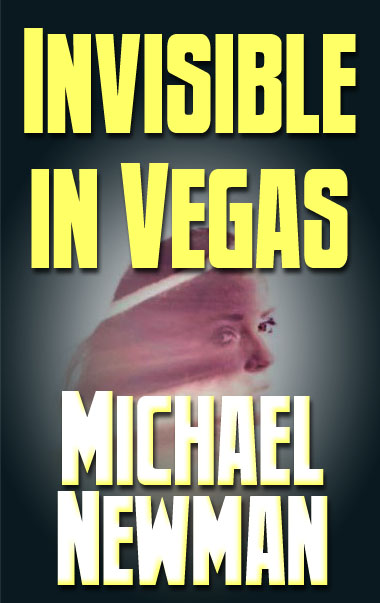
With that in mind, here’s a two-minute redo:
See what I mean? It’s not a good cover by any stretch (because two minutes), but it conveys more clearly its affinity with the authors you cite.
Other comments?




Normally I’m against partially transparent images, but given the context and title this use is a pretty good idea. Balancing the colors of any background and the transparent face will be the awkward part. In pursuit of that idea, I would take my cues from the ‘Indigo Slam’ cover. The yellowed clouds provide a good backdrop, more of a texture, for the silhouetted elements in the foreground. In your case it would be the partially transparent face instead, and with Vegas in the title you won’t need anything like the silhouette of the Space Needle to identify the city. An aerial shot of the strip at night could make a good backdrop for the face to be imposed over, though its brightness and the complexity of a street grid could overwhelm it. It could be tricky. Bleak desert landscape is an easier option, simply swapped in for the Indigo Slam cloud texture.
Doing your title and byline in different colors, like that cover, could be a useful way to add a splash of variety to the fairly subdued artwork that might work best. However, avoid the look of the ‘Welcome to Las Vegas’ sign at all costs. People try that style a lot, but overexposure have given it a lot of baggage that is hard to utilize predictably. I think it would clash badly with your desired ambiance.
One functional note about white backgrounds is that they blend into the backgrounds of most sales sites in an unsettling way. You will need some aspect of your design that ensures a visible edge to the image. Avoiding stark white and stark black should be adequate. Putting a dark border around the image is another option, but is generally the lesser option to just designing with a contrasting color.
Invisible on the sales page, too
Nice image…but it is wasted. It is completely lost in an overwhelming sea of white…which is only exacerbated by the fact that the art is so high key to start with. There isn’t much point to criticizing the use of type until something better is done with the art.
The lightness of the image could really work in favor of the cover—but it needs to fill the entire space…which means that great care will need to be taken with the placement of the text. Leading me to add that there is no reason that the title of a book need be centered. I could see, for instance, the image of the girl bleeding off the left side with the title and author name stacked and following the contour of her face,
Still…I don’t know if the cover would convey enough sense of “dramatic thriller,” though perhaps good use of the type might do that.
I can see it in my head but didn’t quite get there with this mockup. Perhaps someone with more talent can see what I was after and do it better.
https://pasteboard.co/HBLWADj.png
Pretty good, a better implementation of the translucent woman than I had described. There is a little risk of false flagging from the Eiffel Tower front and center, but I think the rest of the buildings are enough to tell the viewer that this is the Vegas tower instead of the Paris one.
Very cool, indeed!
A few more tries.
https://pasteboard.co/HBMcGo9.png
https://pasteboard.co/HBMdEpJ.png
https://pasteboard.co/HBMdRbI.png
Yeah, super nice tries, but with that specific font, it’s screaming “sci-fi” to me. 🙂
I’m scifi-centric so it’s harder for me to match typefaces with other genres.
What about something like this? Obviously with a lot more detail and better color, and possibly with a hand of cards on the table.
https://pasteboard.co/HBOYpXv.png
Scrapping the sheer woman concept, what about an image of a vintage casino with a representation of the poker chip looming over it? Maybe with a smoking bullet hole in it (or something representing the means by which the girlfriend was killed)
All very cool, for sure! But I find myself wondering if people might think the book science fiction or fantasy?
Good idea, perhaps, to scrap the transparent woman…but the alternate suggestions might be too general…
What if the title is embossed on the poker chip?
Maybe a poker table surface with cards, the chip, and a gun/knife/lead pipe/candlestick/rope
I agree that this looks like Chick-Lit to me. It’s too soft for a thriller. Using a sans serif font doesn’t tough it up adequately to look like a book that a Crais reader would pick up. I am one of those, as it happens, and I’d never pick up this book. I’d assume that it was chick-lit, or at best, literature, and if I’m in the mood for Crais that’s not what I’m seeking.
I kind of like a combo of BL’s suggestions, or maybe s/he said this already–what about a background of Vegas, which you can make or find in any number of ways, and a poker chip? That’s got a lot more bang than the fading girl. Or you could try a nice strong sans font, mid-screen, with this: https://pixabay.com/en/las-vegas-night-life-casino-nevada-1428457/ (image is free). Not exactly what you had in mind, of course, but…it’s interesting.
You have, as your backdrop, one of the most recognizable cities in the world, so why not make that work for you? If you wanted to homage some of the older Crais covers, you could even use this: https://pixabay.com/en/las-vegas-welcome-sign-open-sky-308001/ (which is an illo), even though, yes, I know it’s a trope, but it’s a tasteful one, and would look pretty nice done just so. Again, you’ll want a strong sans font–my gut instantly kind of thinks a compressed or thin/taller one, for the title, but that’s a “play around and see” scenario. If you use a brighter image/background, then you might want a slightly distressed sans font, like Masterplan. You don’t want a cover that leans toward Hiaasen, rather than Crais, so you need something to offset the bright colors (for example, see Crais’ Freefall or Stalking the Angel–both could go too light, a bit cartoony, but edge is created with slight image manips…maybe use that drawn LV sign, and fade it to nothingness?
Anyway…I’m not a graphic designer, I usually yammer on about fonts, but there’s not a design here that I can help with on those, not really. I think that the current design, while nicely minimalist and fairly tastefully done, will get you a bunch of clicks from the wrong readers, which means no sales.
Hope that helps.
I agree with Hitch…
…though I do think that it might be possible to include the girl into an image of Las Vegas so that the cover becomes a little more relevant to the book and a little less generic Las Vegas novel. I think the cover art should suggest a bit more than the bare fact of where the story is set. While not exactly what I have in mind, this cover I did a few years ago is of the same ilk https://spaceart.photoshelter.com/gallery-image/eBooks/G0000FCmS225CT8I/I0000E64L4V0w_.0/C0000lZrO0IRzCsc
What about this?
https://i.imgur.com/kwJfp5z.png
Cool! perhaps one too many I’s singled out, but otherwise great!
I did that becasue the outline was so thin they disappeared at less than full resolution. It’d need tweaking but I though it was a nice idea having her outlined by a glow rather than simply translucent.
BL!! I LOVE THAT! 🙂
Thanks
I was thinking if I could find a normal font that matches (or the original on which this is based) I would only have ‘INVISIBLE’ in the stressed version.
BL:
Sorry, not following–matches what? I’m delighted to help, but I need a bit more clarity on what you’re trying to match. The original font, you mean?
BL:
This might be one step too far, but what if you used this: https://creativemarket.com/adam.filipowicz/1249178-Vector-Light-Bulb-Marquee-Letters for the title font?????
I wonder if you could darken the “bulbs” on some of the letters, and leave them lit on others????
That might look cool. I could probably make something like the myself. We’ll see what the originator likes.
I was speaking of matching the stylized font I used in my mockup. I got close but had to manually manipulate it to fit the kerning and scale.
Yes, silhouette vs. transparency makes all the difference.
I think the cover solution is really brilliant! 😀
The multiple I’s don’t look random, since there are so many of them—as though they had been singled out for some special reason. Maybe fiddling with them by hand a little would do the trick, if they are hard to read, but I sure wouldn’t go to that much trouble if this is just for show and tell! Perhaps the only other fine-tuning I might do is to complete or emphasize the line connecting her pony tail with the rest of her head (so that the pony tail doesn’t look disconnected–at the moment it might be taken for a flame over the city). I was also wondering if she ought to be flopped left to right, so she is looking away from the spine.
But this is all just fine-tuning, like I said, and only worth doing if you were actually taking this to completion.
The Is can be made heavier manually, of course. This was a very fast solution. I’d keep her facing left for three reasons:
The profile physically fits the empty parts of the Vegas image better that way.
The brightest parts of both images are on the same side, further tying them together.
She is looking inward suggesting hopelessness rather than outward which would suggest hopefulness.
Two Variations
https://i.imgur.com/uEgdFw6.png
https://i.imgur.com/HdoMzN4.png
They are both quite good, and vast improvements on the original. I hope, sincerely, that the OP reaches out to you, BL. 🙂 VERY nice job on this.
You’re too kind.
I apologize for not responding earlier, I’ve been on vacation. I appreciate all your efforts. I like the one where the word invisible is outlined the best. Once again sorry for the late reply.
I’m channeling my inner Don here…
https://imgur.com/a/PqqsomW
Cool. What process did you use for the title?
clipping masks of the string light billboard things they use there with clipping masks in yellow, white and black set to overlay with varying opacities the color applied randomly for the grungy look and a bevel on all the words and a shadow on In Vega. The font was Impact; it’s an oldy but goody and classic thriller and great for clipping masks because it’s so nice and chunky.
I have a friend who makes the most AMAZING thriller covers, so I try to channel him when doing one.. This was a simpler cover than he normally does but I was trying to be true to the artist’s vision
the girl was faded with a layer mask so the yellow layer beneath it shows through. And she had high contrast and lighting on her. I was trying to imply the lights of Vegas are obscuring her, making her invisible. Not sure how well it translated or if it’s only clear to me because I know what it’s supposed to be…lol.
I’m not sure that the lights are obvious, if you don’t know that that’s what you were doing, but I love the effect–and after all, (Great Minds Think Alike), I had just suggested some Neon Light fonts to BL, to try on his/her mockup. 🙂 I like a lot about this, Shel!
Very nice job! But I wish it gave a better idea of the nature of the story, which is supposedly a crime novel. The distressed typeface hints in this direction, but I don’t think it’s enough. The book could just as easily be the gritty memoirs of a Vegas showgirl.
I had an idea of adding a backlit revolver to the image but I don’t know if that’s how she would be killed so I left it off. Like this…
https://i.imgur.com/6u2ZDhs.png
The backlit poker chip could replace the gun to fill the space inside the profile.
Or this?
https://i.imgur.com/Kdh1oMx.png
Or this
https://i.imgur.com/laqPDOO.png
Those last two are pretty cool, though I would raise the gun a bit so it’s not so much behind the name.
Be a real shame if it turns out she was strangled.
I can always back light a pair of leather gloves. LOL
Yes to the one with the original layout and the gun; no to the two blues. Don’t know why–they just throw me. Something about the Girl’s profile makes me stare at her nose, not think “ooooh, what a great cover” or “oooh, I’m intrigued by that story.” I do like the first one (goldish) with the original girl and the gun. Nice.
I really like not only what you did with the gun, but the overall image as well.
The only potential problem goes back to something I pointed out about the original image of the girl. There is a slight disconnect between her profile and her ponytail. With the gun bisecting the image, this is exacerbated…especially since the ponytail is the brightest part of the image. I think there is a little danger of it looking like a separate element…and, because of its prominence, drawing the eye more than the profile.
Remember, these are mockups using off-the-shelf images to present ideas and inspiration. Anything can be modified or replaced with a better version.
I’m not sure how to integrate the gun
A couple more variations.
https://i.imgur.com/Iz6kZt9.png
https://i.imgur.com/S9rDiWg.png
I’m not so sure about all of that neon tubing…
I think you’re focused on the wrong elements. The word Vegas in the title is enough of a clue as to setting. You don’t need to show it. You need to show the crime aspect, the tone of the book.
Instead of the city try something that says crime/ thriller. And I love the silohette but you need a woman one, not a girl.
I don’t think the symbolism of looking inward is really transferring, she just looks backwards to me…lol There is too much empty space, the elements are unbalanced
the poster’s submission has the same problem. His art is awash in a sea of white. He might try enlarging the picture and setting the title on an angle in the washed out sections of her. if he fades her into black on the bottom he could use white text to make it really pop.
He might want to try a different girl, one that more clearly sets the tone. If she is the victim find a terrified looking woman but if she is the villain give us a dangerous looking one. or even add in some texture on the background to help set the tone. he could still keep it simple but a gritty cement wall will go a long way or subtle red and blue as if police lights are behind her, the choice is endless. he needs to think about what aspects to use that would promote interest in the book
It’d be helpful of the OP chimed in. I’m throwing ideas at the wall to see which might stick. To be honest the photo is not my favorite, either, but I wanted to present an idea. A frightened women faded into a brick wall with my neon title above is another idea I had, but without feedback it’s yet another stab in the dark.
This is why posters should be encouraged to participate while still setting aside their defensive tendencies.
Perhaps the neon is too realistic, but it can be adjusted.
Here one just for fun.
https://i.imgur.com/VjTVj7g.png
Same with symmetrical background.
https://i.imgur.com/YyM8P4N.png
I like the neon (the cover is much better than the poster’s version) but I’m again thinking it needs some additional element but without input from the author that element would just be a guess. The idea is to have a potential reader know the sort of book this is at a glance. I think the girl graphic might be misleading as it has a very high fantasy element)
Setting is very clear. MC is clear but tone/type of story isn’t clear.
Is this horror or mystery? BL’s latest lean heavy on dark mystery, which might be just the thing. Changing out the simple blue lines to a recognizable pattern could further narrow it but that pattern could be anything. (I like the lines but it looks like she is in front of a window and it feels like they could be adding more with tweaking. For instance, if the window affect is intentional, making a few crooked with the tips of a hand poking through would up the horror) But the lines could be changed to have be a recognizable graphic. a speeding bullet says something completely different then a line of cocaine. I think the author has enough info now though to make a much better cover than the one he submitted, and that’s the goal.
I’m glad you like the neon since it took me most of a day to create. The first purple version is a stock image with virtually no changes. The second version I mirrored part of the background and blended it to make it symmetrical.
Yeah, I can see how that purple would take soooome time. Nice. I like the Neon, actually. (If I could figure out a way to make it look like it was flickering, on a book cover, I would, ha!). I didn’t think I would–but I do.
I agree with Savoy that we’re all throwing Jello at the wall, to see what sticks, but hopefully, the OP will reappear sometime soon. 🙂
https://i.imgur.com/N4Y5ILt.png
There’s predone text effects available that can save you hours of work reinventing the wheel. Like https://www.freepik.com/free-psd/neon-text-effect-with-two-color-scheme_713741.htm
or
https://www.pixeden.com/photoshop-text-effects/psd-neon-text-effect-photoshop
I’ve used that last one. It’s free and it’s stupid easy to do it. You just erase the words and type/ draw yours in. But there are some really great effects available for relatively little money (some are free) that use the smart object setting to apply fifty layers in a blink of an eye.
and it doesn’t matter if it only has a few colors because you can use the hue adjuster to change it.
True, but all those hours of work were necessary to challenge myself to advance my modeling and graphics skills. I’ve never learned anything by taking shortcuts.
I also wanted mine to look like a real sign, hence the connecting tubing and transformer. I might even add the Jack chains from which to hang it.
I’m a total shortcut ho. I’ll use ’em! Plus, singing my song (“stupid easy to do”).
Thanks, Shel! (Aka Savoy).
These look great!
Thanks.
The best answer to this book’s cover yet, by far.
Ron:
Which one? I can’t tell to which one you referred?
The really good one.
https://m.imgur.com/VjTVj7g?r
I prefer the symmetrical version, but thanks. Hopefully the OP will come back. Whichever version he chooses will benefit from having a specific element from the book.
I’m a total shortcut ho. I’ll use ’em! Plus, singing my song (“stupid easy to do”).
Thanks, Shel! (Aka Savoy).
RATS. Nathan, would you kindly delete the dupe comment, and this one, thank you?
No. 🙂
You’re just MEAN. Phlllbbbffffftttttttttttttttttttttttt.
(Need I point out that if we could edit these, that sort of silliness wouldn’t happen?)
I apologize for not responding earlier, I’ve been on vacation. I appreciate all your efforts. B. L. Alley your covers were great.
If you want to pursue any of my ideas I’m happy to help.
Two more ideas:
https://imgur.com/a/4hERg8A
I’ve been thinking since I read all of the great comments and looked at all the covers (yours were the best) that were submitted. To me the important images from the book are: Las Vegas strip from the late 1950’s to the 1970’s and the present, poker chip, Marilyn Monroe (person who gets the protagonist to initially search for the chip is a Marilyn Monroe impersonator, and the protagonist’s girlfriend who he spends most of the book trying to get back after she’s kidnapped. The title comes from a line spoken by the Marilyn Monroe impersonator. Once again I appreciate all your efforts and look forward to working with you on the cover.
As the group is fond of telling me, it’s not as important to refer directly to the story as to create something eye-catching that will make the viewer want to read the description and ultimately the book.
I’d avoid photos of real people, particularly famous people. Is the poker chip distinct in some way? Enough to feature on the cover?
As you saw, a lot of the mockups received positive reactions other than not featuring anything related to the story, like a gun, etc.
The poker chip is distinct. The name of the casino was The Silver Star. It was a one-million dollar promotional poker chip. It is distinct enough to feature on the cover.
Another idea:
https://i.imgur.com/XF6tz5s.png
I assume the casino is fictional? Do you have a graphic of the chip?
The casino is fictional. No graphic of the chip. Here’s what old poker chips looked like- http://www.pokerchipplus.com/Desert-Sands-Casino-10g-500-Poker-Chip
I like the new cover. The neon typeface and neon in the photo is eye catching.
The color of the typeface matches the neon in the photo. Is it possible to have it be a little brighter orange so it stands out more? Is it possible for me to take a look at the various Las Vegas photos you are selecting from? Are there any vintage photos?
Contact me directly.